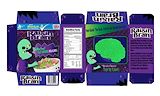
LOVE IT!!! “Raisin’ the Dead” is the character’s name? That’s hilarious! I think you did a great job at both satire and branding. The color scheme is terrific. Well done! -- Mona
- on April 16, 2018
This looks really good. I think that the zombie looks cute, and the box looks very realistic. -- Emma
- on April 16, 2018
This looks really good. I like the smile and the eyebrows. -- Emma
- on March 14, 2018
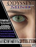
This is a really nice cover. You did a great job! -- Mona
- on March 7, 2018
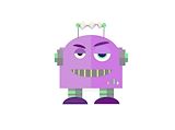
I love this little guy so much! -- Mona
- on March 7, 2018
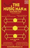
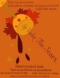
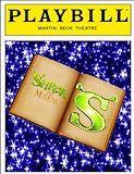
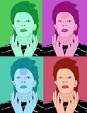
I really loved this poster. There were some symmetry issues I might have changed but otherwise, as a former professional agency designer, I’d have done something pretty similar. Really proud of you! -- Mona
- on March 7, 2018
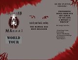
Wow Eislinn this looks amazing! I'd totally go to one of their concerts :D -- Haley W.
- on November 29, 2017
this looks C O O L and G O . O . D -- Mstthew
- on November 29, 2017
?? This is really funny -- Rian
- on March 29, 2017
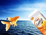
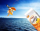
This is way too funny. I do not know if this was on purpose but I think its cool how it looks like the gold fish bag is glowing. Really creative. <3 -- Willow
- on March 29, 2017
This looks like you actually put time into this, which may or may not be inspiring. -- chloe
- on February 1, 2017
THIS IS GREAT!!! -- Camryn :)
- on February 1, 2017
This is a super funny out of sorts picture. I love it! The theme of goldfish and including both the food and fish was very smart. -- Mya
- on November 16, 2016
I love this! -- Mona
- on November 12, 2016
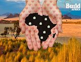
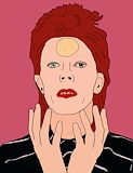
I disagree with your assessment. I love this project and think it all works very well together! And I love the hearts on the hands too. ?? -- Joe-Mamma
- on November 12, 2016
I disagree with your assessment - I love it and think it works together very well! And I like the heart pattern on the hands too! -- Joe-Mamma
- on November 16, 2016
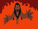
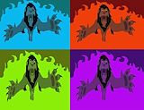
i like this piece! i also like how the fire looks in the background and how defined you drew the claws. -- --\\imani
- on November 8, 2016
i like how you made the fish kind of going toward the goldfish bag. and how the person has a helmet on just like when you ride a horse or something. i also like how the light is coming out of the bag so it looks like he's riding off into the distance. -- //Morgan
- on November 8, 2016
This is very interesting. The eyes look detailed. Nice. -- Emma
- on November 8, 2016
I like how all the colors complement each other. Cool beans. -- Emma
- on November 8, 2016
This has a nice humor aspect. I think it looks really cool and professional. -- Emma
- on November 8, 2016
It looks 3-D because of the colors -- Rebecca
- on November 8, 2016
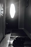
It looks creepy but still a good photo. -- Matthew
- on November 8, 2016
Good tracing. I like your idea. I like how it looks like it is jumping from the screen. -- Benjamin
- on November 8, 2016
Nice artwork. Its nice. I like. My name is Billy. -- Billy
- on November 8, 2016
I like this photo becaus eis has lots of color and value -- brandie
- on November 8, 2016
i like the way you made her face look lighter. and how you put makeup on her. and the highlights in her hair. -- //Morgan
- on October 17, 2016
10/10 nice flowers. pretty picture. My name is billy -- Billy
- on October 17, 2016
10/10 NIce artwork. Its nice. I like it. My name is Billy. -- Billy