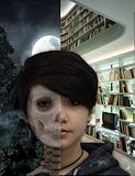
I really like your artwork.I also like the skull and the background!!! You are cool and really creative. -- Deanna
- on April 26, 2017
I really like how realistic the skeleton part is and how you can still tell it's you. Also, you lined up all the features perfectly which I thought was pretty hard. And overall i think it looks really cool. -- angela
- on April 26, 2017
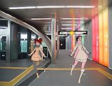
I've seen 8 billion of these in the past 3 years, but this one is by far the best. You executed it beautifully, and the colour scheme is perfect. Not only did you change the original and make it look amazing, you changed the pose to fit the environment. The fact that you also took the climate into consideration shows a skill for character development, and also by not putting them at a beach like everyone else because they wanted to see disney girls in bathing suits. ALSO the choice of charachters for the story you are telling makes sense, considering Ariel and Belle both seem to enjoy discovering new things and junk like that. The only thing I would change is one of their poses so they don't look as much like dress-up dolls. Overall, 10/10. good job -- -Leo haha I made you read a whole paragraph
- on April 26, 2017
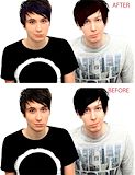
hello dan and phils' robots -- Alexander
- on April 26, 2017
Nice work -- Clarita
- on November 8, 2016
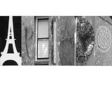
This is cool I would have never thought to do something like this! Props for the cropping job. -- Brooke
- on November 8, 2016
I love this picture! You did a great job with making the letters stand out! You should have used the burn tool, though.:) -- Brooke
- on November 8, 2016
Thats really pretty!I like how you focused on the sky but didnt take attention from the ground. -- Fabiana
- on October 25, 2016
I see the youtuber Natewantstobattle in a poparted form. The lines are precise which makes sure they don't overpower the color, which looks good. Also the colors, while not vibrant are bright and contrast well against the dark blue background. This project seems very well done overall, though the shirt could use a bit more work. -- Ryan
- on October 9, 2016
I like the background of this pop art. -- Zachary
- on October 9, 2016
I like the value in this photo. -- Zachary
- on October 9, 2016
I see a popart tile of Natewantstobattle. This popart is very good because the lines are precise and the colors all work very well. Also the background colors are dark so it doesn't distract from the main part of the art, which is smart. -- Ryan