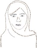
This self portrait is fantastic! Very like you! Good job!!! -- Ana
- on March 21, 2018
I really love all the elements of designs you put into this! The font style and layout work nicely together, good job :D -- Micah
- on March 14, 2018
YESSSSS<3 This is the all time best movie evvaaaa! Love the collage:) -- -Alex:)
- on March 14, 2018
Niceeeee:) My fav colors are included in this, love it MJ! -- -Alex:)
- on March 14, 2018
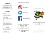
I like how your brochure looks modern, and organized. The logo is very detailed and has a nice font. I like how on the back, you used different forms of social media to represent your company. -- morgan :)
- on March 14, 2018
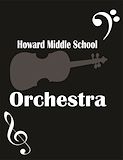
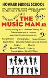
I like how you used the different fonts to make the playbill look unique. The music notes really bring out the idea of the play. The color scheme also makes the cover come together nicely. -- morgan :)
- on March 14, 2018
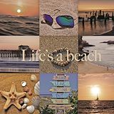
I love the way you incorporated the beach and the color tan (im guessing). This artwork is really pretty and organized, I love it. -- Izzy
- on March 7, 2018
I like how unlike all the other pieces of artwork, your color and theme for your mood board is the same. -- Izzy
- on January 31, 2018
I love this moodboard. I really like how all the pictures are the same size, and they are aligned in a grid like format. I think Maryjane did a great job! -- Emma
- on January 31, 2018
Master od disqise! -- Alexx:)
- on December 11, 2017
What happens if i don't.....:2 -- Alexx:)
- on December 11, 2017
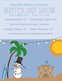
The little snowman is so cute, *peep the sun. -- Alexx:)
- on December 11, 2017
More like cafe beautiful:O -- Alexx:)
- on December 11, 2017
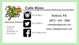
Your business card looks cool, and professional at the same time. I like how you used a picture of what each social media looked like. The font makes the card go with the logo design, which makes the card look nice. -- morgan :)
- on December 11, 2017
Your business card looks cool, and professional at the same time. I like how you used a picture of what each social media looked like. The font makes the card go with the logo s=design, which makes the card look nice. -- morgan :)
- on December 11, 2017
I LOVVVEE THISSSS:))) You should be featured in this, if you know what i mean;)) -- Alexx:)
- on December 11, 2017
I really like how you used the Winter in Florida theme. The sand castle next to the snowman really builds the theme . You used a really professional looking font, and it really makes the whole piece come together. -- morgan :)
- on December 11, 2017
This looks really good. Maryjane did a great job. -- Emma
- on December 11, 2017
This is an amazing idea for the poster! the shades of blue work really nice with the foreground objects, and all the text is layed out good, and easy to read :) -- Micah
- on December 11, 2017
This looks really realistic, and really good. One small detail I think would improve this, is the size of the font. It's big enough, however, it is very skinny and a little hard to read. Besides that small thing, Maryjane did an amazing job. -- Emma
- on December 11, 2017
This is really good! It looks like a magazine I would see at the store -- Eislinn
- on December 11, 2017
I really like your logo, it's simple, but unique at the same time. I like how you made the letters inside the circle in a cursive font. It really stands out, especially if it's in the corner of your artwork.The circle, enclosing the MJ makes the whole logo come together. -- morgan :)
- on October 26, 2017
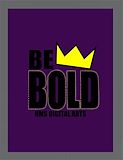
I like how you added the dots on the outside of "bold", it really contrasts with the crown, and background. The crown itself really stands out from everything else. The border around the purple also creates a contrast between the text, and crown. -- morgan :)
- on October 26, 2017
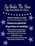
Perfect color selection for an evening event. Very Nice! -- RachelBottin
- on October 9, 2017
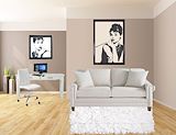
Looks realistic, almost like a real picture. You used the same room as I did for one of my "Dream Rooms"! -- Joris D.
- on October 9, 2017
I like the design and layout of it, but I think you could have put in a warm color to make it look better. Nice choice of fonts! -- Joris D.
- on October 9, 2017
I like the stars and how there placed. -- Zachary
- on October 9, 2017
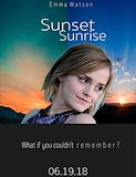
MaryJane this is probably your best project yet. I love how you put the words sunset more to the sunset side, that is very handy and smart in case you forget. -- riley
- on May 3, 2017
this looks really good. I like how you used emma watson bc i like her as an actress too. I also like the story behind your poster , and it sounds very interesting. the background changes look pretty too. -- //morgan
- on May 3, 2017
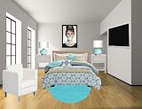
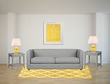
I really like this room because it has alot of teal and that's my fav color :) also it has the same background and walls as mine, so I guess great minds think alike. The poster above your bed also makes the b&w contrast with a little bit of color. -- //morgan
- on April 13, 2017
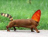
I like how you added the fish head bc I did the same. I think it really contrasts with the other animals because it's so different and abstract. It's also pretty cool that you added the racoon tail bc it makes the fish look un-realistic. overall, it looks really good. -- //morgan
- on April 13, 2017
i absolutly love the colors because those are my favorite colors yellow,grey,white and black! GOOOD JOBBBB -- briana
- on April 5, 2017
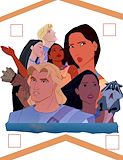
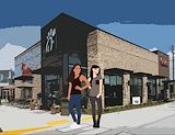
I love this not just because I love Chick-Fil-A but because I think you used a great filter on the background and I love the outfits you chose to put on the characters. Overall i think this is great!! -- Lana
- on February 1, 2017
I really like what MJ did for this project. The filter she used fro the background looks really cool. -- Emma
- on February 1, 2017
i see how you used chick-fli-a as your background but your making me crave that now. the way you put the 2 princesses in front of it is a bit odd because there just standing there posing . i see how you made it modern tho by putting them in front of the chick-fli-a . -- callie
- on February 1, 2017
You made my day because I love chick-fil-a and u also did the background stunning. and their poses are fantastic.! -- Briana
- on February 1, 2017
the way you made their clothes look more 21st-century like makes them look more natural to our modern day world. I like how you put them in front or chic-fil-a because it makes them look like they are a part of the 21st century:)) -- //morgan
- on February 1, 2017
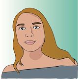
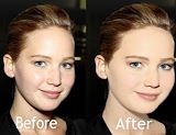
I think you did a really good job on this piece :) I can tell that you changed the natural look of her face, but it looks better. you can also tell that she has some makeup on, but you gave it a natural/ blended look so it doesn't look out of place. -- //morgan
- on February 1, 2017
I like the way you positioned them. You did a great job making the clothes look real. Nice! -- Emma
- on February 1, 2017
MaryJane, this photo is so realistic and their fashion is so cute. Just like you! -- riley
- on February 1, 2017
Two Words...... GO GIRL!!!!! I love it :) -- Camryn
- on February 1, 2017
I LOVE IT! xo -- RachelBottin
- on November 7, 2016
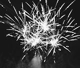
Maryjane I love this piece because I love fireworks. This piece also has a lot of value you rocked this one. All the different shades of white,gray,and black really go together and make a beautiful photo. GOOD JOB! -- Riley
- on November 1, 2016
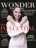
I am also a HUGE and I mean HUGE fan of Emma Watson and i very much appreciate this piece. -- Camryn
- on November 1, 2016
You did a good job cleaning up her face and making the eyebrows darker there is a difference but it still looks natural :)) -- callie
- on November 1, 2016
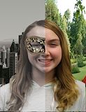
I think this looks really good! I think you did a really good job at making it look natural and also there is a noticeable difference. Good Job. -- Ethan
- on October 4, 2016
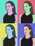
Saw your "Andy Warhol" print. This piece has very good choices of tonality! Barbara, Philip and I are fans of this genre, Pop Art! -- Maria