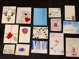
I like how your cards turned out! It was smart to cover lots of different occasions with your cards. I think your lettering looks very nice -- it's really improved through practice! -- Mom
- on January 16, 2018
I really like the various tones of gray you used here. I especially like the box at the bottom of the stack and the one that has flaps. -- Mom
- on November 2, 2017
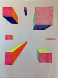
India, I'm excited to see new work posted! This is really neat and tidy -- it's difficult getting those crisp lines, I bet. And the perspective is nice -- it's hard getting that right. I like your colors, too. -- Mom -- Mom
- on September 13, 2017
Very cool. -- Jeff
- on September 13, 2017
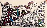
This looks like a tapestry -- very pretty! I'm looking forward to seeing the art projects you tackle next fall! -- Mom
- on June 6, 2017
LOVE this! I'm so impressed with how realistic it looks and how much time and attention to detail this oversized piece took you and Caroline. Fantastic job! -- Mom
- on March 26, 2017
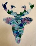
T- I think the floral print on the deer head is really pretty. The eyelashes came out great with the paint, which was probably really hard to do. A- What is the TRUE MEANING behind this piece? G - Um, maybe make the antlers longer next time... I dunno. :) -- Kate C
- on March 26, 2017
Wow that is really pretty!! -- Madison
- on March 26, 2017
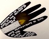
This is a great quote from Harry Potter that reflects the theme of your assignment. The chalk was a nice medium for the candle. -- Love, Mom -- Melissa
- on December 13, 2016
India, I chose this artwork for my Christmas cards and really like how they turned out. -- Nana
- on December 13, 2016
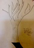
India, I like this piece -- it really does feel desolate. And I like the stark contrast between the tree and the shadow. -- Mom
- on October 26, 2016
India, I really like this and I can see how a painting by Matisse was the inspiration. -- Mom
- on September 23, 2016
Wonderful painting, India. Love, Granddad -- John
- on September 23, 2016
This is one of my favorites. I love the way you incorporated the multicolored flowers in the deer head for your Dad. -- Nana
- on September 6, 2016
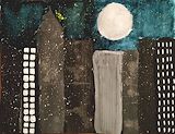
India, I really like this one a lot. The varying gray colors are beautiful and I like how the buildings also have varying textures and fixtures. And the color of the sky is gorgeous. I think the splatter technique was really smart -- it really does look like stars and twinkle lights. -- Jeff
- on June 17, 2016
I really likened the colors you used inside the deer -- Caroline
- on June 17, 2016
I'm dying over this!!! The colors in this are awesome. I also love the deer , such an underrated animal ! -- Mae
- on June 17, 2016
I really like the texture in this piece. And that gold color is very vibrant and unusual. Almost like an egg yolk! -- Melissa
- on March 20, 2016
That is a cool piece too! You will have to tell me how you made it and what it represents. -- Jeff
- on March 20, 2016
yes -- Mom
- on January 21, 2016
I really like this, too. It almost looks like the deer's head is made of flowers. Look up some of Georgia O'Keffe's paintings -- there are skulls of cows with flowers on them that remind me of this! -- Mom
- on January 21, 2016
This is one of my favorite pieces to date! Thank you for bringing me my copy. Glad you found the original too! -- Jeff
- on January 20, 2016
This is really a nice piece. Seeing the detail and motion is beautiful. -- Jeff
- on January 13, 2016
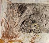
I really like the wheat plant -- it looks very detailed and realistic! -- Mom