I like how you made the background look kind of like a sunset. And how you put one of the characters in the bottom corner.And the way you made the layout for the words, it makes it easier to read the different parts about what to do for the play. -- //Morgan
- on November 7, 2016
I think that this is really good. you can barely tell that is has even been photoshopped, and I think that the name of the album and picture on the cover fit nicely. -- MaryJane
- on November 7, 2016
The lettering looks very cute and i like the colors -- callie
- on October 24, 2016
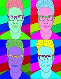
I love how you did the glasses and i like the blue face. -- briana
- on October 24, 2016
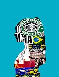
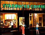
I love Starbucks -- briana
- on October 24, 2016
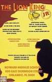
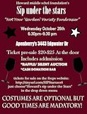
I like the cave shape around the text and the colors you chose for the background, i also like the font you chose to use and the lion on the right side of the play bill. I like the spacing of the text, it's easy to read. -- Xaden
- on September 29, 2016
I love the silhouette of the lion and the shadow it looks great! -- Marlie
- on September 29, 2016
I really like the colors you chose for your flyer.Its also very nice how you changed the text on some facts so they were noticeable. -- isabel
- on September 27, 2016
this is my life goals (heart eyes emojis 10000000x) -- Bao is my nameo
- on May 2, 2016
YOU are the best photoagrapher in the school!!!!!!!!! -- JEFF
- on March 28, 2016
This is sooooooo gooooooooddddddddd -- pola
- on March 28, 2016
This looks so cool! -- graysen
- on March 28, 2016
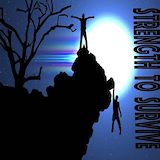
love how you used a photo outside of florida -- lizzy
- on March 28, 2016
YASSSSSSSSSS!!!!!!!!!! -- Graysen
- on March 14, 2016
This is soooooooooooooooooooooooo amaizingggggggggggggggggg!!!!!!!!! ---Austin
- on March 14, 2016
This is very good, I especially like the background color. I can tell that you like MMA, Crossfit and BJJ. This is one of my favorite self portraits. Good job, you are a very good artist. Keep it up!!!! -- pola
- on March 14, 2016
its a pear (pupp+bear) I like pears -- Adam
- on March 14, 2016
Soooo cute! the best one yet! -- Andrew
- on March 14, 2016
Soooo cute! The best one yet! -- Graysen
- on March 14, 2016
I Loved how creative you got with this project. The letters are very visable so i could clearley tell what your last name is -- Pola
- on March 14, 2016
This is a great room for you kalani! This room really shows how much u love the jungle/crossfit/MMA! I LOVE IT -- Pola
- on March 7, 2016
Where could I find one of these? -- Henry
- on March 7, 2016
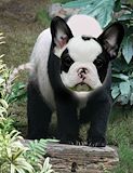
1738 that panda is my new wuv -- jorden
- on March 7, 2016
The head is glowing and its just beautiful -- Bao
- on March 7, 2016
Love how the colors of the dog and panda match -- Jackson
- on March 7, 2016
I really like this project and how the head and the body match in color.Good job very nice -- Austin
- on March 7, 2016
This is really good! :) -- Andrew
- on March 7, 2016
I also like Starbucks and Eos lip balm ;) . I really like the color you used in the background as well. This is really nice overall! -- Genesis
- on February 29, 2016
This is really good! :) -- graysen
- on February 29, 2016
I liked how you put on new clothes on the characters well and how realistic and put together they are. -- Jackson
- on January 4, 2016
I like the way that everything is layed out and that each of the princesses have different style choices not like the other modern day fairytale projects. Great job!!;) -- Pola
- on December 14, 2015
i love the way his eyes and his glasses pop out -- william
- on November 18, 2015
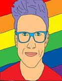
OMG i love him.I love the hair and rainbow background you did a good job and he looks just like the real Tyler Oakley! -- Morgan
- on November 18, 2015
This is really good!! she looks good with the face makeup as well as her teeth. Keep up the good work! -- Morgan
- on November 18, 2015
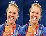
I learned a lot these few weeks of school including ho to use photoshop to make pop art and how to bring out a celebrity figures real beauty without using all of the makeup that they usually wear. As you can see in my art work I didn't use a lot of make to increase her already beautiful skin I only used makeup where there where blemishes or red marks on her skin. I chose to do Ronda Rousey because she usually does not where a lot of makeup but when she does and she is beautiful so I found a picture where she is clearly not wearing any makeup so I put foundation and concealer on her to make her real beauty stand out.
- on October 12, 2015
The background of the portrait compliments the persons hair very well -- Steven
- on November 18, 2015
I see a pair of glasses and a bunch of vibrant colors such as purple, yellow, pink etc. My eyes started in the middle and went diagonal. The hair and backround look emphasized. -- Andrew
- on November 18, 2015
I clearly see a lot that I can describe as value,You have used a lot of value between this pop art such as the different colors you used,and the saturation shows so much and really describes the person that you have used in this artwork! -- Pola
- on November 18, 2015
I love the way all the colors work together in this. -- Katie
- on November 18, 2015
This is really cool!!! -- Katie
- on November 18, 2015
I like how they used rainbow colors, it really makes each picture different. -- Morgan
- on November 18, 2015
I see how you wanted to show different feelings/moods for the picture.Also I love how the picture you has different colors to it. -- Mia
- on November 18, 2015
I think it has great variety ,color,and texture. -- Nicholas
- on November 18, 2015
I love the artwork, the color caught my attention. -- Carly
- on November 18, 2015
You have good mixture of colors.Also you have a good work of art. -- Mia
- on November 18, 2015
Your artwork has a great color scheme , they all look great together. -- isabel