You could have made the pictures smaller, and added more in there. -- ; )
- on May 2, 2016
LETS GO KNIGHTS! Go job. -- anthony
- on February 24, 2016
You should've treated this like a trip to the grocery store, don't do it while hungry -- Dank Yeemes
- on May 2, 2016
Interesting house... Should have added more stuff to the outside, but its seems ok. (Personally likes the limo :3) -- -Cierra
- on January 25, 2016
the proportion between the "U" and the rest of the letters is a little off. their is not enough contrast between the c and the rest of the ground in its picture. i could have made all the letters a little wider. -- Dylan
- on January 4, 2016
the proportion between the heads and the bodies are a little off. i could have given Ponocio more defenition in his clothes. and also fit their heads a little better. -- Dylan
- on January 4, 2016
I like the idea of the squad but I think there should've been more effort towards the heads matching and fitting on the bodies. -- Drayton
- on January 25, 2016
I should have made the first c have more texture. also, expanded the u a little more. the m is not very clear -- Dylan
- on December 14, 2015
this picture is awsome it has ferb and pinocio are cool -- mark
- on January 25, 2016
I chose this because i like the dolphins -- Dylan
- on November 16, 2015
i did this because i like kind of want to go here -- Dylan
- on November 16, 2015
i did this one because i want to go to their enginering program -- Dylan
- on November 16, 2015
I did this because i like their football team and their colors -- Dylan
- on November 16, 2015
i should have expanded the"u." Also used the ruler tool to make suer they are all even. the first three letters a little hard to see -- Dylan
- on November 16, 2015
I really like the simplicity of the artwork. Great Job! -- Katie
- on November 30, 2015
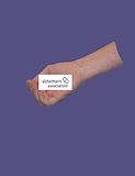
i should have cut out more of my hand. also filled in the background. the purple is the other color of the assosiastion.
- on November 2, 2015
i should have been more carefull with the paint bucket tool. should have outlined the hair first. the microphone is a little out of place.
- on October 19, 2015
i should have droped the opasity an little on his skin. the eyebrows are a little to dark. but he looks diffrent
- on October 19, 2015
I should have outlined the hair before using the paint bucket tool. should have been more carefull with the lines. the microphone is a little out of place.
- on October 19, 2015
I should have taken down the opasity a little. for first real buety, i think it is good
- on October 12, 2015
I think if you dropped the opacity a little bit more this would look more realistic, but for a first real beauty this i really good -- Katie