Nice choice of color. Glad you discovered the Wacom tablet. Nice piece of work for first time with Illustrator. Its a great and powerful program. -- Dad
- on May 31, 2017
My dream kitchen if i were to ever cook. -- dillon
- on May 3, 2017
This looks great! I could definitely see myself with this as my planner's front cover! -- dillon
- on May 3, 2017
It's terrific Madeline. I like your style???????????? -- Tony
- on April 13, 2017
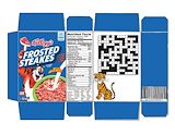
This is great, clean, clear and informative, it has all the information and an eye catching picture that makes you want to pick it up and read it. Good job, as usual. -- Granddonna
- on March 15, 2017
i love it - I would hire you! The photo is beautiful and I like your logo. -- Lynne
- on February 16, 2017
I like you poster for the play. What a fun piece. -- Dad
- on February 25, 2017
Very nice work Madeline. Keep it up. -- Dad
- on February 25, 2017
Great job, Madeline. It looks like a Christmas card. It is an eye catching picture and it has information too. It is a smart design. -- Donna
- on January 4, 2017
Beautiful, clean lines - I love it! -- Lynne
- on December 19, 2016
Creative and funny, the humorous twist made me chuckle. -- Donna
- on December 8, 2016
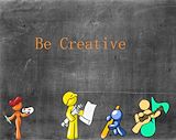
I love this piece, all the little figures are adorable. You did a great job of showing the personalities of each. Your work is creative and imaginative. I am impressed and proud! -- Donna
- on December 8, 2016
Very nice work Madeline. Keep it up. -- Tony
- on December 2, 2016
I love the chalky blackboard. I like the primary colors. -- Lynne
- on November 21, 2016
lol,I like how you made it funny.Very creative and shows sense of humor -- Evenyka
- on December 2, 2016
This is really cute! I like the faces and the design is adorable -- meemaw
- on December 2, 2016
Good job, Madeline. You are very talented and we are so proud of you!! Love you very much! -- Donna
- on November 16, 2016
I love this! The abstract look of the TOP logo is a really cool look. Good job -- Brandie
- on November 9, 2016
I like the way you made the grasslands look like the shape of the characters. I also like how you made one of them at night, and one in the morning. The transcripts are really good. -- //Morgan
- on October 25, 2016
The information is laid out nicely and I love the way the graphic looks. -- Will
- on November 2, 2016
This is really good, the creativity is great! The one thing that bothers me is the color in the background. It's a little too dark, a lighter color would be a good contrast between the title and Simba/Scar. I'm Scar in the play here and I approve! -- Eislinn
- on October 11, 2016
I really like how in the heads there are the different scenes of pride rock. All of your words are spaced out nicely. -- Emilyyyyyyyyyy
- on October 4, 2016
I like the colors you chose. Very strong piece. -- Tony
- on October 19, 2016
Nice work Madeline. I really like it. Good luck in the contest. -- Tony
- on November 2, 2016
This seems very vintage because of the car chair, the camera, and all the rest. It seems like the time frame is 1960. However, the background does not seem to fit the contents in the moodboard. -- Noelani
- on November 2, 2016
That background reminds me so much of my backyard lake it makes me wonder if you took the pic there. -- Skylu~
- on November 2, 2016
HOW DID WE USE THE SAME BIRD I JUST PULLED UP A PIC FROM THE INTERNET TO INSPIRE ME I AM A VICTUM OF CIRCUMSTANCES!!! -- Skylu~j
- on November 2, 2016
I'm sorry I copied your idea:( -- Billi Jo Boi
- on November 2, 2016
Great job, Madeline. I'm so proud of you!! -- Donna
- on November 2, 2016
Madeline- I love the color palette. These items definitely illustrate your mood - looks like a happy mood! -- Lynne
- on September 20, 2016
I like your artwork because the bottle frame at the bottom attracts your eyes up towards the information, and the text is really easy to read. -- Hildi :)
- on September 20, 2016
I love the simplistic feel of the flyer and how it gets the message through! Awesome, Madeline! -- Kaya
- on September 14, 2016
i really like how every thing is black and white expect the plant witch draws all the atention away from anything else, including you. -- skyla
- on May 24, 2016
Madeline, that is beautiful!!! You are so talented!!! I'm so proud of you! Love you and miss you! GrandDonna -- Donna
- on April 14, 2016
I like the lake in the background -- Emma
- on April 14, 2016
This is a really good macaw Maddie. Good job -- Tyler Joseph
- on March 15, 2016
This is incredible and beautiful and amazing! You did a great job! -- Julia
- on March 14, 2016
omg -- zakem
- on March 15, 2016
Wow Maddie, this is amazing! We haven't done this yet, but this is really good! <3 -- Haley Wilson
- on March 15, 2016
one thing that stood out was the shading. It could have been better if you did not only shade one color and contrast the pressure. The reflections are also great. -- cj
- on March 2, 2016
That's a hedgehog. -- you didn't see anything
- on February 24, 2016
Hello Baby, this is very impressive! I am so proud of you and all your art!! You are doing wonderful. Keep up the good work!! Love you!! -- GrandDonna
- on February 22, 2016
Love the simplicity of the room -- JN
- on February 22, 2016
Nice subtle use of color again Madeline. It's like the perfect dash of seasoning. -- Tony
- on January 31, 2016
Very nice! I like how subtle the overall appearance of the space is. The grays and whites work nicely together. Your idea to add the colorful piece adds a perfect splash of life into the space. -- Tony
- on February 22, 2016
i love the deer and the bunny!!!! -- Haley
- on January 6, 2016
I like the way that you made Belle look like she is closer and Cinderella look like she is further away. They look very natural in the field. Good job! -- Camryn
- on January 6, 2016
The problem with this is that you didn't change the clothes in any attempt to make it look modern which is the purpose of the assignment. -- Drayton
- on January 6, 2016
Very pretty! -- AT
- on January 6, 2016
madeline- i think they look like they are having fun dancing. It looks like Disney meets The Sound of Music! -- Lynne
- on December 16, 2015
You know I really like this piece to Madeline. It reminds me of things I used to draw. -- Tony (aka Dad)
- on December 16, 2015
Wow Madeline! I love this piece. Your use of shapes and patterns integrated across panels is very clever. I notice various shapes from nature within the piece as well. I also enjoy your choice of colors. They are very pleasant and cheerful. It draws the viewer in to explore with their eyes. Nice work. -- Tony (aka Dad)
- on December 3, 2015
i like where/how you placed your hands in the forrest. -- Lynne
- on November 30, 2015
you could have left a little room in between the letters. also, highlighted some of them so the letters are more visible. but the photos are leveled. -- Dylan
- on November 18, 2015
Great job, Madeline!! You are so talented! Your eye for detail is amazing. Keep up the good work, I look forward to seeing more of your artwork. -- GrandDonna
- on November 1, 2015
Really nice work Madeline. Your artists touch is very nice. -- Tony
- on October 28, 2015
I can see a lot of line in the hair. I can also see a lot of shapes in the crown. Other than the hair and crown there is not much detail. I am impressed by the detail on the crown. The amount of detail makes the crown stand out from the rest of the image. The lines in the hair are very effective in giving shape to the hair. Despite the imbalance of detail the image is still quite good. -- Anna-Teresa
- on October 19, 2015
this artwork uses color to emphesize the subject very well. And the detail is beautiful. -- Reyce
- on October 19, 2015
I like the how you used texture. -- Christopher
- on October 3, 2015
Great job, Madeline! I like how the bright red makes the person stand out against the background. -- olivia
- on September 26, 2015
I like how Madeline used the colors on her dress, and I like the color she used in the background, it really stands out. I also like how she designed her hair, it looks like Queen Elizabeths hair. -- Morgan
- on September 26, 2015
Your art work is awsome the line everithing. -- Yelian
- on September 26, 2015
I love the types of colors you used in this artwork.It really makes it stand out. -- Dylan