I like the puny you used for this t-shirt. You used the maximum of 4 colors, you could have colored in the "HMS DIGITAL ARTS" in green, it's not that visible. -- Xaden
- on January 4, 2017
This is a clever play on words because vector is a type of image. Vector is the type of image where there are no pixels. Instead of victorious, you have used vectorious adding in vector instead of victor. Although something you could have done better is adding a more bold color when writing HMS DIGITAL ARTS. This overall is a good idea and concept. -- Gary C. Home
- on January 4, 2017
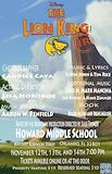
at 9:45am on the morning of November 15th, 2007, at Fox News’s headquarters in New York City, there was a brief power outage, then everything will appear to return to normal. i used the outage, however, because metal gear solid style i sneaked into the power room and attempted to create a whole city blackout by letting all the energy in the city to the power room. I started letting the energy in and then someone saw me. He called the police and i told my mom what happened and my mom got scared and said “You’re movin’ with your auntie and uncle in Bel-Air.” I whistled for a cab and when it came near The license plate said fresh and it had dice in the mirror If anything I could say that this cab was rare But I thought, “Nah, forget it. Yo home to Bel-Air!” I pulled up to the house about 7 or 8 And I yelled to the cabby yo holmes smell ya later Looked at my kingdom I was finally there To sit on my throne as the prince of Bel-Air. -- Bob
- on October 5, 2016
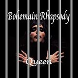
This is probably the best song in the world in my opinion. I like how you put the singer in the background and the bars in front but still can the singer. -- Mackenzie
- on October 5, 2016
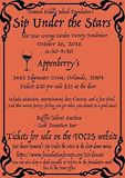
There are a few things I like about this piece of artwork, I really like how you outlined it with a border because it makes it look more elegant. Another thing i like is how you added things that made the artwork unique like the sentence under what it includes. I also like how you used different sized fonts which makes it easier to look at. -- Blake
- on January 4, 2017
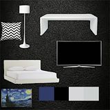
I like how the objects are all organized, and are not overlapping. Also your color scheme is neutral but modern. I like the artwork you added too, it doesn't just make the mood board all black and white. Your color swatches are perfect squares as well, which is visually pleasing. -- Xaden
- on January 4, 2017
i think that the border you used is really cool. -- Lizzie
- on January 4, 2017
This picture is really nice. It's sharp, and the angle is kewl. The greedn really pops out at you, and stands out well -- James
- on September 12, 2016
good range of values -- blayne
- on January 4, 2017
Good job Bryce. The photo is cool and weird just like dreams. It reminds me of a dream i had before where only stuff the color green would be in color.... -- Caden
- on January 4, 2017
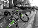
Your photo is amazing because of how you got the same color to show and the rest was black and white. -- Mya
- on January 4, 2017
I like this photograph because only a few parts of the bike are green, and the rest is desaturated. I also like this photograph because the walkway leads the viewers eye up and out of the picture. -- Hildi4
- on January 4, 2017
I like this photo because there are some parts in green and the other colors in black and white. It brings more attention to some parts and not to the other parts. -- Anabella
- on January 4, 2017
I LIKE THIS BECAUSE IT SHOWS A COOL SUBJECT AND THE PERFECT CROPPING IVE EVER SEEN -- JABRAEL
- on January 4, 2017
i like nthe fact that the person in the background is blurry because it putts focus on the golf balls -- landon
- on January 4, 2017
I really like this pic because, it is clear that the golf balls are the focus, and the golfer in the back is not. Also the trees in the back give a relaxed feeling, and one of the golfballs lines up with the rule of thirds! -- Graham.F
- on January 4, 2017
I really like how many different ranges of values and how the golf tees are pointed upward to lead your eye to the persons feet -- XADEN
- on January 4, 2017
Good job with the picture. I thought Mr. McCracken would choose you as the top 5 Still life photos but oh well. Good job though. -- Caden
- on January 4, 2017
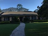
Is that really your old house? i don't remember it that way. -- Adam
- on January 4, 2017
this photo reminds me of Clash of Clans for some reason. Probably because of the rustic fashion its styled in. Like Clash of Clans. -- Erik
- on January 4, 2017
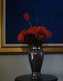
The flower in the center really catches your eye. There shpuld be more darkness in it next time. -- Erik
- on January 4, 2017
i like this artwork but it needs more contrast. oh and i have your orange pen -- landon
- on January 4, 2017
The best part of the artwork is the shading and texture. other people should study this art because I think it shows the effect on nature mankind has made -- nicholas
- on January 4, 2017
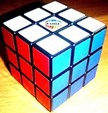
I like the angle of the rubix cube, and how it has been completed. -- Xaden
- on January 4, 2017
It looks like a square disco ball. Very colorful -- aja
- on January 4, 2017
This image reminds me of how multiple shapes and forms can make up other bigger or smaller shapes and forms. -- Zachary
- on January 4, 2017
mood is calm. if i could ask the artist a question it would be,why a rubix cube. -- Landon
- on January 4, 2017
The artwork makes me think about the 1800's when ever thing was made of bricks.The art work to me is about olden days. -- nicholas
- on January 4, 2017
I like the darkness of the photo because it shows the darkness in lamps and reality. -- Erik
- on January 4, 2017
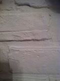
The lines are solid and the contrast in color is awesome. The texture is nice and smooth and I adore The values. -- nicholas
- on January 4, 2017
I see three white bricks one on top ,one on the bottom ,and one in the middle there is no background. There are two shadows at the diagonal corners.the surface has tiny holes in the bricks. -- Nicholas
- on January 4, 2017
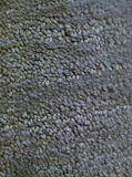
i like how much texture this picture has . -- William
- on January 4, 2017
i like how its not all the same color. you can see tiny tints or color in the carpet. -- Landon
- on January 4, 2017
I like that it has great background and the foreground is great too. -- nicholas