I love how you you made it look like this girl is running! What a good idea! -- Giavanna
- on January 3, 2018
I love the different shades of purple and how it puts emphasis on your logo. The white is a nice color to add to the light and dark purples. -- Skyla
- on May 25, 2017
i like the colors but you could have put the address so people would know where your business is . -- callie :)
- on May 25, 2017
I think this theme is very good! The colors match and compliment each other nicely. -- chloe
- on May 25, 2017
I think the greens and light tan-brown look cool together! this pattern is really good looking and would make a nice poster or phone background =) -- chloe
- on May 25, 2017
I love the sharp red background that just really catches your eye! I think the scale could be a bit more simplified to match the flat looking font, but all in all this is very nice! -- chloe
- on May 25, 2017
I really love the colors and think this is really pretty! Good job with the font and letters as well. I think this is a very nice logo! -- chloe
- on May 25, 2017
I think I recognize Max, Ka-Zakz! I really like this one. Keep up the good work, Court!... -- Neal (Papa)
- on May 25, 2017
i like the pun you used, it is very clever. I like the colors you used. There are only 3, maybe you could add green or yellow to compliment the purple. -- Xaden
- on May 25, 2017
I see a geometric lion in the background with a ground and a white background. The background is really plain so the lion pops out more so the viewers attention goes to the lion. The text is really plain and boring but, you didn't want it to stand out too much I can see that you tried to do that. I think you we're trying to show that the lion is the king so he rules the others. I do like this artwork the thing that is really bothering me is that there isn't enough white space in this artwork it's too cramped. -- Anabella
- on May 25, 2017
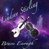
I see a galaxy in the background and in the middle two violins that black and white. The text you used for this artwork is very fancy and plain. I think you put two different color violins because you are showing not everything has to black and white. You don't always have to be love or hate to be honest. Overall thi starwork is really good because the violins make the background pop think it brings so much curiosity. -- Anabella
- on May 25, 2017
I love how you put the glow around the violins to emphasize them.It looks god im jealous. -- ~your BEST friend
- on May 25, 2017
The background for this is really cool. I like how you made the two violins different colors so they both contrast. Overall, the album is really good -- Emma
- on May 25, 2017
I like the lion in the center, it is very geometrical but the colors of the text do not go good with the background or the lion. The format of the text is unproportional. The format of the credit at the top is very well done. The Lion King Jr. logo should have been put at the top or the bottom in my opinion. -- Noelani
- on May 25, 2017
I like the geometric lion on the front and the orange haze around him. The crown look good behind the logo as well. The text on the left side would look better untilted, and straightened out. I like the spacing of your text as well. -- Xaden
- on May 25, 2017
I see a flyer for the lion king jr. It also has a big lion right in the front with a crown on top of its head to show that the lion is the king just the movie. I think the artist used the colors really well to show the lion king the orange is kind of the color of the lions and used the white backround to better see these colors. the shapes i think should be different because I dont feel like it is a lion. I would use like a more circle or oval for the face and would use a circle for the maine of the lion. -- Molly
- on May 25, 2017
A beautiful, serene photograph. -- Kimberly
- on September 18, 2016
This is one of my favorites! I love the bright colors. It reminds me of spring. -- Kimberly
- on September 18, 2016
That's a great photo of Max. He looks very focused. -- Kimberly
- on September 18, 2016
I love the angle of this photo and the beautiful eye color. -- Kimberly
- on September 18, 2016
An artist deep in thought... -- Drena
- on September 18, 2016
I'm ready for my close up Mr. Demille! I know you won't get that but its a great picture! My baby is getting so old. -- Drena
- on September 18, 2016
You definitely caught the simple beauty of this landscape on film. -- Drena
- on September 18, 2016
What an eye! If you told me this was an ad in a magazine I would totally believe it! -- Drena
- on September 18, 2016
i really like the proportion of the light it looks amazing -- skyla
- on September 18, 2016
the eye in this picture looks way more clear and visible.good job. -- skyla
- on September 18, 2016
your dog is so adorable! -- skyla
- on September 18, 2016
i love how the values are symmetrical and the background is a mystery. -- skyla
- on September 18, 2016
i love how the plant glows in the light. -- skyla
- on September 18, 2016
I enjoy the bright glow coming from the flower, it makes it seem angelic. I find it good that you used the rule of thirds to point at that the main focus is the flow. You make the viewer's eye go from the top leaf, to the sideways leaf and that points to the flower. -- noelani
- on September 18, 2016
my dog looks the same -- keiton
- on September 18, 2016
looks good -- keiton
- on September 18, 2016
i love how you got the lining to line up with it -- skyla
- on September 18, 2016
I like how realistic you made the eye color :) -- kanye
- on September 18, 2016
I like how you chose the tree moss for texture because the tree moss feels very fluffy and tangled.The tree bark is great for texture too. -- Isabel barkley
- on September 18, 2016
Wednesday bell work: I think that the photograph could possibly mean\represent a love for the animal kingdom. -- Chaney
- on September 18, 2016
the trees move your eyes up to the clear blue sky. -- aja
- on September 18, 2016
cute dog courtney -- Jabrael
- on September 18, 2016
Your dog is so cute! I like how his spot and the sofa represent form -- Madeline
- on September 18, 2016
wow this one is really good its so realistic -- Alex :)