This is so unique! Way to cute. Keep it up!! <3 -- Willow
- on April 5, 2017
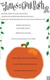
Koryn has an amazing eye for design. The current poster, James and the Giant Peach, shows her talent with color nicely balanced with placement. Through her artistic efforts she has created a poster design that captures the imagination and makes you want to see the show! -- Karen
- on March 13, 2017
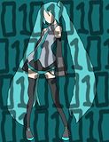
I love Vocaloids and Hatsune Miku is one of my favorites! I also love the addition of the 1's and 0's. -- Melissa
- on March 13, 2017
I know she love #papajohnspizza! Because everyone loves #papajohnspizza! -- Papa John
- on December 11, 2016
Before #papajohnspizza after #papajohnspizza -- Papa John
- on December 11, 2016
We grow our #papajohnspizza straight from the green grass in the ground #papajohnspizzalove the earth -- Papa John
- on December 11, 2016
KALN should change her name to KALNO so she can use #papajohnspizza as the O. -- Papa John
- on December 11, 2016
This is already cool but, I have an idea for this at her neck make it black but faded it would look awesome!!!!!! -- ~Anabella
- on March 13, 2017
OMG yasss. I love how you made this!!!! When I tried this I 100% failed >.< -- ~Anabella
- on March 13, 2017
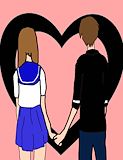
This...is mildly adequate . There is lines on there faces for no reason but it is fitting. You have a random club background for no reason but it is fitting. Also the two people look really out of place but it is charming.Please try to do more next time or don't -- Spencer Griffith
- on March 13, 2017
I do not understand what the person is wearing on the left, or why the two are in love. It is well drawn though. please comment what the dress is. -- IHateAnime
- on March 13, 2017
This is... very good. I like the lines on their faces to add more color. The well thought out club in the background is a nice touch. The two people are placed very well. I hope all of your artworks may be this good in the future. -- Spencer
- on March 13, 2017
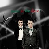
Wow. This is cool. I think that the contrast between the black and white and the color is really representative of the feeling you get when you listen to their music. I like the fans in the background and the giant speakers. Again making this band feel bigger than life which is very representative of their music. Nice job. -- Xan
- on October 12, 2016
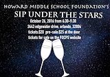
I see that you are sticking with the theme sip under the stars because the background is stars. The wine glasses aren't far apart from each other they are close together. You used color and texture for the background, the color and texture brings the stars out. The wine glasses show that you might want to bring your brother,husband, ect. to come with you to have a drink while looking at the stars. I really liked this artwork because I was pull in by the stars in the background and I know why you made the text white you wanted it to stand out plus if you made the text black you wouldn't be able to see the text as much as you could with the white. ~Keep up the great work :) -- Anabella >_<
- on October 12, 2016
This...is not very good. There is lines on there faces for no reason. You have a random club background for no reason. Also the two people look really out of place.Please try to do more next time -- Spencer Griffith
- on October 12, 2016
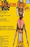
I see that you put a man with something on his head and that you put the lion in the corner half way because we are doing a play with real people not lions. The font and the text size is good because the text you wanted to stand out more is obviously the bigger text. The font you used is very bland so the viewers are looking at the man with part of the lion on his head. I think you put the man there because you were sticking with their culture, the man also has somewhat of a lion head on his head. Maybe you were trying to show is a playbill not a cartoon we designed. Overall I really like this artwork because you stayed with their culture with the man in the background and the text isn't too big or small so you see it just perfectly. -- Anabella >_<
- on October 12, 2016
wow good job i like how the people look -- liznell
- on October 12, 2016
luet this is soo great i love it -- liznell
- on October 12, 2016
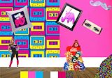
This theme is interesting. This would be a cool room in the time of the 80's or 90's because of the contents. The wallpaper with the cassette tapes is nice and would be better balanced if it covered the whole wall. The woman on the left looks like a dance instructor leaving me, the viewer, thinking if this is a room or an 80's themed dance class. The pile of something on the bottom right corner confuses me and makes the room look messy, maybe if you took the care bears and that out and added something like the wallpaper, the artwork would look a little better in my opinion. -- Noelani
- on October 12, 2016
Nice work Luet! I love the color scheme and layout you used to promote the event! Keep up the good work! -- Debbie/Haley
- on October 12, 2016
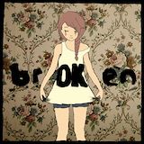
I like this a lot. It tells a message and stands out to me. -- Alexis
- on May 23, 2016
<3<3<3 I love the concept. It's such a livid reminder of how insane the world we live in is. -- Allie
- on May 24, 2016
Wow. I like this project. Maybe in your artist statement you want to tell me why you blurred parts of the picture. Is there a special meaning? -- Mama
- on April 29, 2016
i remember that! it turned out terrific -- Allie
- on April 29, 2016
good job actually great job -- Ellianna
- on April 29, 2016
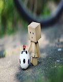
This is so adorable! -- Luna :)
- on April 29, 2016
i like how u put the emphasis on the wooden dude he looks like he's from minecraft. the expression is cute and it gets my attention -- Allie
- on April 29, 2016
This looks so amazing and real, great job. -- Marlie
- on March 29, 2016
This is super good and pretty! :) -- Marlie
- on March 29, 2016
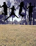
I like how carefully the people were worked on. the proportion and position is also fantastic! I think a sunset photo could have been better with the black bodies. -- cj
- on March 29, 2016
This is really cool! Keep up the good work -- Emma
- on March 29, 2016
The background is really pretty and I like where you placed the people -- Emma
- on March 29, 2016
I like the idea of the animal I just wish it was more blended. -- Emma
- on March 29, 2016
This is a wonderful piece of artwork. Not only do I love the idea of this project, in that it is representative of the things you love. I also really love the balance between color and shape and the absence of color in the background. This is a picture I would like to hang on my wall. As soon as I can afford it, I would like to buy a large framed print. I would like to see you create more pieces like this. I can see that you really enjoyed the assignment. I am very proud of you. -- Mama
- on March 9, 2016
you could have made the it a little wider. also their is a lot of unfilled spots. you could have put more objects insted of making them larger -- Dylan
- on March 9, 2016
sorry again I meant dog not doge -- luet
- on February 6, 2016
sorry meant cat not can -- luet
- on February 6, 2016
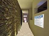
this is one of the mane hall ways leading to the pool and hot tube. -- luet
- on February 6, 2016
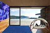
i added a nice blue them with a nice view. -- luet
- on February 6, 2016
in this i added a blue roof, a cute doge and can, a car, and brides. -- luet
- on February 6, 2016
absolutely love the blue roof and white walls contrast ?? -- lizzy
- on February 6, 2016
I like the realism of it, car looks a little weird but overall nice job. -- Alejandro
- on February 6, 2016
i like the place it has a nice view, Good!! -- yatzarith
- on February 6, 2016
i really like this house it is very HD and the colors or soo nice together, Good Job!! -- yatzarith
- on February 6, 2016
this is really good :-) -- maddie
- on January 13, 2016
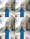
this is really nice the camra make it look the real -- keiton
- on January 13, 2016
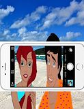
I like the way that the characters are seen in and outside of the phone. The poses fit very well with the background. -- CJ
- on January 4, 2016
ive seen alot of artworks with the photo taking. but this is probably the best because you added them outside of the camara too good job! -- reyce
- on December 18, 2015
i love the idea and how there is already photos in the camera roll but you didn't completely cut out the phone so it looks awkward but overall amazing -- amoy
- on December 18, 2015
This is a good idea and I love how her hair is wet and she's at the beach. It is also cool how you have another picture of them in the camera role and how flonder and sebation are in the water. -- Marlie
- on December 14, 2015
There are 4 characters in the photo that I see. it has a photo in the camera roll already. i wish i could have one of the characters holding the camera. -- luet
- on December 14, 2015
Cute baby. Fun idea. I am curious what the assignment was. xoxo -- Xan
- on December 7, 2015
Very Cool. I may have to order this as a print to hang on our wall. I really kinda love it! xoxo mama -- Xan
- on November 16, 2015
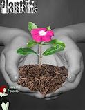
I uesed cavings, chares, plantes, and a fens to spell out my last name. -- luet
- on November 16, 2015
I see a beautiful flower in soule on the hands of an angel. I also se poison ivy saying some thing wise. -- luet
- on November 16, 2015
I love your sweet pink flower!! So proud of you :) -- Karen
- on November 17, 2015
This is really good . It looks like you're actually holding the plant .next time i suggest taking more time on cutting the flower out because i can see choppy edges but other than this is an amazing artwork , definitely the best one ;). -- Aubrey
- on November 17, 2015
I really like how you made the hands and the background black and white. It really makes the flower stand out! -- Catherine :D
- on November 17, 2015
nice project i like the flowers in your hands -- jada
- on November 18, 2015
I like how the de-saturated background contrasts with the beautiful green plant. I also like how you incorporated the ivy super villain to compare to the plant life topic. -- CJ
- on November 18, 2015
I like how you can tell the difference between before and after by the change in squinting, and lip color! -- CJ
- on October 28, 2015
the first photo is demie lovato without makeup ant the secend photo is her with makeup
- on October 19, 2015
the hair is tha bomb! -- reyce
- on October 19, 2015
That is so fascinating and a little bit scary!! GREAT job Lulu :) -- Grandma
- on October 19, 2015
Wow. You really changed Demi. Her freckles are all gone. Don't you like freckles? I would have thought you would have added more of them :)
- on October 12, 2015
I see a woman with pictures that represent her.The pictures around her are very organized.The artwork has a great meaning.It has a message. -- Dylan
- on October 19, 2015
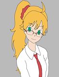
THE HAIR IS SO FLUFFY -- skyla
- on October 6, 2015
I see a pop art with a girl and two boys on it, including a little girl. this peace is a girl which is from doctor how, A great tv show. she is a companion to the boy on the right side. the color is not like abstracted or original but it represents her. it is vary cool that her past is in the picture.
- on October 5, 2015
Wow! Love the hair texture. You are so talented! -- Papa
- on September 28, 2015
I absolutely LOVE this picture!! The hair looks so really, I feel like I could reach out and touch it. I am such a big fan of Koryn50 and I can't wait for the next picture!!! -- Grandma
- on September 28, 2015
I love Doctor Who, I love this drawing, but I super duper love the artist!