I like it! The way you intertwined the E's loop into the H's middle is very sleek! -- Romerlyd
- on May 30, 2017
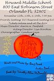
I'm loving the color combo! Very complimentary and pleasing to the eye. The info is all there, but I had a bit of a problem reading the name off of the peach because it's the same color. U could have used peach but maybe bold it, give it a border, something to make the name stand out. Bur its very cute! -- Romerlyd
- on February 28, 2017
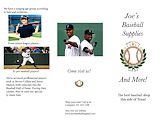
It's well balanced, it gets the point across and it's not overcrowded. The left side looks a bit tight, there's more space underneath, but good job overall! -- Romerlyd
- on February 13, 2017
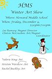
I like the color contrast and it's very pretty to look at. The info is all there and in good size. -- Romerlyd
- on December 26, 2016
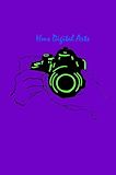
It looks sci-fi! The lettering is a bit difficult to read Though, make it stand out by changing the color and larger : ) -- Romerlyd
- on December 2, 2016
It looks good but maybe it could be less crowded. -- Mya
- on December 2, 2016
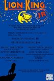
I like the use of color, the wording though, is a bit difficult to read, just make sure your wording is easily seen even by far. Otherwise, I like the stars at the top, it's like a night scene. Another thing is that the main info of Where/When should be bigger than the Credits {Director/Lyrics, etc.} because people need the previous info first before needing the details of the play. Again, the colors are really attractive!! : ) -- Romerlyd
- on October 11, 2016
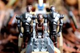
This is one of my favorites, from a simple figurine to a really dramatic picture. Just love it. -- Romerlyd
- on September 26, 2016
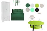
I love the balance of the color choice. It's very soothing to the eye, reminds me of a designer's idea board. Good job Erik! -- Romerlyd
- on September 26, 2016
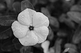
The photo has light whites, dark blacks, and many different shades of gray. It uses the rule of thirds and has a foreground, middle ground, and a background. The water droplets make viewers wonder if it recently rained or if the flower was watered. Speaking of the water droplets, they have an interesting form. -- Grayson
- on September 14, 2016
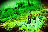
The photo is very dream like. The colors of it give a dreamy look so you definitely know it is not reality. The dark, black border also makes it look like a vision of some sort. There are also other features that make it a good photo besides how it looks like a dream. The values, even if it is not in black and white, have light whites, dark blacks, and different shades of green and yellow. This photo contains the rule of thirds and a foreground, middle ground, and a background. -- Grayson
- on October 11, 2016
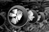
I like his photograph because of how the pot in the foreground is in focus, but as the other pots get farther towards the side of the photo, they get more blurry. I also like this photo because it has a full range of values throughout the photo. -- Hildi4 ;)
- on October 11, 2016
The intentional blurriness gives this photo a stunning effect. Despite the amazing effect there could be a few more values -- Zachary
- on October 11, 2016
I like this photograph because of how one pot is in focus, and all the rest gradually get more blurry the farther the other pots get towards the side of the photo. I also like this photo because it has a full range of values. -- Hildi4 ;)
- on October 11, 2016
I enjoy viewing this photo due to the diagonal line leading my eye to the window.The colors displayed in this photo are in a great variety from the white lines in the left window or the black nonobjective shape in the right. The pattern in this photo is making this piece interesting for me to look at. The fence looking at the house almost is telling a story with mystery proving a pleasureful view. -- Aja
- on October 11, 2016
I really like how you applied the rule of thirds to the photo. -- genesis
- on October 11, 2016
This photo looks fantastic for many reasons! First, the fence doesn't come out blurry so it show's the texture and contain's lot's of different shades of gray, light whites, black blacks that is also show in the background. The background is also blurry so it reduces distractions. The fence leads of into another direction that is unseen in the image so viewers wonder and want to see where it leads to. -- Grayson
- on October 11, 2016
I love Star Wars! And the great thing in this picture is how the background blurs out and how the front is clear! Star Wars for life! -- Caden
- on October 11, 2016
I love how the glass looks like a bridge in this photo. There is enough black and white plus gray in this picture. And is that a window? A mountain, Sky, Windmill? -- Caden
- on October 11, 2016
This artwork intrests me because it lines and the blur drag to the center and focus your eyes on that one line. i believe this is a great artwork. -- landon
- on October 11, 2016
I really like the way the texture looks on the fence, it looks like I could touch it right now. I like how the background is intentionally blurry so you focus on the fence. -- Xaden
- on October 11, 2016
i like this a lot i like the feel and quality and ya -- callieeee
- on October 11, 2016
I like how one side is darker than the other side, it communicates variety. If all the picture was, was the light part then it would be boring to look at unless there was something interesting in the background. -- Xaden
- on October 11, 2016
The reason I enjoy seeing this artwork is it really draws my attention to the lamp. This looks like a pictorial picture. I like the many shades of the lamp. -- Noelani
- on October 11, 2016
I like this photo because the texture is smooth and is real texture. -- Anabella
- on October 11, 2016
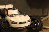
your toy car shows lots of line,nice car -- Jabrael
- on October 11, 2016
What I see first is the monster truck following the rule of thirds. Its colors are blue, black, and white. The truck seems to be placed on the carpet and in the back I see the half of a chair. -- Grayson
- on October 11, 2016
Love it -- Anthony
- on October 11, 2016
This looks nice. The Blurred background draws attention to the sharp and clear flower. It looks nice -- James
- on October 11, 2016
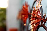
Wow this is awesome! i love how your eyes are immediately directed to the red flower at the right side of the picture. It looks great! -- Cynthia :3
- on October 11, 2016
I think you showed the rule of thirds really well and I like the unity. -- nicholas
- on October 11, 2016
I really like the focus on the main object and the blur in the back round. -- Grayson
- on October 11, 2016
I really like how you focused on the flower closest to you, also i like how it wasn't a picture straight at the flower. -- Xaden
- on October 11, 2016
The warm vibrant colors create a sense of unity in this photo, with the flowers in focus. Its very well done. -- Aja
- on October 11, 2016
I like the use of Emphisis, the photo was a great example of this. -- Carly