Good job Mya. The fire adds something really cool to the work. :) -- Emma
- on April 4, 2017
I think this is a really good magazine cover. I like how you used mostly pastel colors and put emphasis on the peach. The only thing i would change is the font you used. -- Genesis
- on March 6, 2017
I think the M looks really cool, since it is made up of music notes. Great job Mya! :) -- Emma
- on March 3, 2017
The paint splatter looks really cool. Mya did a great job :) -- Emma
- on March 3, 2017
I really like the idea Mya chose to illustrate in this artwork. I think she did a really good job on this project. -- Emma
- on March 3, 2017
Very creative!! Loved how you mixed harry potter with emojis! (the two best things!) The only thing I would suggest is to put some color in the background! -- Katelyn
- on March 3, 2017
This is super cute, and clever. Love it :) -- Emma
- on March 3, 2017
This is really cute good job! -- Eislinn
- on March 3, 2017
This is really cute!! I love how you mixed HP and emojis! Totally talk to apple about making this emoji!! -- Izzy
- on January 11, 2017
I really like this project. I think Mya picked a really meaningful quote. Overall I think that this is a really good shirt design. -- Emma
- on November 14, 2016
I really like the patterns used to create this project. It looks really neat how the different shapes connect to one another. Overall, I think Mya did a really good job on her project. :) -- Emma
- on November 7, 2016
I really like the flowers captured in this picture. I think that the angle of the picture is perfect. Overall, I think Mya did a really good job on this project. -- Emma
- on November 7, 2016
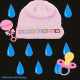
I love this artwork because the title "Cry Baby" deserves a pacifier, tears, a baby hat and a baby rattle. It just reminds me of a baby, and I think you did well on what you were supposed to do! -- --Izzy
- on November 7, 2016
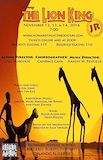
I really like this piece. The background goes along with The Lion King theme, and looks really nice. I think the way the text is positioned looks good, and doesn't take away the pictures attributes completely. I think Mya did a really good job overall on The Lion King project. -- Emma
- on November 7, 2016
this image gave me goosebumps as i had no idea what i was looking at. great photo -- Chaney
- on November 7, 2016
Looks great a lot of things to look at for the whole picture! But to make it look better in my opinion you should have added a little more focus to the items that are close up. -- David
- on November 7, 2016
I like this picture because because a lot of it is blurred out, drawing your attention to the parts in focus. There are many different values and dramatic lighting, and these things make the photo interesting. Overall, it is really good. :) -- Lia :)
- on November 7, 2016
My artwork included the game Scrabble. I could have done some lighter whites because there aren't that many of them in my photo. The photo does have balance through value. My grays have a nice balance to the whites and blacks in the photo. I love how I was able to get such an interesting angle which gave the photo an interesting point. -- Mya
- on November 7, 2016
The photo displays a interesting composition, with a feeling of repetition with the spiraling stair. An interesting focal point with the stairs leading down to the nonobjective people in the bottom level. The photo portrays a variety of values from the dark black space in 2 level right. -- Aja
- on November 7, 2016
This picture is very interesting. The center of the plant is in the center of the picture, which I think is perfect for this perspective. The leaves look even brighter than they already are against the dark background, and they look transparent, and both those effects together make them really stand out. The background and leaf in the foreground are blurred, so they aren't distracting from the main interest. I don't think this picture could be improved, which is especially amazing since it is from the beginning of the year. Nice work! :) -- Lia :)
- on November 7, 2016
I love this picture because the middle is in focus, but not the edges of the leaves. Also, the multi valued background makes you look more at the flower because it is lighter than any of the background. Next time, you could even try to make the background a little darker, so you could focus on the flower even more. -- Hildi4 :)
- on November 7, 2016
i love this photo because it tells a story like follow your own path. -- sophia
- on November 7, 2016
This work of art gives me the feeling of escalating to the top of a rich manor of success. -- Zachary
- on November 7, 2016
What I like about this photo is the way the staircase directs the viewer's eye either moves up and up, or it moves down and down. It almost creates a pattern. What you could do to improve is to find a better angle if you were to take this again, like the top of the staircase pointing downwards. -- Noelani
- on November 7, 2016
that is MY cazibo! I was there first! I like the lighting in this pickture -- Adam
- on November 7, 2016
In this photo I see a flower and a out focus background brings more attention to the flower. -- Anabella
- on November 7, 2016
I like this photo because the main focus or the flower is focused and the background is blurred. -- Courtney
- on November 7, 2016
I enjoy seeing this image very much. This is so due to the fact that it has a complex pattern of what looks like peppers. I like the mixture of warm and cool colors. -- Noelani
- on November 7, 2016
What I see in this artwork is an assortment of stems mixed in with red and orange buds.Due to the red and green, I noticed a great use of complimentary colors. The background contains what seems to be soil. -- Chaney
- on November 7, 2016
The bright pink flowers in the picture make a good color scheme with the dark green background and the light green ferns. I used to have flowers like that, but I never really looked at them like you do. Great Job!! -- Hildi ;)
- on November 7, 2016
I really like how you chose a pink flower , it really shows a lot of emphasis. -- isabel
- on November 7, 2016
I really love the emphasis on the flower petals. It is amazingly captured as well. -- Vald-Jerry Yayo