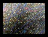
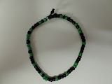
You did this really well. The colors blended really good. -- emma
- on April 13, 2016
Great job! I like the animal that you used! -- Alyssa
- on April 13, 2016
I really like this! The colors are nice, and where the green meets the yellow it looks like a deer. Good job! -- Morgan
- on April 13, 2016
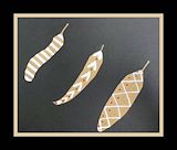
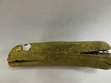
Nice job. Cool stick. -- Avery
- on April 13, 2016
This is really cool. Nice firns. -- Avery
- on April 13, 2016
I love the pattern you used on your piece. It makes it look very real. -- Erin
- on April 13, 2016
Your work looks very good, and what I like the most about it is how all of your pieces are very clear and easy to see. -- Erin
- on April 13, 2016
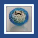
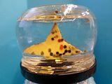
Aww. This pufferfish is so cute! -- Avery
- on April 13, 2016
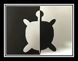
Cool black and white. Neat arrowheads. -- Avery
- on April 13, 2016
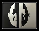
Nice "scream face". Cool black widow and bad test. -- Avery
- on April 13, 2016
Very elegant design, dude! -- Mike
- on April 13, 2016
Nice clean lines! Keep up the good work! -- Ali
- on April 13, 2016
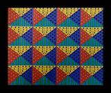
This is really interesting. It reminds me of old film strips. I like the vibrant colors. -- Kay
- on April 13, 2016
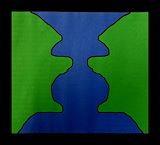
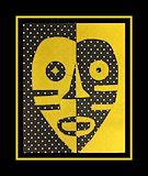
I like the use of the negative space, but the face could've been smoother. -- Michael
- on April 13, 2016
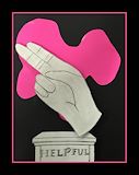
I like the hand, but the word has some letters that are darker than others. -- Michael
- on April 13, 2016
I like the saying, but the 'y' cuts off the 'o' in you. -- Michael
- on April 13, 2016
I think you did really good, but the top seems like one side is bigger than the other. -- Michael
- on April 13, 2016
I really like the artwork, but it looks like you used the same colors twice. -- Michael
- on April 13, 2016
I like the vibrant colors, but I don't like the colors being bent. -- Michael
- on April 13, 2016
I like the colors. -- John
- on April 13, 2016
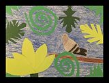
I love your leaves and your pigeon is almost perfect. -- Erin
- on April 13, 2016
Great work! -- Kay
- on April 13, 2016
You're right, they don't live in jungles. Good job! -- Laylah
- on April 13, 2016
I like your bird. -- John
- on April 13, 2016
Its beautyfull -- john
- on April 13, 2016
This is really good~ :) -- Laylah
- on April 13, 2016
The colors you used in this piece.. Great Job! -- -Mary
- on April 13, 2016
This is AMAZING! I would love to know how you got it to look this way. Great job! -- -Mary
- on April 13, 2016
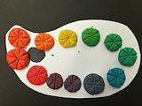
You picked great colors! They go together. -- Abigail
- on May 12, 2015
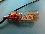
I would like to sleep in it if it was a real quite! -- John
- on May 12, 2015
This design is so cool.! -- emma
- on May 12, 2015
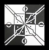
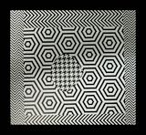
This picture hurts your eyes to stare at it, but looks cool. -- Gabriella
- on April 24, 2015
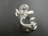
The ring has a very cool and organic look to it! Great job! -- Morgan
- on April 24, 2015
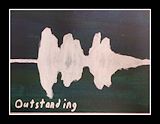
I like your sound wave because the dark background helps show the main point of the artwork. -- Leah
- on April 24, 2015
Wow! Magnificent! -- Michael
- on April 24, 2015
I like the color choice. -- Ashton
- on April 24, 2015
This is a lovely piece. You have a gift for wire work. -- Diana
- on March 17, 2015
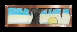
You did an incredible job at making that tree. It looks so realistic. -- Angelo
- on March 17, 2015
I like your art piece and how you used the state of Louisiana and its flower. -- Alyssa
- on March 17, 2015
I love the state, then blue dog, then the magnolia! -- Arlan
- on March 17, 2015
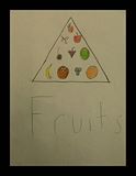
The pyramid with all of the fruit is really cool. -- Arlan
- on March 17, 2015
I like the red dots on the leaves it gives it a pop. -- Arlan
- on March 17, 2015
I like that you just did things related to our state. -- Avery
- on March 17, 2015
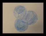
I like the swirls and the size! -- Sophie
- on March 17, 2015
I like the colors that you used and the shape you chose because they go perfectly together. -- Breanna
- on March 17, 2015
I love your artwork because the line patterns look intricate. -- Leah
- on March 17, 2015
I love your piece of artwork because you used symbols to represent something about yourself. -- Leah
- on March 17, 2015
This has a cool pattern! Good job! -- Morgan
- on March 17, 2015
Wow! This piece is really magnificent. -- Michael
- on March 17, 2015
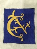
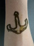
Although it has a slight smear, the anchor looks great! -- Ashton
- on March 17, 2015
I like the style you did this ring in. The swirls were so pretty! -- Avery
- on March 3, 2015
I like how you made really original but still made it where you used different ideas. -- Breanna
- on March 4, 2015
I like the colors and the pattern you used! -- Arlan
- on March 4, 2015
The way your ring spirals is so cool! -- emma
- on March 4, 2015
This looks weird in a cool way! Great job! -- Morgan
- on March 4, 2015
Wow! I really like it! -- Michael
- on March 4, 2015
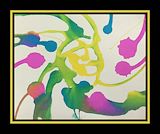
It looks like they blended. -- Ashton
- on March 4, 2015
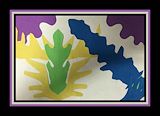
It looks like an awesome frog. -- Ashton
- on March 17, 2015
This looks cool! Good job! -- Morgan
- on March 17, 2015
The blue looks very nice. -- Ashton
- on March 17, 2015
They really look like blueberries. -- Ashton
- on March 17, 2015
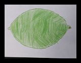
That is a very green lime, it is beautiful -- Ashton
- on March 17, 2015
I like how well the design came out. -- Gabriella
- on March 17, 2015
Well done! This is a strong design.
- Patricia (teacher at South Crowley Elementary) on February 3, 2015
The different patterns give this piece a cool look! Great job! -- Morgan
- on February 2, 2015
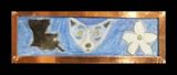
I like how the two pictures contrast against each other. -- Brennon
- on March 17, 2015
I like this piece of artwork because it symbolizes culture. -- Leah
- on March 17, 2015
It looks interesting. -- Ashton
- on March 17, 2015
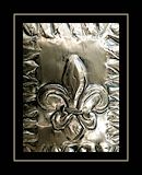
The raised Fleur-de-lis is incredible! Great Job! -- Morgan
- on March 17, 2015
I think that this is really good. -- Michael
- on March 17, 2015
The symbols look beautiful. -- Ashton
- on March 17, 2015
This is one of my favorites in this category of artwork. I really like how it looks so detailed and simple. Keep up the great work! -- Kadyn
- on March 17, 2015
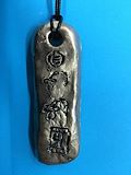
Good job on both your clay shape and your carvings. But don't forget the loop next time -- Alyssa
- on March 17, 2015
I love your artwork even though you forgot your loop your symbols were very clear (unlike mine). -- Erin
- on March 17, 2015
Very well done, your carving is very delicate and precise! The only error was omitting the loop around the hieroglyphs.
- Patricia (teacher at South Crowley Elementary) on January 6, 2015
Good job. -- Brennon
- on March 17, 2015
The colors make it stand out when compared to the others in a good way! Great Job! I like the pattern as well! -- Morgan
- on March 17, 2015
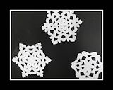
These are very pretty and each one is different like real snow flakes. Keep making beautiful art! -- Kathie
- on March 17, 2015
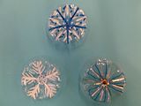
Nice Work!
- Patricia (teacher at South Crowley Elementary) on December 16, 2014
Well done!
- Patricia (teacher at South Crowley Elementary) on December 16, 2014
Nice work!
- Patricia (teacher at South Crowley Elementary) on December 16, 2014
Beautiful!
- Patricia (teacher at South Crowley Elementary) on December 16, 2014
Beautiful! Good use of variety to create unique snowflakes.
- Patricia (teacher at South Crowley Elementary) on December 16, 2014
Good job on your chasing and repousse. I love your picture. -- Alyssa
- on March 17, 2015
Great job! I love this piece because it's simple, but came out really great. And also l love the saints! -- Erin
- on March 17, 2015
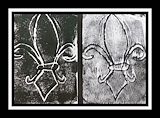
GO Saints! that's what this reminds me of. And a simple, but neat, symbol of New Orleans. And of Louisiana. -- Avery
- on March 17, 2015
Nice Cooper the fleur de lis came out nice. -- Arlan
- on March 17, 2015
the fleur-de-lis is so perfect -- emma
- on March 17, 2015
I enjoy how it reminds me of my favorite football team. -- Brennon
- on March 17, 2015
I really like how detailed it is. The outlines look great. -- Ashton
- on March 17, 2015
Very nice! Fleur-de-Lis are a popular motif where I live. You could sell this easily here! -- Kathie
- on March 17, 2015
Awesome work! You demonstrated an understanding of the techniques and achieved a lot of depth through the use of both techniques. Keep up the good work!
- Patricia (teacher at South Crowley Elementary) on December 4, 2014
I like this piece because this it is very detailed. I also like the fleur de lis. Keep up the good work! -- Kadyn
- on March 17, 2015
I like the picture that you made. It looks very real and I think you did a good job. -- Alyssa
- on March 17, 2015
I like the way you captured the way a cactus sucks up water. Before I moved, I used to have a cactus at home. The amulet is unique. -- Avery
- on March 17, 2015
Nice work Cooper! I love the triangles! -- Arlan
- on March 17, 2015
I like how it represents life itself. Good work. -- Brennon
- on March 17, 2015
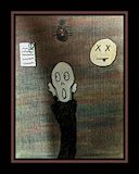
I love the kangaroo at the top and the head in the mirror. It looks creepy. I love it! -- Victoria
- on March 17, 2015
The combination of yellow and purple make this piece stand out and look very genuine! Excellent work! -- Morgan
- on March 17, 2015
I appreciate how the color pallet of your peice is remanicent of my favorite sportsball team. Great job! -- Brennon
- on March 17, 2015
I like the style and look of the piece, and I love how it represents LSU. -- Ashton
- on March 17, 2015
I really like the way the pieces are spread out to make a perfect gap. -- Ashton
- on March 17, 2015
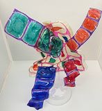
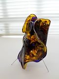
This is awesome! I like that it is freestanding! -- Michael
- on March 17, 2015
Cooper I like how your artwork is mixed in with dark and bright colors and the way it can stand up on its own. -- Isaiah
- on March 17, 2015
This piece is so interesting. I really like the shape and the muted colors. Thanks for sharing your talents with us! -- Chris
- on March 17, 2015
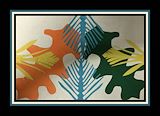
The complimentary colors in this piece make it very striking. Especially as where they blended they became more of a neutral color. You did an excellent job making the piece free standing and balanced.
- Patricia (teacher at South Crowley Elementary) on November 10, 2014
The overlapping of shapes gives this piece more depth. Keep up the good work.
- Patricia (teacher at South Crowley Elementary) on November 10, 2014
This piece shows you understand the concepts of macabre art as well as collage!
- Patricia (teacher at South Crowley Elementary) on November 5, 2014
Well Done!
- Patricia (teacher at South Crowley Elementary) on November 5, 2014
You met the criteria for this project. Keep up the good work!
- Patricia (teacher at South Crowley Elementary) on November 5, 2014
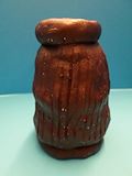
Well done, the vertical lines in the design compliment the shape of the piece. Keep up the good work.
- Patricia (teacher at South Crowley Elementary) on November 4, 2014
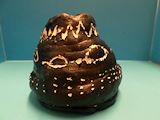
This is an excellent piece, it sit level and the fluted texture of the outer pot is lovely. Keep up the good work.
- Patricia (teacher at South Crowley Elementary) on November 4, 2014