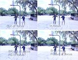
this image is good but the gray car is a bit off -- Grillby
- on April 13, 2016
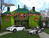
Hey! this one looks preaty gud m9 -- Grillby
- on April 13, 2016
same with this one everything is slanted -- Grillby
- on April 13, 2016
omg pizza kid! howd he get here -- Grillby
- on April 13, 2016
why is everything slanted in this image? -- Grillby
- on April 13, 2016
noice image m8 -- Grillby
- on April 13, 2016
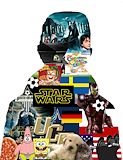
Wheres the background!?! 0_0 -- Grillby
- on April 13, 2016
hoi em temmie thuts a bwig spoder! -- temmie
- on April 13, 2016
ok m8 you need too size this better -- mr.wth
- on April 13, 2016
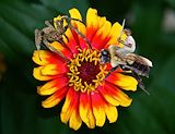
with the sword excaliber i send you , the king of the bees, to defeat the evil spider on the top of the mighty flower -- reyce
- on April 11, 2016
hahahaha dead -- kaybae
- on April 7, 2016
NOICE -- sam
- on April 7, 2016
this is cool LOL -- maddie
- on April 5, 2016
woe bro so gud -- didly don doe
- on April 5, 2016
Where did the feet go? GOOD JOB , it's funny but creepy -- BAO
- on March 11, 2016
i feel like you can do alot of things better.They need to be more precise,all of them.Most of them need to have feet or shoes.Also cinderella arms just needed to be better.It looks like you rushed so next time I feel like you should take your time and make it accurate. -- Evenyka
- on February 1, 2016
This artwork be fleeking! But the guy who's in the movie with Jasmine doesn't have shoes! NONE OF THEM HAVE SHOES. I also don't understand the cruise ship in the back. The concept was cool. -- Bao
- on January 4, 2016
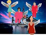
i like the wings and the background -- Reyce
- on January 4, 2016
Good idea but the heads need to fit the bodies, the wings need to be cut out more precisely, and the bodies also need to be completed. -- Drayton
- on January 4, 2016
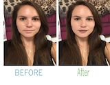
I really like this popart because we can see the changes you made, even from afar. The skin change looks for the most part, natural. The lips and eyes work well. I feel like you could have done a little bit more with the eyes, But it already looks great, as well :) -- RS
- on November 2, 2015
This piece looks really nice! The only thing i would change is making the circular edge around the skin look more natural. Everything else looks really natural and clean! -- Gabrielle
- on November 2, 2015
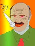
I really like how you choose Dr. Phil, he really deserves more recognition for his work. -- John Cena
- on October 12, 2015
I can see a lot of color line and shape used in the artwork. this artwork is very bright and has nice lines. I like how the artist used different tones of color in the artwork. the artist used saturation in the creases such as the nose,eyes,mouth,etc. -- Kalani
- on October 12, 2015
The lines are a bit wavy. his eyes are too small and I can not see the puples. I like the bar of light. Also, the microphone is in a good position. -- Dylan
- on October 12, 2015
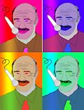
Wow this is terrifying...but cool! -- Cynthia :3
- on October 12, 2015
this is ok -- kailey
- on October 12, 2015
awesome use of color and patterns. -- Elijah
- on October 12, 2015
nice job -- alana
- on October 12, 2015
Nice name for your tessalation -- Julisha
- on October 12, 2015
I like how you were able to change colors and make blend in. -- Noah