I see a a quote. This quote is used to portray beauty, or beeuty, in an unlikely way. They used a steady color type, shades of yellow, throughout the picture. The focus point is very clear. This picture was used to inspire people and to lighten people up. To express beauty, the artist chose an image that many would describe as beautiful. I like this artwork very personally and i want to see more works like this from the artist -- Adam
- on September 19, 2016
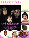
I found the poster for Bee Movie 2. I just saved Dreamworks a lot of time. I also like the character from jimmy Neutron you included. Overall I think this art is really good. -- Cory in the house
- on September 19, 2016
Where has this picture been all my life. This quote comes from my favorite character, bee, from my favorite show Grey's Anatomy. -- Adam
- on September 19, 2016
really cool, i love the logo. -- anthony
- on June 3, 2016
i remember watching this stop motion vid haha . this was the best one -- kayla
- on March 14, 2016
this is so creative! good job -- kayla
- on March 14, 2016
I love this! I love you! Can you marry me?!?!?!?!?!?! -- Love, James ps youre super cool k thx BBYYYYYYYEE
- on March 14, 2016
I absolutely LOVE how you display the info,but the date is wrong -- Chardnet
- on March 14, 2016
Wow this is really creative! I like the playing card idea! -- Cyndy :3
- on March 14, 2016
this is my favorite sadie, it has great detail -- kayla
- on February 23, 2016
Great job on making everything look 3D!! -- Laurie
- on January 25, 2016
this is actually a great cover. best one i've seen so far today. -- Cierra
- on January 25, 2016
I love the random person in the back -- John Cena
- on November 16, 2015
I was confused thinking like this was a normal city in America! Love this idea -- Sam V
- on November 2, 2015
I like your picture. The buildings really fuse together well. ( ?° ?? ?°) -- Scrubl0rd
- on November 2, 2015
In my opinion, best mood board I've seen! -- Sam V
- on October 19, 2015
Very creative, but the bright teal is a bit untasteful. It is still pretty good -- James
- on October 12, 2015
This looks like a professional logo -- Katie
- on October 12, 2015
This looks really cool. -- Reana
- on October 5, 2015
It's the end, by a centaur, shark, unicorn thing. -- Miles
- on April 8, 2015
All the shading and value is really cool in this. -- Hannah
- on April 6, 2015
This is really good and its funny. Good job -- Yasmine
- on April 6, 2015
This is really good. The only way to make it look better would have to been to blend the torso with the horse but other than that its good. -- madison
- on March 30, 2015
CREEPY! -- Sarah
- on March 16, 2015
This is really cool looking!!!!!!!!!!!!!!!!! -- Hunter
- on March 16, 2015
cool! i like how big you made it and its really obvious that its three animals. well done! -- Quinn :)
- on March 16, 2015
This is a wonderful centaur, shark, and unicorn thing! I really like it!!! -- Keira
- on March 16, 2015
I like how it's terrorizing the streets of a city. -- Jude
- on March 30, 2015
this is very amusing! keep up the good work -- Elijah
- on March 16, 2015
this is what you call the end of the world -- samantha
- on March 30, 2015
I really like how you spaced the jumpers and added a shadow to make the photo look realistic. I also like the choice of background. Good job! -- Elena
- on February 23, 2015
I love how the boat in front of the sun that is setting over the water and how the sky looks like a real sunset and I love the darkness of the sea. -- Greta
- on February 2, 2015
Looks Like The Beginning Of A Movie ! -- Carlos
- on February 2, 2015
Your artist statement is complete -100 I like your use of color pencil techniques and how each face looks very different.
- Rachel (teacher at Howard Middle School) on December 15, 2014
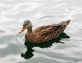
The clarity and focus of the duck is amazing.Great Job! -- Elaina
- on December 8, 2014
I see the color and movement in this artwork. Nice job! -- karina
- on December 8, 2014
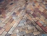
I like how you got the part where all of the walkways were intersecting. Great picture! -- Catherine
- on December 8, 2014
This is incredible! I love the hair and how detailed it is. I also love how detailed the ears are and I like how you chose a bright background. It really pops! -- Kennedy
- on November 27, 2014
I like your background And your pose GOOOOOD JOBBBBB ! -- Chaquruis
- on November 10, 2014
I think you did a really good job, despite the lips and eyes. However, one thing I would change, because it is a pop art project, is how he is still "life" colored, rather than bright colors like the background -- Madison
- on November 8, 2014
good job with the texture on his hair because from a distance it looks very realistic. And the choice of colour for the background is great because it really makes Steve Jobs pop out more. -- Elena
- on November 3, 2014
I really like this picture you did a very great job of making this popart look realistic. -- karli
- on November 3, 2014
This looks amazing!!! -- Greta
- on November 3, 2014
Really well done on the hair and features, very realistic. However, the mouth and eyes could use some work -- James