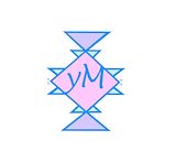
wow! it looks like a real tween magazine! has some misspelling, but still cool! -- makala is cool xddd
- on April 14, 2017
Looks very real, great job on making it look like a real magazine! -- Katelyn
- on April 14, 2017
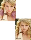
This is very well done!! I have seen her before and she looks amazing in this picture. You made her still look awesome -- Chaney
- on March 14, 2017
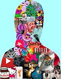
i like this artwork because it shows my love for music in a picture. -- jabrael
- on March 14, 2017
I think you preformed admirably on this project it really shows a lot of thought and effort that was put into this artwork.It is really amazing. -- Makyla
- on December 12, 2016
I really love this artwork because it shows some much about you and what you stand for and you represent.Really good job on this artwork. -- Makyla
- on December 12, 2016
I really like the project especially the use of the colors.It is really amazing and is the exact opposite of dull. -- Makyla
- on December 12, 2016
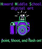
I like the camera and the colors you chose. You used the maximum amount of colors you could, and the saying/pun you used is good. You have all the information needed. -- Xaden
- on November 7, 2016
It all fits together and looks really neat. I like the color and fonts you used. -- Evenyka
- on November 7, 2016
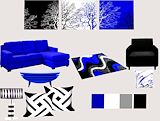
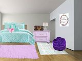
Your swatches matches wit the furniture you used.It looks really nice. :) -- Evenyka
- on November 7, 2016
The three main colors in this piece are expressed very boldly and vividly. the colors put together really show what the theme of the moodboard is. The images put in this work of art describe what the artist was really looking for in the art work. The overall artwork truly captures what the artist is trying to say in what the artist means entirely. I personally approve of the effort put into the artwork. -- Zachary
- on November 7, 2016
This looks sooo good!!!!!!! -- Morgan :)
- on May 16, 2016
you did sutch a good job keep up the good work -- jennesis
- on May 9, 2016
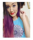
the shirt looks real and the hair you did a really good job lol -- maddie
- on April 11, 2016
i think that you did awesome job -- jennesis
- on April 5, 2016
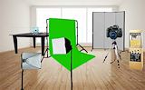
i love how you made it look like a filming room it looks so cool -- jennesis
- on February 29, 2016
i love how you filled up all the space with things you like -- jennesis
- on February 29, 2016
i love how you made it so every thing tied to gether -- jennesis
- on February 29, 2016
I love all of these things and I love how I can see every thing clearly. -- Marlie
- on February 29, 2016
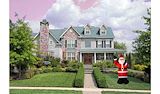
Santa is cool and I like the sky -- Beth
- on February 23, 2016
This room is so cute! I love how the colors match! I would make some of the things a little realistic size! But all around this was pretty Good!!!! -- Victoria
- on February 23, 2016
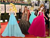
I really like how you put the disney princesses on the red carpet!! I think this is sooo good. The hand made shoulders look so real. Great job!:) -- Graysen
- on January 20, 2016
I really think you did a good job making them fit with background -- Anna-Teresa
- on January 4, 2016
I did this princesses because they are the most classic and are from my favorite movies. it was hard to take the sleeves off and color over to match the're skin color i did have to hand make the're shoulder. the dresses were really, it was hard to make belle look like she is holding her dress i did use a trick our photo. teacher taught us , it was to go to Edit then Transform and Disort and it make the dress layer/picture more flexible and easer to work with. i am glad with how this came out to be but i could have done better now that i have experince! -- yatzarith
- on December 14, 2015
i like how you made belle's dress look like she's rlly wearing it -- destiny :)
- on December 14, 2015
i think you did a good job with finding the letters for your last name and i love how you used the lock as a o -- jennesis
- on November 30, 2015
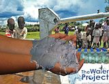
such a good charity, and good job with editing the water! delivers a powerful message :) -- kayla
- on November 5, 2015
i think you did a really good job with making the water look like it is in your hands and all the water pumps an the kids and adults and the logo. -- jennesis1
- on November 5, 2015
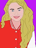
i like how you colored her hair and the colors you used for her makeup -- Alycia
- on December 14, 2015
The artist put a lot of detail in the face accenting Sabrina Carpenter's smiling muscles. I really liked this popart, but i am actually really curious to see this piece tiled! -- Gabrielle
- on December 14, 2015
I did Sabrina carpenter too but i love your and i really like her jacket. -- Ellianna
- on December 14, 2015
i like your color scheme because the use of the red in her jacket brings out the peach color in hear lips and the blue in her eyes -- jennesis
- on December 14, 2015
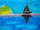
I really like how you made the shadow of the boat. I also liked the different shades of blue you used. -- Keira
- on December 14, 2015
this a very pretty peice of artwork . i like how u did the refecting shadow of the bout and its a very pretty sunset . what i am confused about though is y the sun sun is green and yellow thats quite confusing but other than that its a very pretty artwork . good job -- michaele
- on December 14, 2015
Es un buen trabajo donde puso su dedicación es un trabajo realmente maravilloso -- Blanca
- on December 14, 2015
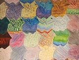
I like all the diffrent tecnecs that you did and i think you should do advanced art you friend Jevannie. -- Jevannie