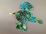
That bird looks like he's ready to fly outside and enjoy the spring weather. You really made the bird come to life. -- Katie
- on March 21, 2015
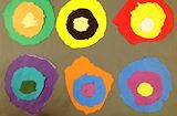
I like that you used many contrasting colors. They make the picture feel well balanced. I also like the rough edges around the circles. Your picture makes me feel happy. ? -- Auntie Tricia
- on March 21, 2015
Great job, Tim! Very creative and full of color. -- Auntie Ellen
- on March 21, 2015
A thought provoking composition that explores a spectrum of contrasting colors in a repeating pattern evoking the most popular works of Andy Warhol. The piece exceeds Warhol's works by stripping human and canned forms while adding two additional images to Warhol's 4 hinting at the artist's mastery of the additive arts. Brilliant! I would definitely hang this on my wall. -- Ud
- on March 14, 2015
I love your use of contrasting colors and symmetry. This is beautiful! -- Grandma
- on March 14, 2015
Stunning. Makes me hungry for some reason. -- Grandad
- on March 14, 2015
I loved talking with you all about Kandinsky. You taught me lots of new things. Keep up the good work. -- Katie