Its a good idea but the main graphic should be larger -- Katie
- on October 13, 2015
this is so pretty and it looks so realistic i hope you win -- michaele
- on October 12, 2015
this is so cute great detail i like how its alll black and white its so pretty and simple att the same time time -- michaele
- on October 7, 2015
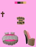
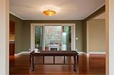
for this project we had to create 7 rooms for the inside of the house . for this specific room its my kitchen i want a simple kitchen
- on June 2, 2015
This is very creative and the princess aren't normally togethor, so it shows something different. -- Kiana
- on September 21, 2015
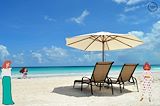
I like the house and the beach. -- brooke
- on April 27, 2015
This is really cute. I love the pictures you used and the colors used. Great job~ -- Candice
- on April 27, 2015
This is really cute. I think if you had made the pictures bigger it would have made it better but its still amazing.... i love this soooooo much ... its so pretty -- madison
- on April 6, 2015
Love it!!!!!!! -- Cierra
- on March 16, 2015
Great gob!!! -- Yasmine
- on February 23, 2015
I Love Your Mcdonalds Logo.Mainly Because I Love Mcdonalds! -- Chazzy
- on February 23, 2015
This is really good. I like how you put the numbers at the top and kept it simple -- Kennedy
- on February 23, 2015
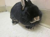
i like this is had detail in it since it is a closeup. (I LIKE BUNNIES :D) -- elijah
- on February 9, 2015
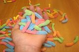
GUMMY WORMS!!! I love it. -- Kendrian
- on January 20, 2015
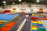
This is really creative. I like how you put your hands on the beam. good job. -- yasmine
- on January 5, 2015
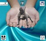
the color of the satin is easy on the eyes with the artwork. also the pattern/placement of the charity boxes flows well in comparison of the placement with your hands. i love the charity you chose because it is narrowed down instead of the category of dogs you chose a specific breed. i believe this art work is memorable because the background makes the dog and the hands stand out which i think is memorable -- Erin
- on November 3, 2014
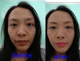
I REALLY like your project but I wish your face wasn't cut off :( -- Laurie
- on October 7, 2014
this is really cool but u could have zoomed into ur face so ur body doesnt look like a box -- erin
- on October 7, 2014
I like this photo because of the bunny. -- Jack
- on October 7, 2014
Gotta love Albert. Nice picture. -- Kiara
- on October 7, 2014
this is a good picture -- hannah
- on June 3, 2014
I really like the pose! -- Jasmine
- on March 17, 2014
this is so cool -- kate
- on March 17, 2014
thats really good!!!! -- kate
- on March 17, 2014
I like the way you positioned you name. Very unique. -- Petra
- on March 4, 2014
that looks pretty realistic and a good piece bro -- sage
- on February 24, 2014
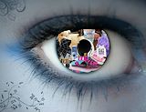
I love the eye design and the colors. -- Petra
- on February 10, 2014
I like the things you put in the eye -- Jaden
- on February 10, 2014
I really like your photo because it is really funny and creative.I think you did a great job. -- travis
- on February 8, 2014
This is so cool. I really like the desighn on the skin. IT really make the pictures pop -- Madison
- on February 4, 2014
This artwork is really beautiful and everything in the eye fits in perfectly. -- Osmara
- on February 3, 2014
this is really good i love the back round -- hannah
- on February 3, 2014
I like your eye choice. Even though most of the things in your eye are not my favorite things, we all like different things and thats what makes us all unique. -- Victoria
- on February 3, 2014
Nice job matching the skin color -- Victoria
- on January 13, 2014
thanks i changed the color that way so it would stand out -- jennah
- on January 7, 2014
pretty -- Anais
- on December 13, 2013
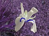
I love the way that the white flower is in front of the dark purple to create emphsis -- piper
- on December 13, 2013
This is so cool! I really like the colors and the texture. -- Candice