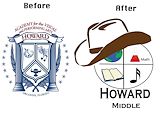
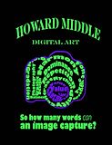
I like how you did Howard's logo... School Spirit! It's not a bad design, but I have to say, you can't beat the original... Good Job though! -- Izzy
- on April 26, 2017
I like how you made it look nice formal. -- Paris
- on April 26, 2017
You did a lovely job changing the logo of Howard Middle School.How you included the Earth and some subjects plus you added a cowboy hat on the top ,since I know that Howard's students are called Rangers so nice detail. Also your logo has the name of the school in bold letters and it's a simple logo not a big detail one. -- Riley
- on April 26, 2017
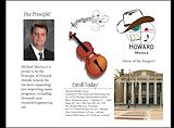
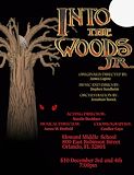
I love the paintbrush music magic hat and the way you display the info,but the date is wrong -- Chardnet
- on March 14, 2016
I like this one, but it needs color. -- Guy
- on March 14, 2016
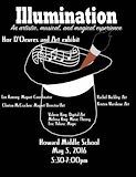
This is very creative! I think there is great detail on the podium thing, but the grass is a little bit too plain. Overall good job. -- Kayla
- on March 11, 2016
I just loooooooooove how you did all of it! 10/10 Best 2016 -- Kevin
- on March 11, 2016
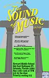
I just looooooooooooooooooooove how you did the text and symtrical style you did! I like that green grass too! 10/10 -- Kevin
- on March 11, 2016
I like how you made the arch look good -- Chardnet
- on March 11, 2016
Quite enjoyable to look at. Weird but cool -- -Cierra
- on February 1, 2016
This is really cool! I like how you added different tones to make it look more dimensional. Good job! -- Camryn
- on January 25, 2016
I really like the colors in this design you made -- Emma
- on January 25, 2016
You did good job! 10/10 -- Kevin
- on January 25, 2016
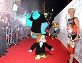
i like the way you did sully -- reyce
- on November 16, 2015
I like this, but it's hard to tell a difference between Dan's teal shirt and the teal wall behind him. But, Good job William! -- Madeline
- on November 16, 2015
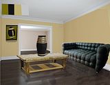
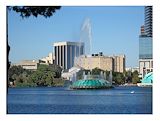
THIS IS REALLLYY GOOD !! I love how you made it so i can see the reflection of everything in the room in the gloss on the floor. -- Aubrey
- on November 2, 2015
I like the coordination of your color pallet. The tones work well together. Integrating these colors within the various textures plays a key role. Great work. -- Callie
- on October 19, 2015
Absolutely love the creativity shown here! -- Sam V
- on October 13, 2015
This is really cool i like it ^o^ -- Cynthia :3
- on October 13, 2015
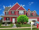
i like this picture because i picked the same house lol but good job -- Chazzy
- on May 9, 2015
i like how natural the tree and the fountain look wit the house. i also like how natural the walkway looks. the shadows look very realistic and i really like the color you made the house. great job :) -- Quinn :)
- on May 9, 2015
This looks really good and you did a good job on painting -- Aryanna
- on April 27, 2015
oh my god, this is fantastic i really want one of these as like a plush or something. -- Alex
- on April 27, 2015
It looks so real. -- madison
- on March 30, 2015
This is awesome i love that grumpy is like ew look at those shoes. -- madison
- on March 30, 2015
This is really good and i like hoe you fitted the clothes to the character -- Aryanna
- on March 30, 2015
You did a really nice job with fitting the clothing on the characters and I enjoy the backround you chose. Its very unique and Sully fits in very well. It represents how I think the characters would respond if they were in this scenario. Great job! -- Ethan
- on March 30, 2015
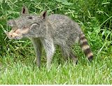
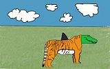
thats a ugly animal but you did a good job with blending colors and animals parts. -- brooke
- on March 30, 2015
This is strange but yet awesome. You blended the fur into the head very nicely. -- Miles
- on March 10, 2015
REALLY GOOD JOB!!!!!!!1 -- Grace
- on March 10, 2015
I really like how every animal was well blended and it makes it look natural. -- Elena
- on March 10, 2015
This actually looks like a real species -- Mackenzie
- on March 10, 2015
Amazin -- emily
- on March 9, 2015
This is very well morphed. -- Greta345
- on March 9, 2015
This is really good. I like how you put the fur on to the alligator head. -- Katie
- on March 9, 2015
good jobbbb -- Angelina P.
- on March 9, 2015
Wow. This is fabulous. Is that a pig head or an alligator head? Anyways, great job! -- Kiara
- on March 10, 2015
This is really cool but is definitely uncomfortable -- Aryanna
- on March 9, 2015
great job it looks so cool -- jaron
- on March 9, 2015
Burn it at the stake for it is a witch or sorcerer. this is witch craft to make one beautiful and it has backfired we must burn this monstrosity. -- Brendan
- on March 2, 2015
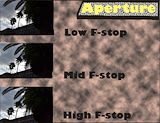
This looks really good. Its cool all 3 f-stops worked the same -- yasmine
- on February 9, 2015
KILL IT WITH FIRE! -- Anthony
- on February 9, 2015
I like how you made it so realistic and kinda morphed it in the face. -- Nia
- on February 2, 2015
I really liked this video and the picture -- kenneth
- on January 5, 2015
This is a really creative piece. I love the motion. -- Jennifer
- on December 13, 2014
I like the food you chose. Yum -- Cooper
- on November 10, 2014
This is so cool. The background matches perfectly with the theme:) -- Jasmine
- on October 27, 2014
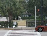
I really like how you added shading under the truck, helicopter and sign!
- on October 27, 2014
i love the back round but i think your arm doesn't look realistic. -- elijah
- on October 27, 2014
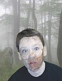
You did a really good job morphing your face into the creature's. Well done. -- Ethan
- on October 7, 2014
i really like the rotting flesh look on the side of its face i also like how it was fit in to the back ground its really good -- jaron
- on October 7, 2014
I like how you really made it fit your skin color but I would've smudged it out a little more and make the body fit into the picture. -- Nia
- on October 7, 2014
THis is really good and i like the color theme. -- Jasmine
- on June 4, 2014
cool picture -- austin
- on March 17, 2014
Cool pose..! -- Breana
- on March 17, 2014
Nice pose -- Raymond
- on March 10, 2014
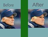
very good! it really makes him look younger! -- laurie
- on March 10, 2014
Nice Work -- Breana
- on February 25, 2014
AMAZING you made him look younger BEFORE he looks like he is 58 but AFTER he looks 47 -- makayla
- on February 25, 2014
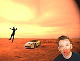
Nice picture, as I am fond of these kind of cars -- James
- on February 19, 2014
Cool car -- Raymond
- on February 12, 2014
A very intrigued Lamborghini. -- JImmy
- on February 9, 2014
I like how you put the pop art and the animal morph in one picture. Good job. :) -- Kiara
- on February 9, 2014
I really like this photo, especially how the "i" and the "a" look as if they are connected. Great job! -- Cindy
- on January 27, 2014
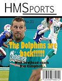
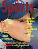
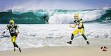
I like this scene because, it involves football. Specifically the green bay packers. -- Thomas
- on January 14, 2014
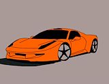
I like how you made the car come to life and the color orange -- Carlos
- on January 14, 2014
i like all of the colors and its just so vibrant :carlos -- carlos
- on January 6, 2014
This look very neat and pretty. -- laurie
- on December 10, 2013
I love the colors! This is a very beautiful photo! -- Laurie