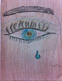
Now this is REALLY detailed! I mean the eye shadow...the the vains in the eye showing fatigue...the lines surrounding the iris...down to the tear drop going down the cheek. Good work, man, really good detail!
- on October 23, 2014
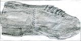
Okay, what exactly is being observed? I see the shading and the use of the grey scale. But the shoe is rather huge. And I just noticed that you even drew the stitches. Good "paying attention to detail".
- on October 23, 2014
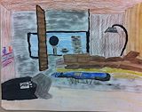
So this is how it looks completed? Man, THIS - IS - GOOD!!! I'm wondering how'd you get the colors, water colors at that, to render the texture of the objects and the scene as a whole? AMAZING!!!
- on October 23, 2014
Good subject matter.
- Laurence (teacher at Central Middle School) on September 22, 2014
Attention to detail, shapes, proportions and structure of the animals and the lines used to create them are important aspects of the learning process. Please put your best effort into these assignments.
- Laurence (teacher at Central Middle School) on September 22, 2014
Work on observation skills to describe in your art what things look like in order to build volume, form and texture. Focus on light to dark with watercolor.
- Laurence (teacher at Central Middle School) on September 22, 2014
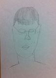
Focusing on observation skills and the actual structure of the eye is important to building credibility in your art. Proportions are another area that is important. Please work on the assignments and activities so that you expand your skills.
- Laurence (teacher at Central Middle School) on September 22, 2014
Okay, I can tell that it's a dinosaur; but it walking through the forest or is it floating above the ground. And if so, how's that even possible? Great use of the imagination, though, and colors. -- Daddy
- on September 15, 2014
Nice use of the grey scale. -- Daddy
- on September 15, 2014
This reminds me of a samari warrior who's sadden because he was just told her has to leave his wife and kids and go off to battle. -- Daddy
- on September 15, 2014
Now this one is the best example of how detailed you are. Excellent work. -- Daddy
- on September 15, 2014
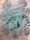
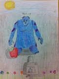
Is this an alternate depiction of that teacher? -- Daddy
- on September 15, 2014
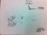
I like this one. Looks like an outside bar at the pool. And you chose to do it using only the grey scale and shading. My only real critique is the shadowing of the objects are consistent. The shadowing of the sign shows the sun beaming from the front while the bar and chair depicts light coming from a back side angle. Stil, none the less, good over all job. -- Daddy
- on September 15, 2014
Good sading, Nice. -- Daddy
- on September 15, 2014
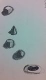
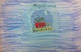
Though you decided to go with you usual coloring, I can tell that it's a snow globe. Nice work. -- Daddy
- on September 15, 2014
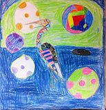
Yet again with artistic statement and expression. I have a couple of questions: 1) What is it? (It appears to be a tortoise or an upside-down alien man who's stuff went flying out of his hands after being flipped. -- Daddy
- on September 15, 2014
I take this as another one of your statement pieces. Is that a pelican? Good job...confusing to my layman's eye, but still good work. -- Daddy
- on September 15, 2014
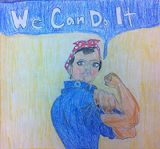
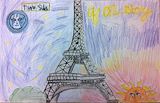
I remember this ad. God rendition. -- Daddy
- on October 23, 2014
I know what this is. It's that cartoon character from that Disney movie. And he's posing for a picture with his camera that he set the timer on and set-up on a tripod. Again you did good with depicting the casting of shadow. Keep up the good work. -- Daddy
- on September 15, 2014
I'm observing that i don't have a clue with one. Explain. -- Daddy
- on September 15, 2014
Okay, what's really happening here? Looks like a frustrated cat, or some type of feline, making a mess trying to paint its room....with boots on. Still good job...in a strange psychedelic sense. -- Daddy
- on September 15, 2014
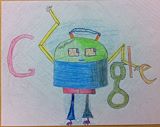
Google should've picked this one. It's clever how the two "O"s are represented by it'seyes That's really smart of you, Camryn. Smart drawing. And I always like your use of colors and coloring. Just simply smart.....wait a minute, is that a worm on its head? Man! that's smart, too. -- Daddy
- on September 15, 2014
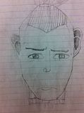
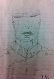
Who's this sleeping guy? Is this a drawing of your teacher? Good job. -- Daddy
- on September 15, 2014
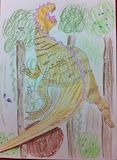
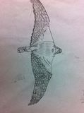
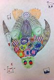
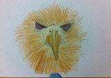
Cam, man, when I first looked at this, it appeared to be a mixed animal, of some sorts, but now I see it's the head of some kind of bird. At first glance, the eyes looked like ears....the wholes looked like eyes...and the feathers looked like a lions mane. However...the beak looked like a huge nose covering a smiling mouth. Either way, good job "my due" (pronounced "doo"). -- Daddy
- on September 15, 2014
I see you're saying that there's two side to every story...like night and day. True. But the light show over look the day. Agreed? -- Daddy
- on September 15, 2014
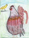
Now this one is either a really old one or a day you didn't feel like doing ANY work. I see you did a chicken calling to a yellow dove in the not to distant back ground. I can tell that they're under the sunlight cause you drew the dove's shadow as it passing by the chicken. Kudos... -- Daddy
- on October 23, 2014
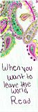
Yep, you DEFINITELY have that artistic intelligence. "When you want to leave the world, Read" what the*?!....OOOOO, now I get it! Submerge oneself and imagination into the vast world of reading books! Amazing! "Amazing" how this could come from someone who doesn't like to instruction manuals of technological devices; but rather go through the long, lengthy process of just figuring out all uses and ways a device works. And the word for the day is...."hypocrite". Love you... Oh and the paisley design with the pastels are on-point; better than the accompanying statement. Really Camryn?...like, "cereal"? -- Daddy
- on October 23, 2014
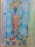
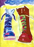
These are sooo cool and realistic. What makes it realistic is it's boots I actually can see you wearing- the color combination and everything! Good job, my dudette. YOu have that eye.. -- Daddy
- on September 15, 2014
Okay, is this the finished version of the first one? Or is it just altered or enhaced to look less morbid... -- Daddy
- on September 15, 2014
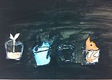
WOW! I thought the last one was strange! This one is cartoonish strange. It looks as if you have a plant in a glass of some kind of flavored drink,,,,then you have a glass of warter that's splashing out....then there's an empty glass...and finally you have this flam-in-a-glass monster. Put together, it looks as if they're either in space or it's just night and they're running from the the flame monster thingy who's yelling for'em to stop running. (It probably felt lonely and just wants some body to play with.) What ever drink that plant's in- being that it's out in front, my bet it' Gatorade, the glass of water seems to be struggling to keep up, and the empty glass will probably disappear into the night/space once it realizes it only needs to stop and stand perfectly still. If it didn't then the glimmer from the flame would give away it's position hence foiling its survival. Or it could simply "take one for the team" and get evaporated or douse the flame therefore killing it and
- on October 23, 2014
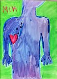
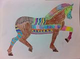
Daddy, again! I've been posting these comments thinking they're posted to the specific art work. The first one is for the horse and the second, for the "unfinished?" Going forwar, I'll include notes referencing the work I comment on. Like your "Mik" work. To me, it looks kinda' morbid...like a confused zombie that's been shot four times. Its head slightly tilted shows as if it's wonder why it's been shot or why its heart is hovering on the outside of its body....on the wrong side! ;-) Or it could be an zombie alien that's not anatomically correct hence its confusion being shot and the displacement of the heart. Your have the makings of pure genius, my dude. ;-) -- daddy
- on October 23, 2014
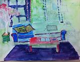
Okay, this one I like, too. Again your use of colors is eye catching. But what's also eye catching, is the unfinished part of the painting. Unless you're trying to make an artistic statement of some sorts. And if so, it'll need to explained to your instructor AND me- so we can know what's going on. It would then make this work ingenious, in that artistic way, or you just showing laziness and lack of caring for the finished product. So going forward, you would need to either explain or simply finish your work. LOVE YOU...my dudette!!! ;-) -- Daddy
- on September 15, 2014
Hey Cam! Daddy loves you. Okay, I really love the coloring on this, man. It makes the object unique. And I really like the level and the amount of detail shown. It shows the you have an eye for detail and that you are and you show a blossoming talent. You've inherited that gift. The choice of colors and the different elements of design stands out and makes the your work POP! Good work my "dudette"! -- Daddy
- on September 15, 2014
Good perspective and vibrancy of color choices. Use values to define shapes and forms more than using outlines. Why did you not finish?
- Laurence (teacher at Central Middle School) on September 8, 2014
Be creative with background and forms. Use color, pattern and design to keep projects interesting. Be patient with applying paint to keep colors transparent and intensity strong. Apply layers of color to help build values. Good attention to shapes, proportions and line work, these elements will become more important in each upcoming project.
- Laurence (teacher at Central Middle School) on August 29, 2014
Good job on copying the pattern, but remember to use your own creativity. Be neater with your lettering as it becomes an important part of the design. 46
- Laurence (teacher at Central Middle School) on August 25, 2014