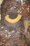
This art piece has great detail and value in it and the mix of brown and white symbolizes the different wing colors of the owl. -- Matthew
- on February 5, 2015
Great job. Awesome job on the colors. -- Caleb
- on February 5, 2015
I love how you incorporated different types of brown and different values of black. I love the texture of the owls body and face. Also I love how you used darker colors on the edge to give it more of the out line of the owl's face. -- Savannah
- on February 5, 2015
I really like how you incorporated texture and color into this piece. The colorful background makes thus piece stand out. Great work! -- Alexandra
- on February 5, 2015
I really like the colors and patterns you used. They blend together really well. Great job! -- Alexandra
- on February 5, 2015
I really like how you used many different shades of blue and yellow. It really adds to the beauty of the piece. Amazing job! -- Alexandra
- on February 5, 2015
I love how the colors go good together and the design -- Ariel
- on February 5, 2015
I really really like this. It's so pretty and it looks really realistic. -- Ariel
- on February 5, 2015
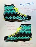
Your converse shoes look very realistic. I like the way you used your colors and chevron type of pattern. Usually yellow looks weird with blue, but you were able to make it look perfect. -- Mya
- on February 5, 2015
I absolutely love your wildlife landscape. I like the way you used different colors to add texture to the owls feathers and used different shades of brown. I look very similar to a real owl. Owls are known for staying out really late and you modeled that very well by giving the owl nice big sleepy eyes and a little shine to its pupil. Nice job -- Myaf1
- on February 5, 2015
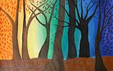
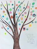
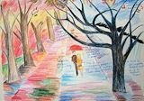
I really love the background and how each color matches the leaves. I really, really like how each color represents a season or a time of day and how many leaves on each tree reflects which season/ color it is in. I love the texture and detail in what color the tree is depending on where it is on the page or what time of day it is. -- Alyssa
- on February 5, 2015
I absolutely love the detail in the owl's feathers. The splatter of different colors adds character to the owl and the different shades of brown where the wings and "mask" of the owl are. The bright eyes and beak stand out from the darker feathers that catches my eye. -- Alyssa
- on February 5, 2015
I like the texture and the color you used in your art piece it makes it stand out. -- emily
- on November 17, 2014
Your fish are perfect, amazing colors!! -- Carina
- on February 5, 2015
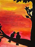
I really liked how you used different shades of red and orange to create the realistic sunset as the background. I also liked how you used the quote to fill some of the space between the birds and the top of the paper. Beautiful! -- Myra
- on February 5, 2015
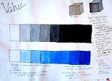
This is so good! I like how the 2 value scales gradually flowed into the colors. I also like the cubes that you used to show value. Good Job! -- Myra
- on February 5, 2015
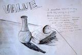
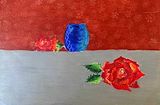
Your value and shading on this artpiece is amazing! I really like the shadow you made by the book and the vase. I also really liked the hatching and lines you used on the 3 objects. -- Myra
- on February 5, 2015
I really like how the tree flows along with the flowers. I also liked how the flowers are not attatched to the actual tree, which added more of a spring touch ! great job! -- Myra
- on February 5, 2015
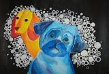
I really liked how you made one dog in all cool colors and the other dog in all warm colors! It added a great pop of color to the black cover. i also really liked the silver accent circles you added to the background! great job ! -- Myra
- on February 5, 2015
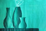
This is so realistic! I loved how you painted the still life to show the light hitting the vases. I also liked the value you included with the black and green together. Amazing! -- Myra
- on February 5, 2015
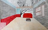
I would LOVE to live in this room! I really like the tree design you put on the wall, as well as the cool pattern you put on the ceiling. I also like the red sofas that go around the room. Love it ! -- Myra
- on February 5, 2015
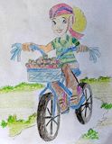
I really like this piece because you actually went a step further and drew a girl on the bike, (I only drew the bike lol) And I also like how you added the burst of color with the strawberries in the basket of the bicycle. Great job as usual! -- Myra
- on February 5, 2015
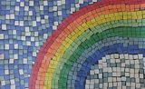
This is so good! I really like how intricate this paper mosaic is! I can tell that this piece must have taken a lng time! Overall, my favorite part of this artwork is the attention to detail. You did a really great job! -- Myra
- on February 5, 2015
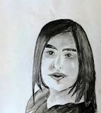
This portrait is amazing! Its so realistic and it looks just like you! I like how you used shading on your face to make the shadow effect! I also really like how you did it in black and white to add extra value to the piece. Love it ! -- Myra
- on February 5, 2015
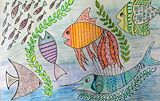
Wow! I really like how you pu more than one fish in your design! I also like how you put intricate patterns and matching shades of each color for the different fishes. I also liked the seaweed floating around the fish; it added a nice touch to the artwork -- Myra
- on February 5, 2015
I think the art piece has a great value of context and great texture. -- Matthew
- on October 16, 2014
I really love how you used the trippy pattern on the ceiling, it makes it look curved or open. I also like the way you put a tree on the far wall. squiggly~ -- Ty
- on October 16, 2014
I love the way this was created! The tree's shaped beautifully-the branches have a peaceful feel, almost like water. The bright colors of the flowers provide an amazing contrast against the dark wood of the tree. All in all, this is one GREAT piece. -- Camille759
- on October 16, 2014
I think that this piece is really well done. The tree is really good...it's neat and really realistic looking. All of the bright flowers represent Spring becasue there are flowers in spring and that is when everything is blooming. This piece is really pretty ad very well done. -- Regan
- on October 16, 2014
This is absolutely stunning. You're such a talented person! This piece is not only amazing, but the intricate detail that you put into this shows that you are very passionate and dedicated to your art. -- Isabelle
- on October 16, 2014
You are the best artist in grade school I know and this is amazing. I like how you used placement and value in this artwork. -- Nolan
- on October 16, 2014
Drashti, I just absolutely love how you used the different techniques of space in this art piece. The rose is beautifully detailed. -- Ami
- on October 16, 2014
I like the light colors you used to create your dog, they are soft and go together nicely. I also really like how you dotted certain part of the background. You did a really great job with the value in the dogs. -- Ami
- on October 16, 2014
I love the details in the artpiece. It's beautiful! -- Madison
- on October 16, 2014
That is very Ron Burns inspired -- stacey
- on October 16, 2014
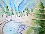
OMG, The value you used on the trees makes it look so real and I really like the background of snow. -- Ty
- on March 23, 2014
Wow!!!!!!!!!!!!!!!!! I love how you used both color schemes in one drawing, you put them together so well that they barely clash. -- Ty
- on March 23, 2014
You have a good use of color with different values and a great color scheme. I like the dots all around the dogs since it focuses your eyes right in the middle. This is a great artwork. -- Lindsey3702
- on March 23, 2014
I really like how you used different shades of orange. -- brecken
- on March 23, 2014
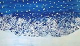
This contrast on the dark royal blue and the pure white show is amazing! How the snowflakes pilled up looks awsome too! :) -- Riley
- on March 23, 2014
I like how you crossed the seasons at the middle of the road, I also like the way you blended the colors and made other colors. -- Ty
- on March 23, 2014
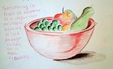
Drashi5, I love the way you used overlapping with the fruit, and the way you used shading on the bowl and fruit for shadows and lighting changes. I like the light reflection on the right top of the apple. Fantastic gob! Emma16631 -- Emma16631
- on March 23, 2014
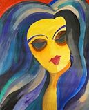
I really like this art piece, it reminds me of lorde. I like the hair because of the really nice color scheme you used. I also like how you had the hot color theme on the arm, the pattern looked really cool. -- Ty
- on March 23, 2014
I love how it's so surreal yet still very abstract -- Juliette
- on March 23, 2014
This piece is amazing! I love the way one side is colorful and warm whereas the other side is dark and mysterious. It's very beautiful. Great job. ~ Ami 8th grade -- Ami
- on March 23, 2014
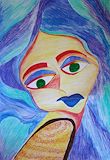
Drashti, I LOVE IT!!!!! The colors look really well blended from afar, but up close there are a lot of clashing colors! Your use of value is, to me :P, REALLY ADVANCED!!!! Gonna go look at more artwork! ~Jasper -- Jasper
- on October 9, 2013
You are very good at writing about your steps in your journal (much better than I am!). I really love how realistic your graphite sketch of the black and white photo of a house is. I think graphite could be your main medium. Cool! -LCMA 8th grader -- Greeshma
- on October 9, 2013
Whoa! This is amazing! I love how you emphasized the warm and cool colors on either sides of the art piece. You are amazing! I would love to see more of your work sometime soon! -LCMA 8th grader -- Greeshma
- on October 9, 2013
This piece is amazing! I love the way one side is colorful and warm whereas the other side is dark and mysterious. It's very beautiful. -- ~Isabelle
- on October 9, 2013
This is beautiful. I love your use of warm colors in the background and the colors you chose to blend in the foreground go very well together. -- ~Isabelle