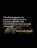
this is good, but the last words should have been in a different font so you could see it better -- emmanuel
- on May 23, 2016
I like how you drew your character and chose its colors. -- Chardnet
- on May 9, 2016
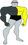
This is very well made, how the features make up for a real superhero. Good job :-) -- David
- on May 9, 2016
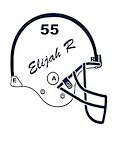
I like how your artwork portrays your interest in football. Good job! -- David
- on September 22, 2015
I like it! Got to keep hit the metal. Thats me in the summer. -- Hakeem
- on May 18, 2015
Good work. It looks really good. -- nickelson
- on May 18, 2015
This is really good. I really like how there is a photo in the shoe. -- madison
- on March 30, 2015
thats funny -- kaitlyn
- on March 9, 2015
no -_- -- kaitlyn
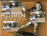
- on February 23, 2015
lol heisman -- derrick
- on February 19, 2015
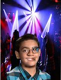
this is really good i can defiantly tell the difference -- yasmine
- on February 19, 2015
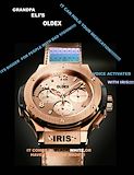
I like how you went old school with this watch. -- Jimmy
- on February 19, 2015
Nice layout. I like how part of his face is bashed in. -- austin
- on January 20, 2015
I really like the way it looks but there is a big hole on the side of the head , but other than that you did great. :D -- kaitlyn
- on January 20, 2015
This is really funny and i like how you only put glasses on one eye -- yasmine
- on January 20, 2015
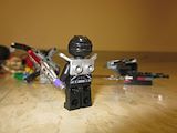
I like your use of legos. I love legos, it makes me want to watch your video. -- Rocky
- on January 5, 2015
This looks really cool! Good job! -- Kionah
- on December 9, 2014
clever idea bro -- Gabe
- on November 17, 2014
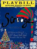
I think this one is the best. I am also in that play. -- sloan
- on November 10, 2014
This was a really creative idea. You have some nice work but i would recommend taking a little more time when you are putting in the pictures of your celebrity so that you won't have so much white space. -- Kyla
- on November 10, 2014
I like how you used Santa instead of an actor--very creative! -Lleyton -- Lleyton
- on November 10, 2014
Funny idea -- Noah
- on November 3, 2014
really good design and layout but i recommend you taking the white parts around MS.Clauus -- Austin
- on November 3, 2014
Its really unique -- noel
- on November 3, 2014
i like the design it looks really good but you should of kept more of your arm so there it isn't just a floating arm. Also The hand doesn't look natural you should have smoothed it out so it will look like there is actual grass on your hand. -- Austin
- on November 3, 2014
The elephants in this photo look really real your hand and it looks really cool. -- justin
- on October 27, 2014
You did a good job, but next time I would recommend adding more of your arm so it's not just your hand floating randomly? Yeah. -- Angelina
- on October 27, 2014
I love how you put the elephants but I think you should have put more of your arm -- yasmine
- on October 27, 2014
I like how the lighting of the elephants is similar to the lighting of the background. -- William
- on October 27, 2014
this is really good. The only thing I think that you should have done differently is that there is just a random hand floating out of no where, so maybe you should have added more of your arm. -- madison
- on October 27, 2014
I really like this even thought i don't know who that is. But its still really cool. -- Emmanuel
- on October 13, 2014
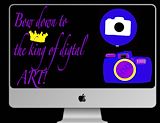
The rainbow background is a little much -- Alex
- on October 13, 2014
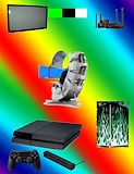
I like the way you arranged the different pictures you used to represent digital art. -- Brian
- on October 13, 2014
nice technology -- noah
- on October 13, 2014
smart idea -- noah
- on October 13, 2014
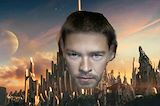
nice thor face -- noah
- on October 13, 2014
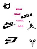
nice logo and font -- niah
- on October 13, 2014
Good contrast with colors makes your initials pop out -- Austin
- on October 13, 2014
Hay Elijah. This is a really good piece of artwork. You could have spaced it out a little more, but other then that it is really good -- Emmanuel