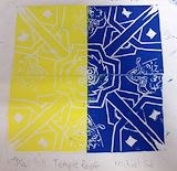
Your favorite colors - yellow & blue!! The contrast looks really cool, just in time for summer. It must've been difficult to make those elaborate lines. They look fabulous! -- Elizabeth
- on May 31, 2014
This is so cool!. I liked the designs. This name is really funny. I wonder what it would look like if it was a shark. I liked in the inside it had a different design. Keep it up! You are a good artist. -- Joshua
- on February 19, 2014
This is so cool!. I liked the designs. This name is really funny. I wonder what it would look like if it was a shark. I liked in the inside it had a different design. Keep it up! -- Joshua
- on February 19, 2014
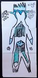
This is an interesting figure....looks like an alien bird! I like the turquoise color as accents. It has a sort of mysterious character! Keep up the good work Michael! :) -- Elizabeth
- on February 12, 2014
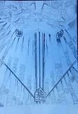
What a beautiful drawing of the Korean gate!! It's especially interesting because of the wolf-like image that stands out from a distance. You have really elaborate details! -- Elizabeth
- on February 5, 2014
Michael!!This is SOOOOO COOL!!! Fat mutant duck, huh? ha ha That's funny. I like the contrast of colors and the abstract imagery! It's interesting how you can utilize computer techniques with artistic creativity! -- Elizabeth
- on February 5, 2014
Michael, you have worked very hard to create a visually interesting tessellation without gaps or overlaps. You have included some great details in the fish, bird head, and the "ninja" area. As you mentioned in your artist statement, adding a few more details in the black bird would have added some additional interest there. You seemed to have good control over the process of painting on the computer as well as manipulating layers.
- Melissa (teacher at Seoul Foreign School) on February 4, 2014
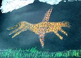
Wow Michael!! What a clever and fantastic picture! Look at those fancy wings! I can see the texture of the leopard and grass and sky so vividly...it's almost like the leopard will fly right out of the picture!! How did you make it stand out like that? Cool!! -- Elizabeth
- on April 11, 2013
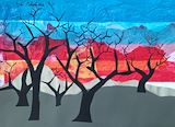
This is so impressive Michael!! I love the colors and the contrast of warmth and coldness. You really depicted the wintery barren land well. And the warmer shades from the sunset seem to show a glimpse of Spring just around the corner. And the cute little birdie is definitely a symbol of HOPE!! You always have lots of interesting details and special points in your artwork. The treees and branches remind me of deer antlers. They're so beautiful!! Thank you for sharing! -- Elizabeth
- on February 23, 2013
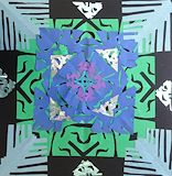
Wow Michael! Another beautiful piece! The bluish purplish hues go together nicely and create such a mysterious yet peaceful ambience! I love the various snowflake patterns and how you made them overlap. The ones in the corners remind me of palm tree leaves on a beach and the smaller ones on the edges look like cute little faces or masks!! Keep using your imagination!! -- Elizabeth
- on February 23, 2013
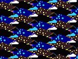
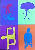
Wow Michael! I love Keith Haring's work, but your version is even cooler! :) The one in the top right corner looks like it could be called "brainstorm." Very interesting imagery you've created here. Thank you for sharing and keep those creative juices flowing!! Great job Michael!! -- Mom
- on November 30, 2012
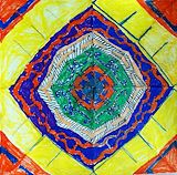
Michael, this is a beautiful work of art!! :) I'm very impressed with your use of bold colors. I really like the strong, bright contrast. Your patterns are elaborate and delicate. You must've used up a lot of hand/arm muscle strength coloring in your mandala with those colorful markers. I love your finished design. Will look forward to your future creations, too! Awesome job!! :) -- Mom