Excellent job sketching "the other half" in the picture. Your artwork has improved so much over the years. -- Cindy
- on June 8, 2015
I really like the pots you made, especially the Pinch Pot. Did you chose the color blue or were they all that color? Looks like the pocket pot could be hung on the wall. Good job. -- Grandmom
- on June 2, 2015
Wow, those are some ginormous staples. I could use them for some of my data packages. ;) -- Cindy
- on June 2, 2015
I laughed when I saw the title of this artwork. I liked the use of men for the piano keys and strings. Nice job!! -- Cindy
- on June 2, 2015
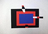
The use of a dark accent color was a good choice for this "quilt." The arrows reminding me of a quilt pattern called flying geese. Nice job! -- Cindy
- on June 2, 2015
This is really fun to examine - I see a ship, a submarine, sea animals, and other water related "stuff." Another great piece of artwork! -- Cindy
- on June 2, 2015
I like the variations in the colors. Nice job!! -- Cindy
- on June 2, 2015
This is Really Neat! Lots of bright colors and so many different things to look at. So much fun to use your imagination with this. -- Grandmom
- on June 2, 2015
Nice job mimicking Picasso! -- Cindy
- on June 2, 2015
I like the way you used many different pieces to make this person. Is that a dog's head or a hamster's head? You were very creative in finding arms and legs that worked with the other body parts. -- Cindy
- on June 2, 2015
I enjoy looking at Escher's artwork because it is mind twisting at times. This is a great representation of his work and the contrasting colors really help to enhance the pattern. -- Cindy
- on June 2, 2015
The bright and cheery colors make me think of Spring. It is quite refreshing to see during the bleak days of Winter. -- Cindy
- on June 2, 2015
Chris - You did an amazing job on this project. I think you are enjoying art more this year than ever before. I like the fact that, with encouragement, you were able to see the "wolf" that you had basically already drawn. With just a little fine-tuning, you turned this project into one that is visually appealing and admired. Great job! Love, Mrs. Ric -- Kathy
- on February 24, 2013
I like the geometry of this hex sign. Using the same radius for the flower petals as the whole sign is very practical and keeps the symmetry of the work uniform. The contrast of the colors emphasizes the two parts of the work. Good job. PopPop -- Alan
- on February 24, 2013
This reminds me of the hex signs we see when we drive out to Lancaster County, PA. Do you remember seeing any when we go to visit Aunt Joan & Uncle David? I especially like the colors you used. GRANDMOM -- Jeannette
- on February 24, 2013
I like this piece of artwork - it looks like a dog sitting, looking backwards at his tail. Is this Linus? -- Cindy
- on December 27, 2012
As a longtime fan of Escher's work, I can see his inspiration in your picture. The color contrast is also very appropriate. -- Alan
- on December 27, 2012
I really like this, especially the colors you chose. -- Jeannette
- on December 27, 2012
I like how you used various object to create this centerpiece. It is definitely very patriotic! -- Cindy
- on December 27, 2012
I love the quilt! As a quilter, I can tell you the stitching is perfect, as well as your use of bright colors. -- Cindy
- on July 8, 2012
I like your bugs - they remind me of dragonflies! -- Cindy
- on July 8, 2012
A new species? Looks good. -- Joe
- on May 11, 2012
I really like this! It's so colorful and has lots of interesting images. Some of the things I see are an alien, a submarine, a jelly fish and a plane. What fun! Grandmom
- on November 29, 2011
This is a really colorful painting. It reminds me of a quilt with the individual squares of different colors. They even look like they have different textures or patterns from the brush strokes similar to fabric patterns/textures. -- Cindy
- on November 16, 2011
Chris, I like your use of color for the border on this picture. It really makes it pop! -- Cindy
- on June 4, 2011
Good job, Chris. -- Dad
- on June 4, 2011
A very bold and striking picture, it really grabs your attention. PopPop
- on April 19, 2011
I like it too! -- Joe
- on April 19, 2011
I like the colors you've chosen - the red really makes it pop! Grandmom
- on April 19, 2011
I like the colors - nice contrasts. -- Wendy
- on April 18, 2011
I think the holes in the foil look like teeth - nice effect! -- Wendy
- on March 30, 2011
This looks like an aerial photo of a mountain range and valley. Very nice. -- Alan
- on March 30, 2011
This is very interesting. -- Jeannette
- on March 30, 2011
This piece is retro and reminds me of something out of the 1970s. The orange is a bright, contrasting background against the foil. Nice job selecting the colors and mediums. -- Cindy
- on March 30, 2011
I like it! Very interesting. -- Joe
- on March 30, 2011
Your pumpkin looks great because you did not draw a perfect circle for it. Pumpkin shapes vary and each are unique. I love this picture because it reminds me of Autumn, my favorite season! -- Cindy
- on March 26, 2011
Very good combination of colors and images. PopPop
- on March 1, 2011
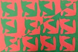
I really liked this abstract symmetry drawing. The colors chosen were also appropriate - orange and green. PopPop
- on March 1, 2011
I really liked this abstract symetry drawing. The colors chosen were also appropriate - orange and green. PopPop
- on March 1, 2011
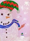
Great Snowman! Grandmom
- on March 1, 2011
Very interesting. I love all the different colors and shapes. Grandmom