The fall scene is beautiful. The colors of fallen leaves on the ground really looks like fall. The two birds in the sky add a bit of fun.
Posted 9 months ago by Brenda (fan)
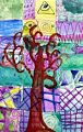
I love the color choices for the background, they make the branches almost look three dimensional.
Posted 10 months ago by Brenda (fan)
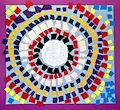
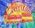
I like your choice of yellow and purple. They are opposite each other on the color wheel. Orange was a good choice to complement both. Nice job.
Posted 11 months ago by Grandma
You were so precise with the placement of the pieces. Good job for being so meticulous.
Posted 1 year ago by Grandma
Polka dots are so much fun.
Posted 1 year ago by Grandma
All the different squares behind the tree add a lot of interest.
Posted 1 year ago by Grandma
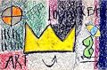
This is interesting. I can read ART and LOVE. I am not sure what the third word is. What were your directions in creating this? I wold love for you to tell me about it
Posted 1 year ago by Grandma
This looks like it would be a happy place to live. You use paint and shading so well.
Posted 1 year ago by Grandma
Hi Flynn. Great redbird picture. I have it on my mouse pad.
Posted 1 year ago by Grandpa
Purple, blue and green are some of my favorite colors together. The pink, yellow, and orange makes your cat POP. Love the picture.
Posted 1 year ago by Grandma
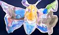
The butterfly looks happy. Did you use watercolor paint? Grandma
Posted 2 years ago by Grandma (fan)
How did you do the tie dye? The speakers look so real. This truly looks like a boombox from your parents childhood. Grandma
Posted 2 years ago by Grandma (fan)
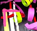
The pink and green really pop from the black background. Grandma
Posted 2 years ago by Grandma (fan)
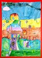
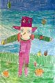
I love your scarecrow. The way you made the field cross hatched was a great design decision. Also the shading in the sky adds depth.