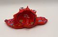
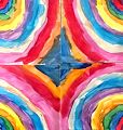
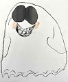
A bias-relief self portrait in colorful clay! Complimentary colors balance the piece.Well done
Your hands are in your pocket from the looks of it.
Posted 3 months ago by Papaw (fan)
Row Houses facing the street, behind a pool, basketball goal, swing set and sandbox trampoline. Spread the news!
Posted 4 months ago by Papaw (fan)
Blue baby 2 Tusked Long Horned Snail? Or, a kind eyed Pair-atops panting from racing around the floor.
You're one of the best character creators I’ve seen.
This could be the next …Animated figure in its own series!
Posted 5 months ago by Papaw (fan)
Sometimes the success visually of a work of art or a masterpiece even is the empty space between the subject matter , think of the empty space between Gods finger and Adam’s Finger in Michelangelo’s Creation of Adam in the Sistine Chapel,what does that empty space represent? What happens when God actually gives Adam Life?All of humanity! Voids or the negatives in the visual plane like dramatic pauses in music speak just as loud as the subjects or the notes. Your collage has lots of positive subjects that we can pick out as viewers all sorts of fruit , character's etc. The success of a collage like this is placement of the items. You actually are conveying a message of your characters, their environment. It’s a great work!
Posted 7 months ago by Papaw (fan)
This is a fun piece of art that expresses visually as well as literally the limitless possibilities of subject matter as well as media. I see a turtle begins the path, a flying saucer, a pink rabbit-too many subjects to mention in a written paragraph but you drawn them all in a single word! Amazing illustration!
Posted 8 months ago by Papaw (fan)
You have such a great eye for picking out details that the Artists of Focus utilize as signatures in their pieces -ie the spiraling eye. Bold Color is a trait of the Artist that comes naturally to you.You love bold colors! Your assemetric composition is perfectly balanced. Against the main figure on the left half the colorful spheres are like weights to balance out.
Posted 9 months ago by Papaw (fan)
High quality artwork, I’m not familiar with the artist of influence for this assignment. But I truly love your collage. And I’m going to check him out Something so busy with so many moving parts in intense full spectrum technicolor yet it is a single piece. Great job!
Posted 9 months ago by Papaw (fan)
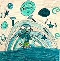
Artists’ world of imagination only limited by assigned monochromatic criteria! Just Think of the subject possibilities; a monochromatic rainbow? Artistic tools swirling in an astronomic emerald windstorm! All awhile his feet casually shod on the green firmament below. And even the hue of your pants are Crayola Spring Grass!
Posted 1 year ago by Paul
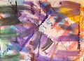
From that to this?! This is a motion picture, mixed media extremely interesting. earth tones with a splash of sun light. I have thoughts of US mail or postcards that have been discarded on the ground and have been run over with a muddy tire print due to the repetition of tracks of color
Posted 1 year ago by Paul
Your Self Portrait Confidence and Bright Eyed visions of the visible and invisible radiance of your environment. Confidence evident by your hands on hips forward facing flat footed stance. Eyes looking directly into the onlookers follow from any angle in an inescapable gaze. Radiant sunbeams cause heatwaves mirage like images to rise from the landscape. Sending moisture back up to the clouds until they burst with overload. Always a sofisticated use of color,composition and drawing.
Posted 1 year ago by Paul
A peering spray paint can peeping over a beautifully woven patch work blanket combines for this surreal satirical work! Utilizing grouping of opposite colors along with the squares balances the composition, yet the wide variation of organic squiggly lines , patterns and shapes within the confines of these geometric cells successfully draws our eyes away from the central characters’ constant stare so we can look away and relax to enjoy the rest of the piece.
Posted 1 year ago by Paul
Love this so much!
Posted 1 year ago by Wade (Father)
This bright red bottom feeder has its mouth wide open (spotted tongue exposed) waiting for a curious minnow to swim up to investigate, which will end with a big SNAP. Anatomically very believable,especially those eyes.
Posted 1 year ago by Paul
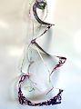
Alexander Calder is known as an American Artist that developed many advances of the mobile, (Some say he created it) a 3 dimensional suspended art form that is always changing and in motion. I would like to view your mobile suspended in air being able to turn a complete 360 degrees, so as to see all sides. A great job!
Posted 1 year ago by Paul
I love this one!! This should be a Christmas card.
Posted 2 years ago by GramB
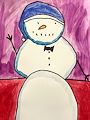
I missed this one. What a cheerful snowman. He really gives the illusion of being stacked. The 3D shading of the 3 separate snowball that make up his base torso and head are successful in doing this and giving him weight. He’s waving! Hello Mr Snowman -nice hat!
Posted 2 years ago by Paul
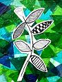
Awesome! A collage. Don’t you love how the tissue paper is transparent enough to show the layers upon one another and mix the colors in the process -looks like stained glass. Really successful in expressing light and shadow too. The drawing of yours shows diversity of textures by the patterns, lines and shapes in the different leaves. The opening flower bud adds a sense of expectation and hope.
Posted 2 years ago by Paul
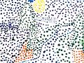
pointillism is a tedious and repetitive style but it is impressive and satisfies the viewer and the artist once completed I know it requires patience to develop this style. George Suerat did huge very detailed pieces in wide range of colors. If you look at older comic books they were printed with hundreds even thousands of small dots. Your first attempt appears to be a landscape based upon the yellow sphere that appears to be the sun, and the linear lines following the terrain. You can gain speed working in one color at a time over the whole piece. And it’s ok to loosen up by applying color not as individual objects but as dots of reflection of light and shadow. It is good exercise and will help you in other styles as well. This is a good start adding more dots will bring the picture more in focus.
Posted 2 years ago by Paul
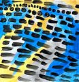
This work looks like a painting on top of another painting. The defined strokes, black jots and dots are one painting as if suspended above on a glass. Seen underneath is a 3-4 color expressive painting that acts as a slightly out of focus background. Very good 3 dimensional quality.
Posted 2 years ago by Paul
Brand New Grade!I'm glad you’re still doing this. The painterly textures and lines and as always your use of bright colors without muddying them is so bright and cheerful. The four similar panels are each very different, but combine as a whole.
Posted 2 years ago by Paul
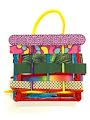
This colorful yellow handled woven basket looks like you’re ready to go to the farmers market to fill it full of vegetables ,dried bean's, fruit and maybe some candy. The sturdy popsicle stick frame allows expansion of the colorful woven body and the padded pillow top allows for many hours of worry free use! I think you have an eye for designing product's to sell. That’s why I wrote this comment as a sales pitch for the piece.
Posted 2 years ago by Paul
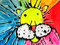
A kaleidoscope Lion it appears
Posted 2 years ago by Paul
This is art well beyond your age in its sophistication. The piece is so well balanced, the interest grabbing qualities of the wide range of textures, hues and shapes unify powerfully as one as my eye keeps seeing new interesting details in the minute bits and pieces. Colors are magnificent.
Posted 2 years ago by Paul
This mixed media piece blows me away. What was your process? This is worthy of framing, I would like to see the whole piece the tassel type strings at the bottom are cut off in the photo. It’s very weighty to be so small. Your use of color has not changed. Still bold and beautiful,
Posted 2 years ago by Paul
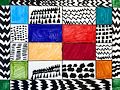
Wow, this piece takes time to look over. The different colors, I wonder why the choosing of these. The stroke texture of the colors adds more interest to the color cells. The black and white cells are especially interesting. I imagine rows of Christmas Trees, tent's in rows, sound waves etc. It’s busy with excitement! But orderly by the uniform cells. Calming even. Well done.
Posted 2 years ago by Paul
Proud Penguin waddling at Sunset,,anatomically accurate! You are progressing well in your drawing skill. Looks like it may be Skate boarding off the ramp or fence??
Posted 2 years ago by Paul
Do you know I did not see the assignment and when I saw this I thought That looks like a Piet Mondrian , wow this is awesome. You nailed it! Your sketched lines are similar to his Tree Pieces And the primary colors his Composition Pieces
Posted 3 years ago by Paul
This beautiful garden of flowers, Your drawing in this piece is very strong and confidently precise. Very advanced details of exotic botanicals The composition of the flowers fore and aft make my eyes search closely across their unique interesting shape's. The color placement is so that I place the time of day at dusk. The warm sunlight is retreating to the right as long blue shadows advance from the left. Beautiful piece of work!
Posted 3 years ago by Paul
I see tops of open paint cans and the deep pools of color made by thick dimensional strokes that have a wet appearance inciting the artist in me to “go paint!” I want to grab a brush and spread some of that bright yellow on a masonite board! You did that with circles of color! Well done!
Posted 3 years ago by Paul
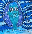
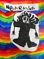
Monochromatic Nehemiah? Are you kidding?You are a colorist a wide palette has always defined your artwork. This is like Picassos blue period. Your reliance more on your line drawing to radiate the energy works to offset the limited palette. The background is action packed and your figure is full of movement from the crooked smile ,radiant eyes chiseled chin and the reflections in your hair. Monochromes can be boring but Yours jumps off the Page. Well done!
Posted 3 years ago by Paul
I love this! Comical Art, this would be a great character in a comic or cartoon series. The ducks cool blue against the warm reds makes it jump out.
Posted 3 years ago by Paul
You nailed this assignment “A Funny Monster” It truly is monstrous! Those teeth, horns and dark eyes But it’s tiny arms and that deer in the headlights stare Are what come across as funny As always your colors are strong And thought out.
Posted 3 years ago by Paul
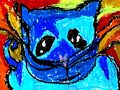
This to me looks like a superhero! It’s the “Phantom Owl“,(Or Cat) Your color as usual are intense and powerful And I love the eyes The cool blues and flaming reds!
Posted 3 years ago by Paul
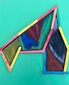
I look and think stained glass window. The frame and then the teal color in the center frame Matches the background so it appears to be transparent like glass. Sometimes the great thing about art is that something happens that we weren’t even planning. But that may be exactly what you planned.
Posted 3 years ago by Paul
A collage! Mixed media piece! Expressing the limitlessness of line drawing The opposite colors give great contrast. I like the subtle shadows that the yarn-line makes on the paper Collages are Fun And there’s no limit to putting objects together to make art Well done!
Posted 3 years ago by Paul
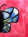
Wow” intense “ contrast of color The wing of the butterfly looks like a stained glass window. The background of pink I imagine is a large flower petal
Posted 3 years ago by Paul
You’ve done it again, taken a simple subject and made it ART! The numerals configured like we would see on a any standard keypad, but you’ve made each individually unique with diverse colors and style yet they work together as a whole to be an appealing single design. Your color tones in each square, some intense(9,1), some subdued (2,7) balance the overall composition. And the 6 turning around to look at the rest is fine -Its Art!
Posted 3 years ago by Papaw
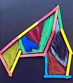
Your mixed media piece with the strong shape Vibrant colors,intense drawn strokes and isolated Sections utilizing makes me think of stained glass
Posted 3 years ago by Paul
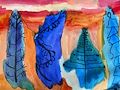
The blue spruces in the foreground against the bright oranges of fall. Total opposites on the color wheel make for a dramatic High contrast scene!
Posted 4 years ago by Paul
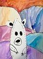
This is Great! Those sharp claws on those dangling arms! And young innocent bear face with startled eyes as it stands upright on the colored tundra blanket
Very sophisticated work of art This could hang beside any professional work inside a gallery The depth of the landscape of rolling hills represented by the horizontal lines and repeated fall colors of green orange red yellow. A large bird looking and flying downward through air swept leaves,hovering,its sweptback wings Shadowing a plump body as feet anticipate landing. The base color of the paper really works well with the earth tones
Posted 4 years ago by Paul
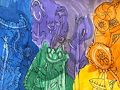
Nehemiah, your picture is beautiful.Your colors are in the correct order just like a real rainbow! Your Primary colors Red Blue and Yellow create the Secondary colors Purple Green and Orange where they meet and blend! Your self portrait is happy and you look as if you’re lying flat riding on a floating white cloud.
Posted 4 years ago by Paul
A sunny fun-filled time on the playground! A Swing,a climb about, monkey bars and a swirly slide! Good job on your name too!
Posted 4 years ago by Papa
Nehemiah your artwork is amazing!! Love the bright colors!!
Posted 4 years ago by Beth (fan)
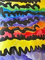
I love your colors! And the use of black to give definition and depth. When I look at the sharp zig zag line at the bottom and purple against its opposite yellow. It looks like a horizon of spruce trees in front of a yellow sunset below stacks of swirling reflecting clouds overhead.