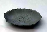
It looks fine the flowers in it are pretty. It looked like a jewelry dish. The craftsmanship is nice. The outside would look better if even.
- Remi on March 25, 2024
The color combination really give off the swamp vibes. I like how the dipped color is Matalic it gives a lot of dimension. The rafiia reminds me of trees and i liked how you brushed it instead of keep it how it came.
- Remi on March 25, 2024
The title picked for the piece describes it perfectly. The tassels hanging add a nice contrast and old look to the piece adding to the theme. The two different greens add balance to the piece and the texture helps boost that.
- Milenna(fan) on March 25, 2024
I like the way you tied the raffia and then untied the ends, it adds character. I like the metallic green and the way it contrasts the darker shade of green at the top. I also appreciate how neat the lines and texture was put into this.
- Amal on March 25, 2024
This is a very intricate piece with a form of perfectionism and imperfection working together harmoniously for the first time. It makes me wonder how you were able to pull off that off with the blending of the glaze and the additional thick thread knots which makes it look ancient. I love how the shape of it is very precise and put together.
- Shruthi on March 25, 2024
The shiny green with the matte dark green looks really cool. Your background i think made it look really good.
- Remi on March 25, 2024
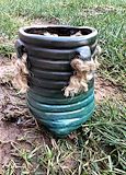
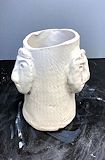
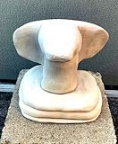
I love the legs the pot has, it really makes it unique. The texture also adds to the vibe the legs and slits are creating for the piece.
- Milenna(fan) on March 25, 2024
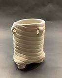
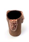
The inside of your pot really highlights the difference on the outside. The faces match really well to the rest of the pot. The glaze used on the heads accents the features on the face. It adds character and depth to the faces.
- Milenna on March 25, 2024
I like the texture on the clay and the slated top helps push the texture a lot. The legs are standing but sticking out which makes it look a lot like roots of a tree. The slits are nice and clean and out to the refined look.
- Milenna on March 25, 2024
I love the paddled texture on it. You can still see the features of the face from the side due to all the depth and height of the clay. The faces show a lot of emotion even from the side you can see it.
- Milenna on March 25, 2024
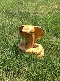
I think this piece stands out not just becuase of your craftsmanship but the way that you set it up for success in the grass. The spots along the snake’s body pushes its connection to the nature and colors around it. Nice work!
- Megha on June 13, 2023
The snake subtractive sculpture is a striking example of the artist's skill in manipulating form. The artist's use of negative space creates a sense of tension and energy within the piece. The way the snake's body emerges from the block of material is both dramatic and dynamic. this work is an example of the artist's ability to create a compelling narrative through the process of subtraction.
- Ava(fan) on June 13, 2023
The round is flowing nicely into each side view. The glaze added texture and balance in the overall sculpture. The piece is rendered together where the body and “legs” meet. The planned position creates a 3D illusion of the snake coming out.
- Shreya(fan) on June 13, 2023
The value tones at the edges push to show the 3D affect. The limited color palette creates a sense of maturity and nostalgia. The grounding and more light values in contrast to push 3D. There is side of the ribbon, and then a parallel line next to it that is narrowed when there is a change in direction.
- Shreya(fan) on June 13, 2023
The roundness in the snakes tail and face is extremely impressive considering it was crafted out of a solid block! I really like how he carved details such as nostrils eyes and a little mouth. These details give the snake a lot of personality. Additionally the grooves in between the snakes coil are perfectly crafted to show the snakes position.
- Maya on June 13, 2023
The ribbon has an amazing sense of depth. The overlaying of ribbons on top of each other as well as the value tones provide the piece with even more depth. The only suggestion I have would be to add a shadow underneath the piece itself in order to make it feel like the piece is sitting on a table. This makes the piece more realistic and provides even more depth.
- Evan on June 13, 2023
The animal you chose is very creative. I really like how you tried to create the illusion that the snake is wrapped. However, I dont like the eyes you put on your snake.
- Kaitlyn(fan) on June 13, 2023
This artwork is very unique and I can see the deepness. I can start seeing the shape of this snake. It’s still flat but I can start seeing you trying to round it out more.
- Jiya(fan) on June 13, 2023
I like the fact that you chose to do a snake because it is very creative. It’s not a typical 4 legged creature like most people did. In addition, the way the tail is wrapped around the body at the bottom shows contrast and levels of depth.
- Amal on June 13, 2023
The piece has great height. Although it is a little flat, the dimension and folds make up for it. The animal is very well visible in the art too.
- Tvisha(fan) on June 13, 2023
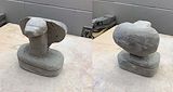
An exquisite example of an artisan pottery is this handmade clay pitcher with the shape of a snake head. A big reverence for the natural world or evoke by the serpents exquisite scale patterns and inexpertly facial features
- Mitchelle(fan) on June 13, 2023
This piece has length and a very good face shape. There is exaggeration on the edges to differentiate the layers. The subtractive sculpture is very balanced overall.
- Shreya(fan) on March 30, 2023
Working on this for a couple classes now I can see the progress you have made. The animal you chose is not very easy to sculpt and so far you’ve done a very good job with including all the features. The smoothness of the clay shows you’ve taken your time and have been gentle throughout this entire process.
- Danielle on March 30, 2023
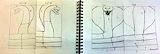
The simplicity of the design allows for the contour to be replicated using subtractive sculpture techniques. The depth is also easy to pick up on and really shows how the animal will come to life. I'm excited to see how the final product will come out in the end. (Salvatore646 COILED COBRA)
- Evan on March 30, 2023
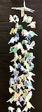
I enjoy the pastel hues used in this piece, which portray a calm feeling to the viewer. The creativity in the shape of the birds elevates the piece, and gives in a story. The negative space is perfectly balanced between the birds, and this brings gradual movement into the piece, like birds in a flock.
- Loukya(fan) on March 30, 2023
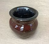
I like the shape of the pot and how smooth it is. I also really like the colors of glaze they used
- Shaina(fan) on March 30, 2023
I like this artwork a lot. I like how it’s glazed and how the color looks.
- Jiya(fan) on March 30, 2023
I like this artwork a lot. I like how it’s glazed and how the color looks.
- Jiya(fan) on March 30, 2023
Glaze is tricky to control but I really like the colors that you used. The contrast between the inside and the outside is really beautiful because it focuses on the outside which is more prominent rather than the inside.
- Nadja(fan) on March 30, 2023
The color of the peace provides a soothing and calming feel, almost like wood. The overall technique used in the pinch pot shows mastery over the process of the ceramics needed for the piece.
- Evan on March 30, 2023
The pinch pot is shaped and definite well. The colors compliment each other with the red complimenting the not so bright red.
- Renuka(fan) on March 30, 2023
I really like this artwork. The texture is very defined and the value tones from the shadows are very nice.
- Ernie on March 30, 2023
The draping in the practice I find to be quite interesting. The curve I feel adds another dimension to the piece, I'm curious how it will fit in with the gesture once the sculpture is completed.
- Evan on October 6, 2022
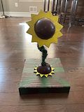
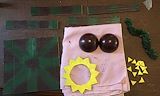
I like what you did in this art piece. I like the contrasting colors between vibrant ones and duller ones. I also like how you used tinsel as a texture tool and how the base is also in the shape of a flower
- Aidan on May 26, 2021
I like the wide contrast of colors in this piece. Also the texture mix is good with the shiny and round parts I also like the green tinsel looking piece you put into it.
- Aidan on May 26, 2021
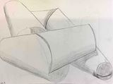
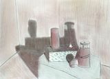
Great picture. Love the way you used the shading, makes it look realistic. Keep up the good work!
- Denise (Mother) on November 18, 2020
Awesome work.
- Sal on November 11, 2020
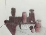
Great photo and illustrations.
- Sal on October 21, 2020
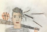
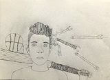
I like how in your sketch you used the abstract shapes of the arrows, not keeping them straight and also I like how you kept the other details of the drawing light while having the words be the most bold things on the page