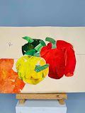
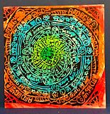
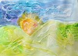
This looks incredible we see a good composition and use of color , i like the orange extending out of the frame
- Elliot (Father) on December 26, 2023
Wow I love this - this could be made in super size in oil
- Elliot on January 25, 2023
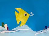
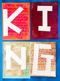
Mixing origami , handicraft with color background can be very interesting. Its a nice collage
- Elliot (Father) on November 19, 2021
Thank God for the wonderful palette we have to paint with! Love the natural child quality of the work it is very hard for an adult artist to do this. Keep it fun!
- Elliot (Father) on November 19, 2021
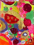
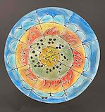
Yup the child-like quality shines thru. Its natural and filled with wonderful and calming use of colors and lines. The flames remind me of the sun - its filled with life
- Elliot (Father) on November 19, 2021
Ok i can totally see this as a funky bandana or some kind of island decor or even something ancient mayan? :) blue and orange for sure are complimentary i didnt know by adding a flourescent green could also look great - love the transition of Aqua in there. This pattern is very engaging
- Elliot (Father) on November 19, 2021
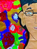
A very vivid piece! Strong punchy poster colors go well with a thick dark black outline of your face. I like the use of “brown paper” tone as the base skin color it matches our skin color very much! The exciting primary colors jump out of the page. The glasses are a great detail. Nice portrait - this is a success
- Elliot (Father) on November 19, 2021
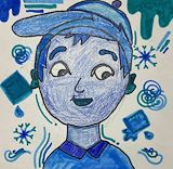
Blue is your favorite color and nice use of different shades if blue to create different gradations. If the world was black and white everything is just a shade of lights and darks. Adding just one color changes the mood immediately!
- Elliot (Father) on November 19, 2021
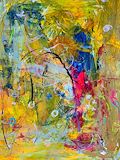
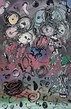
Hi Gabriel this is probably my favorite i like the use of pastel colors over a dull gray. The crazy strokes remind me of Jackson Pollack’s work!
- Elliot (Father) on November 19, 2021
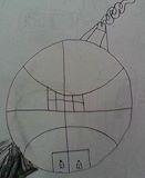
Great use of basketball lines to map out parts of the house!