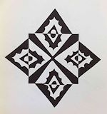
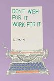
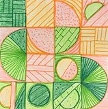
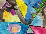
This is a really interesting composition! I like how the inner square is a reverse contrast of the surrounding diamond motif. It makes it appear as though the inner square is floating above everything else. Optical illusion!
- Dad on June 7, 2023
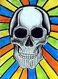
Whoa! That is an impressive skull! The shading really adds depth and make it look 3D. I also like the bright background colors you used in contrast.
- Dad on June 7, 2023
I love how you drew these creative letterforms and how they reflect your interests. Except for that letter A... That one looks a little "suss." ;-) Nice work!!
- Dad on June 7, 2023
OMG! you are getting better every day! Keep up the good work!
- Grandma on May 24, 2023
WOW!! Scary! Impressive! Good Job!
- Grandma on May 24, 2023
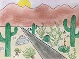
Those cacti and succulents look really well-drawn! Nice work!
- Ryan on March 15, 2023
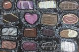
That looks great. It looks 3-dimensional. Adding fine details makes the pieces look like they have texture. You have highlights and shadows that make it look 3D. You have balanced well, the light colored items with dark colored items. No two items are the same. Each as their own character. Well done.
- Uncle Nelson on February 22, 2023
Very beautiful. I love the soft pastel colors. I thought that was interesting to add shadows to the trees and fence to give it depth/dimension.
- Uncle Nelson on February 22, 2023
Wow. From the small thumbnail image, I thought this was a photograph at first. Only when I saw a larger view could I tell that it was pastel/colored pencil. Great job, and nice attention to detail there!
- Ryan Chung on February 22, 2023
I love how you use colors to create the glow of sunset (or is that sunrise?). And I love how the trees cast shadows on the snow. Great job!
- Ryan on February 22, 2023
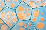
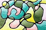
This is a cool abstract composition that reminds me of cellular structures under a microscope. The blue watercolor texture in the background really adds a nice quality to it.
- Ryan on December 28, 2022
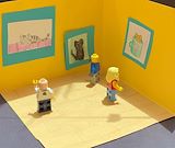
A little diorama. I like Legos too. Your choice of colors are bright and happy. You used contrasting colors--warm (yellow) with cool (turquoise) colors. Set in a common theme of cats. You are using your imagination, memory and creativity. Continue to expand your thinking. You have created a very nice piece of work.
- Uncle Nelson on November 25, 2022
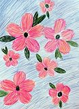
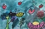
Flowers. I love real flowers. They are an example of how beautiful nature is. Good use of colors--using just 3 colors and using one color as your main color. At first, it looks like the flowers are placed randomly, they are in a balanced pattern. The pencil strokes are also deliberate--the flower petals and leaf strokes point to the center of the flower; the blue background strokes are all going in the same direction. Your drawing shows harmony. I like it.
- Uncle Nelson on November 25, 2022
You have a good sense for picking colors. Your choice of using a few tertiary colors works well for this project. This is very nice.
- Uncle Nelson on November 25, 2022
The description of creating this type of art is interesting. I'm glad that you are learning different methods used to create art. Learning these different techniques, increases your knowledge and skills. The colors you chose are harmonious. This is very nice.
- Uncle Nelson on November 25, 2022
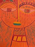
I love the bright colors and creative textures you used to make this composition extra interesting and the face so charming. Since you used a bright colored paper, this feels cheerful even tho this person appears to be crying. Joyful tears?
- Ryan on May 18, 2022
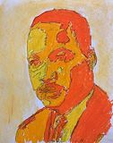
Whoa! It looks like Martin Luther King Jr. What a cool portrait/illustration!! How did you go about making this!? I like the high contrast and analogous colors you used. Nice job.
- Ryan on April 6, 2022
Okay, this really appeals to my design aesthetic. I LOVE IT. Great use of geometric patterns and color! I really dig the composition and color palette too.
- Ryan on March 23, 2022
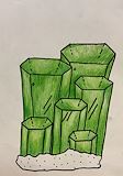
Sry, I just saw this! This is very well done!! Really nice line work and coloring in. I even like how you used dotted lines to hit at the angles in the back of each crystal. Reminds me of Kryponite!
- Ryan on March 23, 2022
You did a wonderful job! I really like the flowers and the colors.
- Therese (Mother) on March 17, 2022
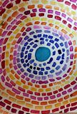
This design feels light and airy to me! It seems like it is swirling in a circle.
- Nana J on March 17, 2022
Cool!!!
- Ryan on January 27, 2022
Yes, that's you--a girl after my own heart! Great illustration work, Kira!
- Dad on November 10, 2021
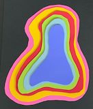
I like your color combinations and abstract/organic shape layers. It really feels 3D! I could easily get lost in that void. Nice work!
- Dad on November 10, 2021
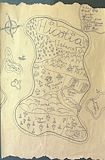
Awesome illustrated map! You know I like maps. Wish my work maps were this charming! I like how you made the paper look weathered and torn as if it's been well traveled. So cool!! =D
- Dad on November 10, 2021
Wonderful drawing. I love the colors and shapes. I hope you get to do more artwork and share it on Artsonia. Take care and keep learning and being creative.
- Nelson on July 25, 2020
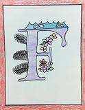
I love illustrated letter forms like this. You did a great job including visual elements that start with 'F'.
- Ryan on March 18, 2020
This feels kinda dreamy with the soft lines and warm colors. Nice job.
- Ryan on March 18, 2020
Cool abstract work!
- Ryan on March 18, 2020
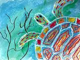
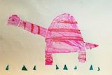
Very beautiful, Kira. I love the use of color in the turtle and especially the color and texture in the background. I feel like I'm riding on that turtle's back, like in that Japanese fable. Nice work!
- Ryan on March 18, 2020
I really like this artwork because it shows a turtle who seems to be slowly gliding along below the viewer. The turtle is also transparent while at the same time colorful. It is obvious Kira plans well as she creates her art. And, I am wondering if she has named her turtle or wonders about the turtle's family.
- Johanna on March 18, 2020
This is interesting. Several different art techniques in this simple image. Contrasting straight lines with curved. Solid colors contrasted with translucent colors. Positive space contrasted with negative space. This is a good piece in creating abstract art using different techniques. Learning art is fun. I wonder if the images are meant to tell a story?
- Nelson on February 19, 2020
Wow. Beautiful. You balanced warm colors (yellow and orange) with cool colors (shades of pink and white).
- Nelson on February 19, 2020
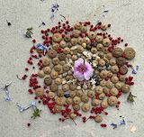
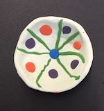
This is very beautiful. You have an eye for balance. There is a combination of symmetry and asymmetry of the images and I like the way you added the 3 red dots--that adds interest to the monochrome scenery. Very nice.
- Nelson on February 19, 2020
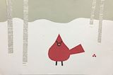
This is really charming. I like the beautifully simple composition and the texture you used in the tree trunks. It totally reminds me of a Charley Harper print.
- Ryan on February 5, 2020
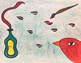
I love this picture. It is well balanced. Although the cardinal is alone, he doesn't look lonely. He looks happy. The colors are contrasted well. Great job!
- Aunty Michele on February 5, 2020
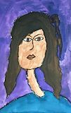
Very nice. Pleasant use of split complementary colors and basic shapes with simplified lines. This is a good exercise of the Modigliani self portrait.
- Nelson on December 27, 2019
I know with the third "F" stands for: Feathers!
- Nelson on December 2, 2019
Illuminated font/letter/initials. Very unique. Not typical. That's good that you experiment and try different designs. But remember that copying a style can also help you develop your own style. A little sample here, a little sample there. You are looking for a design that you like and represents your personality. Looking at this design, I'm guessing it's about things found in nature that start with the letter 'F': Fish, flowers and ferns? Fish, flowers and fuzz balls? Fuzz balls can be found in nature and the color is grey. And I see that you put a red frame around your illuminated font (the color red complements the paper's green color). I'm also guessing your favorite color is red.
- Nelson on December 2, 2019
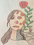
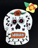
Day of the Dead art. That's a pretty skull. I'm guessing it's a "she." Though she may be dead, her head is covered in life--with leaves, flowers and hearts. The Day of the Dead is to remember those who have left this life and to celebrate as their souls come back to us. Feliz Dia de los Muertos. In the U.S., we have memorials and days of remembrance for those who have died. During the Day of the Dead fiesta, it's a time to celebrate and remember the good thoughts of those people who have gone by. I hope you get to enjoy and not be afraid of Dia de los Muertos.
- Nelson on November 1, 2019
Awesome! Scary but pretty. I bet the skull is a girl. I love the hearts. I also love the dots around the eyes and flower. Keep up with the good work! Grandma
- Lucille on November 1, 2019
Dear Kira, I really like this piece. It helps me imagine "Day of the Dead" and shows the care you take in making an idea into a good design.
- Johanna on November 6, 2019
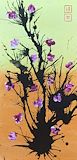
That's very beautiful. It's calming yet full of action. The green and brown background is soft and gentle. Horizontal line between the colors gives the feeling of calm. Whereas, the black lines are powerful and explosive ending with beautiful purple flowers. The vertical and diagonal lines gives the feeling of action/movement. The design shows balance. The background colors divide the image equally in half horizontally. The center black stem divides the image vertically yet gives way, gives space, to the two red boxes in the upper right corner. The two black branches on either side of the center branch give equal weight to the painting. The bigger, lower branch on the right is balanced by the smaller, higher branch on the left with the center branch adding weight to the left at the top.
- Nelson on October 23, 2019
It is really lovely. I love it
- Grandma on October 11, 2019
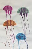
Beautiful. The colors are in harmony. Good use of colors...brighter or lighter colors give the appearance of advancing (coming forward) and darker colors give the appearance of receding (being in the background). The orange and the green jellyfish are lighter hues and they are larger in size, while the magenta and the blue jelly fish have darker hues and are smaller in size. You are doing so well in learning art and design. -- Nelson
- on June 28, 2019
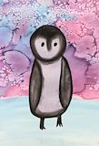
I am wondering if your penquin is a baby penquin. What is she or he is looking at? I am wondering if one of his/her feet is raised up to take a step or if it is raised to avoid something we cannot see that is on the ice or under the ice. I am looking forward to hearing your story about this penquin. -- Johanna
- on June 20, 2019
Oh so cute. I love what you've done with the colorful background. This artwork is simple, yet detailed. It's also reverse color isolation, where the main subject is in black & white, while the background is full of bright colors. It's very beautiful. -- Nelson
- on June 20, 2019
Lovely. I like how you painted flowers into heart shapes. Nice balance of weight--you gave distribution of images across the top-half and bottom-half on either side of the green branch in the middle. Even across the bottom-half with the insect being in the upper part is balanced with the largest flower in the lower right-hand corner. You also balanced dark and light colors. You are developing an eye for design. -- Nelson
- on May 29, 2019
3-dimentional art--cool! That is very nice. I hope you get to work with finger paint and clay. -- Nelson
- on May 8, 2019
Kira: I see a cute little bird emerging from a nest or a hole in a tree. I love it! Keep up the great worK! Love, Grampie -- David
- on May 8, 2019
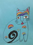
This is very nice. Your cat makes me feel like it's a mellow cat. "Meow" The color blue can represent peacefulness. In the Bible, the rainbow is a sign of peace from God to Noah. I find it interesting that you made the shape of the pupils like a human. Does this cat represent someone I know? -- Uncle Nelson
- on April 26, 2019
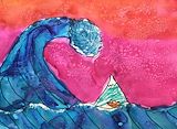
Wow. Exciting. Tsunami. Stormy seas and angry sky. I like your use of colors. Another great artwork. -- Uncle Nelson
- on March 27, 2019
Wow. Cool. Yes, I like the textured background too. Your painting reminds me of work by Salvador Dali with the fluid shapes. Very nice artwork. -- Uncle Nelson
- on March 27, 2019
I like the texture you used in the background. Your line work is really impressive too! I like how this composition seems to tell a story of it's own. -- Ryan
- on March 20, 2019
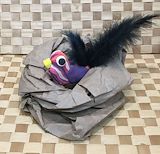
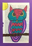
Very creative use of a page from a book to use as a surface to illustrate on and use as a background. Your artwork has dual meaning. An owl is a symbol of knowledge and wisdom and the dictionary is source of information. You also chose harmonious colors that work together. This is very nice. -- Uncle Nelson
- on February 13, 2019
This is a very serious, wise owl who is also very colorful! -- Johanna
- on February 13, 2019
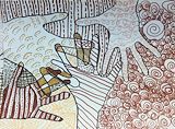
I see "diversity" in this piece. The colors are harmonious. The open hands are reaching out to one another. -- Uncle Nelson
- on January 23, 2019
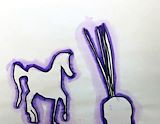
Very, very nice. I like horses too. The colors black and purple go together nicely. -- Uncle Nelson
- on January 23, 2019
Very beautiful. I love the bright happy colors. -- Uncle Nelson
- on January 23, 2019
I bet this was fun to make, Kira! I like how you challenge yourself to do art that is more and more adventurous. It looks like you experiment and see what happens! Your hands overlapping in this artwork remind me how important touch is for everyone. -- NanaJ
- on October 24, 2018
SO COOL, KIRA! I love all the patterns and details you used and how they change where the hands/fingers overlap. Your use of color seems very fitting too. Wow! =D -- Daddy
- on October 10, 2018
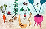
Very nice. Your artwork has improved. This has detail and lot of action going on. It's a story about life. And it seems you are learning biology of plants and insects. That's wonderful that you are learning about our world. -- Uncle Nelson
- on June 6, 2018
Wow! So very proud of what a talented illustrator you’ve become, Kira! This is SO COOL! I love it. -- Dad
- on June 6, 2018
Yay Kira! Love your garden above and below! -- Johanna
- on June 6, 2018
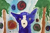
Good job! I love the blue dog. -- Lucille
- on May 16, 2018
Blue dog. Creative interesting images. A nice watercolor painting. -- Uncle Nelson
- on May 16, 2018
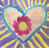
Very lovely. I feel the flower symbolizes beauty and the heart symbolizes love. The yellow lines are the love and beauty radiating out or toward the heart. -- Uncle Nelson
- on March 21, 2018
I am wondering if you turned your paper around as you were making this piece. There is something interesting in each part! -- Johanna
- on March 21, 2018
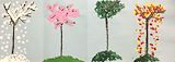
The four seasons. Very beautiful. -- uncle Nelson
- on February 28, 2018
Wow! So Beautiful! I love it. I can feel the seasons change. Great work Kira! -- Aunty Michele
- on February 24, 2018
Very nice. Keep up the good work. -- Nelson
- on February 21, 2018
I am wondering if this huge animal is looking for something. I see it is much much larger than the trees around it. Could this animal have lived thousands of years ago? -- Nana
- on February 21, 2018
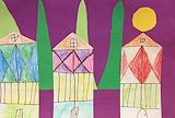
I like your tall houses near the trees. I am wondering what is upstairs in the tallest part of each house! I am also wondering if the sun is coming up or if the moon is full and heavy in the sky. -- Nana
- on February 21, 2018
I am wondering about this piece. It reminds me of so many things! However, what I hope to hear is what you are thinking about as you choose your colors and create designs while you are actually creating. What is in the mind of the artist is important! That is one of the things I look forward to when you visit. Hearing your thoughts while you are creating will be so much fun! We will do art together! -- Nana
- on February 21, 2018
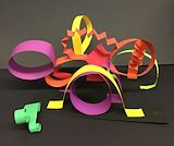
Hi Kira, I have a T shirt with this artwork on it! It reminds me of a carnival with rides and excitement! Love, Nana -- Johanna
- on February 21, 2018
Wow. Interesting. I wonder what this represents? It could be many things. I see a pattern of 3-3-2. The green triangles and the red stripes (three on the long rectangle/neck, three on the dome/body and two each on the smaller shapes (triangle, squares)) I wonder if the school would let the artist to give their work a title and allow the artist to comment on their work? Good job Kira. Thank you for sharing your work. I think one of your favorite colors is red and tints of red (lighter shades of red). -- Nelson
- on January 18, 2018
Another wonderful creation. I can feel the golden sun setting behind tall trees or mountains within a purple sunset sky. Again, the use of variety in the color of the trees, the color of the buildings and each building has a slightly different design. Very beautiful. -- Nelson
- on December 6, 2017
Beautiful! I love the bright colors. It looks festive and happy. I like the contrasting circles and curves with the zigzag shapes. Variety is the spice of life. -- Nelson
- on December 6, 2017
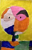
Brilliant! It's a modern Picasso. I love that you are exploring different subjects. The use of different colors on the person is like representing the different emotions people have. I look forward to your next work of art. -- Nelson
- on October 21, 2017
I really enjoy your artwork. Love you always. Grandma -- Lucille
- on October 18, 2017
I love it! This is awesome! -- Auntie Michele
- on October 18, 2017
This is great. Thank you for adding me to your fan club. I love your art work. Good job. I look forward to your next artwork. I hope they will be able to show 3-dimension art work too on your Website. Remember to keep a digital backup of your artwork so years from now it will bring back good memories of your time at school. -- Nelson
- on September 22, 2017
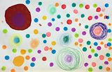
I love your colorful and pretty dots. Please make more pictures. Love, grandma -- Lucille
- on September 22, 2017
What fun to see your artwork, Kira! Everytime I look at it, I will smile and wish you were here so I could hug you. -- Nana