I love the colors you used for this. It fits really well with your robot! :) -- Izzy
- on April 4, 2018
Dobbyyyyyyyy!!!!!!!!!!!!!!!!!!! -- Emma
- on April 4, 2018
Yeeesss Nicole! I like your shading! -- Emma
- on April 4, 2018
This is super cool. I like the gradient. -- Emma
- on April 4, 2018
very cool -- Matthew
- on January 31, 2018
I love your logo! It's simple and easy, but it shows the message that needs to be shown. Great Job! -- Izzy
- on December 6, 2017
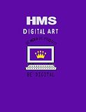
I love this! The way everything complements each other is so cool! And I love the "Be Bold, Be Proud, Be Digital" part. One thing I wish you did differently was the color of the words. The black and purple are really dark and so it would've been nice if it was easier to read. Great job though! -- Izzy
- on December 6, 2017
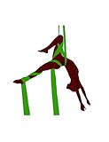
This seems so well photoshopped. I love the green silks, it complements the lyra dancer so well :) -- Izzy
- on December 6, 2017
Amazing job! silks look so fun! -- lena
- on December 6, 2017
WOW these colors are amazing -- bob
- on December 6, 2017
Just spectacular -- bob
- on December 6, 2017
WOW!!!!!!!! This is the best thing i've ever seen! -- Noah Shillings
- on December 6, 2017
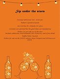
I like how the stars look like they are about to spill out of the glass. It looks super cool! -- Izzy
- on December 6, 2017
WOW!!! THIS IS ABSOLUTELY AMAZING! -- Lisa
- on May 17, 2017
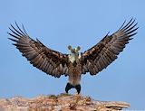
I really like the combination of animals you chose, and it looks realistic. -- olivia
- on May 17, 2017
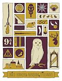
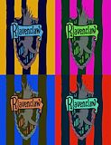
This is a really creative pop art. There are the colors that match Griffindor and some important parts of Harry Potter. Also it was really creative about the different sizes and shapes of boxes. -- Mya
- on May 17, 2017
I like this piece of artwork because it has an symbol for each year 1-Mirror 2-Fang 3-Deer 4-S.P.E.W 5-Dark Mark 6-The Potion (Snape is Potions Master, The Half Blood Prince) 7-The Deathly Hallows (P.S- Number six took me a bit to figure out) -- Adam
- on May 17, 2017
I really love this because it captures the essence of the Harry Potter series from the perspective of the reader. The colors really compliment each other in a way that brings it all together! I love it! -- chloe
- on May 17, 2017
I love this!! Great job! -- Jennifer
- on February 9, 2017
Nicole, I love this! It's so interesting to look at. I love how the huge lady is flying off the seesaw! It is also cool how you have the huge guy flying away with Hedwig. Good Job! -- Izzy
- on February 9, 2017
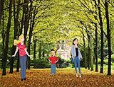
I like the spacing between each letter. I feel like this makes your art feel nice and clean. This artwork is very impressive. You found things on the photowalk that... I would never be able to find. Great Job!! -- Izzy
- on February 9, 2017
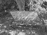
the value makes the picture look mysterious. i like how one simple thing like a bench can make the whole thing look meaningful. the place looks like it was abandoned. -- danielle
- on February 9, 2017
I like this picture because the bench is a leaning to one side it appears. The angle I believe really helped this picture have the potential it actually has. I don't know how you did it Nicole, but it looks really good. Great Job! -- Izzy
- on February 9, 2017
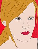
Great job! I love the color on her lips, it just goes really well. I love how it matches the red background. Her hair also looks really good. I love it! -- Izzy
- on February 9, 2017
Awww, I miss Dobby. I was watching Harry Potter and the Deathly Hallows part one last night, and sadly had to watch Dobby die. I love how you did a picture of Happy Dobby, and when you told me you were making Dobby, this was NOT the picture I had in mind. You did way better on this than I could've even possibly done. As said before, I was watching Harry Potter last night and I wanted to say that when I saw Dobby each time, I remembered your pop art and started thinking, I can actually see it tomorrow!! Great Job on this artwork Nicole! -- Izzy
- on February 9, 2017
Go Gryffindor, Boo Ravenclaw!!! You did really great on this project, although your house selection... not so great... but that's beside the point :) I like how in the first copy you kept close to Ravenclaw colors and definitely did not go off to Slytherin colors, or Hufflepuff... or unfortunately, even Gryffindor. I do love how all your projects are Harry Potter themed, except your Out Of Sorts (I already know because you told me what it was). I love the hues you decided to use for the actual pop art part. If blue and partially yellow weren't Ravenclaw colors, I would totally choose the bottom right with the red, navy blue, and mint green color. Great job though! -- Izzy
- on February 9, 2017
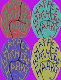
Great job Nicole!! Looks yummy :) The first copy looks looks exactly like the one Hagrid gave to Harry on his 11th birthday!! I love how detailed it is, I wasn't even sure an eleven year old made it... but of course I knew it was yours when I saw Hagrid's handwriting... and spelling. Happy BirthDAE Harry. Overall, you did really great on this project :) -- Izzy
- on February 9, 2017
Nicole I did the same exact picture!!! Great job! Looks exactly like mine... -- Izzy
- on February 9, 2017
WOW!! I love this piece! I love how you used rustic colors too! I think my favorite part is the magic in his hand! I think you did a great job on his ears and wrinkles. -- Katelyn
- on February 9, 2017
The colors you used were nice an the pop-art was wonderful. -- Evenyka
- on February 9, 2017
I like the pop-art tile of Dobby. -- Zachary
- on February 9, 2017
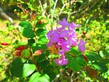
I like how bright the photo is and how much the flower pops. When I look at this photo the flower is the first thing I see. Overall, I like the angle the photo was taken at and how bright the colors are. -- Emma
- on February 9, 2017
I like the flower in the photo. It has a lot of color. I like how it is more focused on the flower thn on anything else. -- Benjamin
- on February 9, 2017
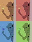
I love Harry Potter, i love how you got every spark (or mostly) when dobby snaps his fingers. -- Mackenzie
- on February 9, 2017
I am a Harry Potter fanatic as well I love your little Dobby! -- Camryn
- on February 9, 2017
i like the hair -- lalya
- on February 9, 2017
i like the hair -- Nicole
- on February 9, 2017
i love how you put so much detail into this project. You paid attention to proportion and made sure it didn't look off. Good job. -- sky
- on February 9, 2017
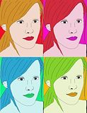
I really love your pop art tile. I really like it when you outline Emma Watson and coloring her.It was a really good choice that you chose her for your project.I wish that you can teach some tips on how to do the pop art tile. -- Deanna
- on February 9, 2017
In this I see Hermione Granger <3. She looks really nice! Everything looks amazing, from the actual first copy (top left) to the others that have their hues changed. I love the color of the lipstick... its so dark. Its also amazing how the hair and lipstick sort of make the other stick out. I think this was an amazing piece by Nicole because all the colors go smoothly with each other and it just seems to be a great piece of artwork :) -- Izzy