i like how you made the panda shadow look . nice ! -- destiny :)
- on May 24, 2016
shoudlve blended boy -- - destiny
- on May 23, 2016
his eyebrows look good after you shaded them in or whatever -- - destiny
- on May 23, 2016
I like the pics you took!! -- marc
- on May 16, 2016
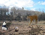
i like that mark on the tree :) -- destiny :)
- on May 16, 2016
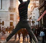
you're so close to the camera -- destiny (:
- on April 7, 2016
Best one ive seen -- AHaah
- on April 5, 2016
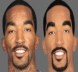
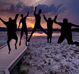
yo ryan who's that boii to the far right -- marc
- on March 28, 2016
i like the background -- destiny :)
- on March 28, 2016
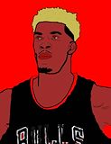
Jimmy butler is raw -- Boyy
- on March 14, 2016
woaw!! kinda scary lol, but nice!! bruh keep it up!! -- 3point specialist marc
- on March 14, 2016
Blackkkkk -- Babyyyyy
- on March 14, 2016
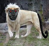
i like the lion as a hell cat thats cool -- mark
- on March 14, 2016
EVERYTHING IS SQUARE. -- [unnamed]
- on March 8, 2016
lmaoo watermelon but good choices for your favorite stuff -- destiny (:
- on February 29, 2016
GOOD JOB I LIKE THEM SHOES THO ALSO I LIKE HOW YOU KEPT YOUR HAIR AT THE TOP OF YO HEAD. -- keiton
- on February 29, 2016
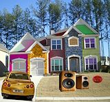
I love all the colors on the house, it's really cute and looks really realistic. -- Cat
- on February 1, 2016
nice pic!!! But why so many colors? -- Shawn
- on February 1, 2016
This artwork is the best you've done so far. sooooo talented!!! keep it up bruh. -- marc
- on February 1, 2016
8/8 gr8 m8 -- josie:))
- on January 21, 2016
i just LOOOOOOOVE what youve done here. mlg gg 10/10 best ever. I like the top part the most -- Kevin
- on January 15, 2016
YOU sir, are very talented! I like everything you've done here. 10/10 good job 360 noscope. MLG gg -- Kevin
- on January 15, 2016
I like how you used my background but it's ok -- Josh
- on January 5, 2016
is this jimmy butler -- Josh
- on January 5, 2016
I like how you copied my background. It's ok. :| -- Josh
- on January 5, 2016
The picture has a some different dark colors in it, the colors match and blind in with each other. I think RYAN DID A GOOD JOB ON IT CONSIDERING he was working with dark colors like that.overall he did well. -- marc
- on December 14, 2015
the picture has a lot of different colors in it and a-lot of meaning.I think Ryan could have done a better job on placing the girl somewhere different where it would have looked more realistic.overall i think Ryan did a good job with it. -- marc
- on December 14, 2015
why is his hair yellow?but nice pic -- shawn
- on December 14, 2015
nice pic!!!!!!! -- shawn
- on December 14, 2015
i like what you used for the letters and it is easy to tell what the letters are in this artwork -- Alycia
- on November 16, 2015
umm.i like how you did it but doesn't look cool...... -- shawn
- on November 16, 2015
Wow this is really good, I like how I can tell what the letters are, the letters you chose show lots of lines and some are 2d while others are 3d. -- Emma
- on November 16, 2015
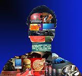
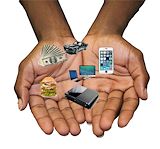
I think what you chose for your hands was really relatable to the things we all wish we could have. if you managed to put "make a wish", your charity logo, I feel we could see what your charity is, more so. Good job though :) -- RS
- on November 3, 2015
Join my fanclub -- Vanessa
- on November 3, 2015
OMG! THAT IS SO COOL! YOU ARE VERY TALENTED!!!!!!! -- Kevin