the most contradicting photo ever -- andrew the best friend ever
- on May 2, 2016
This one also did not have a comment so -- Andrew;)}}}}}}}}}}}}
- on March 17, 2016
This one did not have a comment either so -- Andrew;)}}}}}}}}}}}}
- on May 2, 2016
This did not have a comment so here -- Andrew;)}}}}}}}}}}}}
- on May 2, 2016
OMG THAT PICTURE *INSERT LAUGHING EMOJI* -- Andrew;)}}}}}}}}}}}}
- on May 2, 2016
dude is your dad writing these reflections? -- Andrew the best frand ever
- on March 14, 2016
This looks very professionally made and I enjoyed looking at it.* insert laughing emoji* -- Andrew the best frand ever
- on March 14, 2016
NIKE, just do it. -- Luna :)
- on March 14, 2016
This is kinda cool. -- Luna :)
- on March 14, 2016
Full Moon Ritual? -- Luna :)
- on March 14, 2016
I like the font which gives the illustration an overall feeling of it being old -- elijah
- on February 25, 2016
this is really good -- graysen
- on February 29, 2016
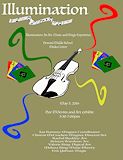
I like the texture of the playbill but I feel like it severely contracts with the white blocking of the logo. Still I love it. One of my faves yo. Good job Boostie. -- callieeee
- on February 29, 2016
I like the big boy words! *insert laughing emoji* -- Andrew
- on February 12, 2016
this is really good! -- gray
- on February 12, 2016
This sample of still life is very superb. The nike symbol actually catches my viewpoint. The bed looks cozy and snug as a bug in a rug. I have no clue why that black square was placed there. But otherwise, great craftwork. My vocab tho ;) -- Josh
- on February 12, 2016
Hi. That moon look like a cookie. Now I'm lowkey hungry. And those clouds look like puffs of cotton candy :). Those birds look like mustaches. But nice brick wall, I think, and the girl look A1 so awesome job. -- Josh
- on February 12, 2016
OML!!!!!!! -- Emmanuel
- on January 25, 2016
This is cool beans. Love the simplicity. -- Luna :)
- on January 25, 2016
Is this the guy from twilight? -- Josh
- on January 25, 2016
Callie kissing up oh well -- Josh
- on January 25, 2016
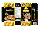
As soon as I saw this, I was drawn in. Besides having the gorgeous Ronaldo on the cover, your blockage and color pallet sets a powerful tone. It shows the strength and boldness of the person and the content behind them. You go Drosin. -- Callie yoooo
- on November 30, 2015
This is good , the only thing i would different is make it so the whole barcode is there . -- Aubrey
- on November 16, 2015
of course u would do that -- michaele
- on November 16, 2015
This artwork totally resembles you oh my goodness. Good job dude. -- Luna :)
- on November 16, 2015
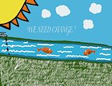
I agree with Vanessa but I really like the fish :) -- Ty
- on November 16, 2015
Nice work. You could've spent a little more time on the fish but overall it looks good. -- Vanessa
- on November 2, 2015
This is soccery. -- samantha aka fav daughter
- on November 2, 2015
i love all ur nike signs and the cleats this is a really cool moodboard -- michaele
- on November 2, 2015
this is really good i like how u added the witch to this it makes it more whole and the forest is realistic but not to reall and i like how u put all the infor at the bottom -- michaele