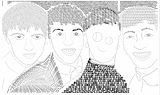
I like the arrows in the mid-section of the HMV. Hildi did a good job on this project. -- Emma
- on March 7, 2018
I think Hildi did a good job! -- Emma
- on January 31, 2018
This is really good despite Mr Smiley in the middle but he honestly makes this piece so great -- Eislinn
- on December 27, 2017
I love the perspective you created with so many different elements. The muted tones of the irregular cobblestone texture contrast sharply with the clear vibrance and repetition of the palm leaves creating an energy in this magazine cover which draws you in. This would grab your attention on any newsstand! Beautiful Job! Wish we could have seen it at WP Art Festival! -- Julie
- on March 20, 2017
Good job Hildi. This logo really represents you, and what you enjoy. -- Emma
- on March 15, 2017
Awesome work! Just love it ?? -- Peppi
- on December 7, 2016
I see that you did a plain gray background and you used the keys "command" and "shift". The purple text really stands out to me. I think you were really trying to make it cute and funny. The thing I like is that you used the keys instead of just putting command and shift, so it brings the viewers attention. Good Job!!!!!!!!!!!!!!!!!!!!! -- Anabella~
- on November 23, 2016
i like how you used the keys to say a phrase, but the phrase doesnt really make sense. The command part is understandable. but the "shift into focus" is kinda hard to understand. Also, if you used other colors it would have made the artwork brighter. the idea is very creative though. -- genesis
- on November 8, 2016
I love this artwork because it just... FITS. It is cute how the actual keys are created into the art. I think you did really good! -- Izzy
- on November 8, 2016
Hey! I love the Beatles. They are a great band. I love how you did the logo on the road. It gives it a nice touch, referencing it to 'Abby Road'. -- Brandie
- on November 8, 2016
This artwork color scheme compliments the furniture. I think the feeling you were going for was calm and cozy due to your dark color scheme. This artwork is great the color scheme matches the furniture it's all perfectly spaced. To me there nothing you can fix because it's all ready perfect. -- Courtney
- on November 1, 2016
This artwork has a giant lion in the background and is made up of warm colors. The color of the title really compliments the color of the background. The feeling I think you were going for is calm. This artwork is unique unlike the others its plain yet full. I think the information is spaced out perfectly, I just think you could make the date, place, and time stand out a little more. I also think that if you didn't zoom in so close on the lions head it would be even better but I still like it how it is. -- Courtney
- on November 1, 2016
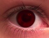
i love how the colors make your eyes follow to the center. -- skyla
- on May 24, 2016
i love the way you blended the colors together and i really like the eye. -- skyla
- on April 30, 2016
I just love the eye. The photography is just beautiful! -- Becky
- on April 23, 2016
This is an amazing picture, it has emotion and texture,I love this photo (By the way, I was Mystery Person ;D ) -- Madeline
- on March 29, 2016
This is an amazing photo. This photo makes you wonder where the girl's legs are. The negative space leads your eye to the cloud and the girl. A way to improve this was instead of blurring out the girl's face, you could have had her be faced downwards. I also enjoy the slight transition from light blue to dark blue. -- noelani
- on March 18, 2016
I love how the story is clearly told without any words. The complementary colors of orange and blue make the photo even better. -- Mya
- on March 18, 2016
GREAT JOB WITH THE PICTURE.I LIKE HOW YOU YOU ACTUALLY MADE IT LOOK LIKE A DREAM WITH THE CLOUD AND THE COVERED UP FACE -- JABRAEL
- on March 18, 2016
This picture looks like a painting to me. The good thing is that it looks like it's from a dream. Overall, Good job. -- Caden
- on March 18, 2016
this is a good photo because it has a good range of objects. ther...... intresting -- landon
- on March 17, 2016
Amazing -- mystery person
- on March 17, 2016
i love how the eyes match its face and the rest of the portrait. -- skyla
- on March 17, 2016
I like the texture of the paper towels in the background against the smooth pepper. The picture has a fun and funny element because of the faces on the fruits and veggies. it has a lot of different values on it. One tip: Maybe try playing with the lighting next time. Really good picture overall. :) -- Lia :)
- on March 9, 2016
This photo does have an interesting focal point. In future artworks, I suggest trying to darken some of the values, or make the focal point larger. -- Erik
- on March 4, 2016
I thoroughly enjoy looking at this photo because of the textures in conveys with the old rusted metal. This photo is almost telling a story with the light coming in the right with darkness following. The values in this photo are very good is seems that you progress from gray in the front left of the lines ,which becomes a black shadow in the middle then back to gray and just a line of white light in the back right. The art is almost secretive like were boxed in. The message that I receive from this photo is that we are thinking in a box. -- Aja
- on February 25, 2016
I think this is a very visually engaging (and kind of spooky) photo. the fact that you look like a ghost in this photo makes it cooler. -- Chaney
- on February 24, 2016
if you used flash on this that was a good choice -- callieeee
- on February 24, 2016
The shadow of the chandelier resembles a spider web pattern. The darkness of the shadow contrasts to the bright lights of the chandelier. -- Bryce
- on February 18, 2016
I love how there is shadow in your artwork. It gives contrast to the photo which makes it even better than it already is. -- mya
- on February 18, 2016
I like how you got to zoom into the photo so nicely and when you take the photo really counts, and you took this photo when the lighting was just right. -- Madeline
- on February 18, 2016
I like how you made the cars actually look like they where in the area, but you could have made some of the dogs smaller for perspective but the rest of this project is very nice. -- Madeline
- on February 18, 2016
I like how you got this close up picture and how focused you got the camera in on the main part of the picture, this is an amazing photograph! -- Madeline
- on February 18, 2016
I like the emotion that you set in this picture and where you took the picture and what the picture is of, nicely done. -- Madeline
- on February 18, 2016
I very much like how you captured this photograph. I like how you got your camera to only focus on the lock, very nicely done! -- Madeline
- on February 18, 2016
I like how you captured this photo. The lighting and the quality of the photo is very nice. Amazing photograph! -- Madeline
- on February 18, 2016
This is a very good photo, I like how it's not completely focused up close and farther away, but it is more focused in the middle of the photo, very nice work! -- Madeline
- on February 18, 2016
This photo looks really cool! I love the the background of the photo is blurred from the rest, and makes the rings stand out. I think you did a very good job! xx -- Genesis
- on February 18, 2016
cute.i love how the dogs are playing on the street. -- skyla
- on February 18, 2016
Inspiring! -- Julie
- on February 18, 2016
I like the way the lock is positioned for the rule of thirds. -- Hildi
- on February 18, 2016
I love the rusty metal lock and blue paint great composition. -- aja
- on February 18, 2016
This photo makes me think of old time roads back when they were made of bricks. -- Zachary
- on February 18, 2016
Your picture is amazing and perfect for shape. It definitely speaks to me. -- Mya
- on February 18, 2016
This is a still-life, and the main interest is in the foreground. It is outside, horizontal, and realistic. The colors are orange and green. -- Lia
- on February 18, 2016
This photograph has really great texture because the lock is rusty , the wooden door looks rough , and the handle looks smooth. This photography also has great quality. -- Isabel
- on February 18, 2016
This is an amazing photo. The first couple of things I see is the patch of green in the back. I also noticed the red object in the back and the white picket fence. I also noticed the emphasis on the stone walkway. ---Jerry
- on February 18, 2016
in this photo i see a still life picture of a doorbell. It is in the foreground, with a grey wall in the background. It is realistic, and it is vertical. The doorbell is scratched and worn. -- Lia
- on February 18, 2016
the bricks are in the forground and the middle ground.and theres a patch green grass in the background. -- Landon
- on February 18, 2016
I like how the stones going upwards adds a nice effect to the photo.This pattern moves your eye across the photo,making the viewer see all of the photo -- Erik
- on February 18, 2016
The way the image focuses on the ground only makes it a good image. You did a great job with looking for a right position for the photograph. -- Mariangeliz
- on February 18, 2016
In this photo,i can see two hoops hanging in a playground near trees.I think this picture could be described as modern.This photo does a great job showing the rule of thirds.The time of the day is daytime.This photo is a great photo!Keep up the great work! -- Caden
- on February 18, 2016
I really like the photo! It's very great how it's rotated and the focus is on the bricks in the middle. Overall, I like your picture! -- Makala
- on February 18, 2016
I see a red door, a white fence and a patch of bright green grass, with neutral colored stone. -- Aja
- on February 18, 2016
I like how the picture shows feeling. I also like how the lock on the door sort of tells a story, and the focus is only around the lock. -- Charlotte
- on February 18, 2016
This is a great example of texture! -- Guy
- on February 18, 2016
This is a cool plant. It is a close up so you can see all the different textures. Good job. -- Riley
- on February 18, 2016
Wowza! I really love the picture! I really like the focus on the stem, showing the thorn. It's much more different and unique from all of the flowers, not saying that anybody else's isn't as unique as this one aswell. Somebody better give you an award! :^) -- Makala
- on February 18, 2016
This is very creative. You did a great job taking this picture. -- Catherine :D
- on February 18, 2016
I like how you compared the plant to the close-up picture! -- Charlotte
- on February 18, 2016
The branch is very detailed, and it stands out against the blurred background. The thorns stand out the most, and they follow the rule of thirds. -- Lia