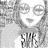
The way you created this is so cool in itself. I love the theme you used. This is so good. -- Izzy
- on January 17, 2018
Looks Nice -- Matthew
- on January 17, 2018
Great job!!! -- Kayla
- on January 17, 2018
So cool!!! And so creative!!! -- Bella
- on January 17, 2018
This is AMAZING!!!! There is so much detail! I also love the title. -- GIa
- on January 17, 2018
i love this. you did a really good job. i like how you used the word basic and then described it. -- molly
- on January 17, 2018
Wow! This must have taken a long time to make. It turned out really cool! -- Katelyn
- on January 17, 2018
wow! this is really good! Great job -- Tait
- on January 17, 2018
This is so cool! It looks like it took a lot of time and patience. Great job! -- Emma
- on January 17, 2018
i really like how there is starbucks in it, and the font of the words. i think you should of made the hand a little more detailed. -- amara
- on January 17, 2018
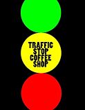
I thought that this idea was very creative! To combine a traffic light with a coffee shop. -- Mya
- on December 7, 2016
I really like the colors you used. -- Lizzie
- on December 7, 2016
I like the pun you used, it is very clever. You used the four colors maximum, the colors you chose were well chosen for this project. -- Xaden
- on December 7, 2016
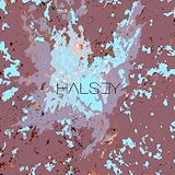
I love the splash of colors.The blue red purple,and diffrent shades.THrow focus on the main attraction of the photo(the photo in the middle). -- Amarilis
- on December 7, 2016
I like the text that you used and how it looks like a real album. -- Paris
- on December 7, 2016
Lemme guess... Halloween. YUM! -- Ryan B.
- on December 7, 2016
Good Job! -- Ryan B.
- on December 7, 2016
Woah! -- Ryan B.
- on December 7, 2016
HAH! Ava be like "YAY!" -- Ryan B.
- on December 7, 2016
Wow, Good job! -- Ryan B.
- on January 17, 2018
Woah! That's Awesome! -- Ryan B.
- on December 7, 2016
Nice! -- Ryan B.
- on January 17, 2018
50 shades of... What was I saying again?.. -- Ryan B.
- on January 17, 2018
Nice! I like it! -- Ryan B.
- on January 17, 2018
Woah! That's cool! -- Ryan B.
- on January 17, 2018
Good Job! -- Ryan B.
- on April 11, 2018
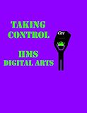
HOI SOPHIA! Good job on the Playbill! I hope you win the contest -- Ryan B.
- on April 11, 2018
I love how the colors just seem to blend together and the font you used is really cool.(If you typed it.) -- Mya
- on April 11, 2018
I really like the final product, Sophia did a really good job. The album cover look really creative, and I think the "paint" splattered on the background looks really cool. Overall, I think this project turned out really good. -- Emma
- on April 11, 2018
this is really cool I think that the backroung is really dark but otherwise i think it is really good -- molly
- on April 11, 2018
this is a really cool album cover it would make me want to hear the music . You did a good job -- molly
- on April 11, 2018
Nice artwork and also nice shoes -- Dillon
- on April 11, 2018
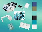
I like the the turquoise color scheme chosen. You could have straightened out the furniture though, it looks odd in an askew position. Your color swatches are perfect squares, and are all connected, you could have lined them up on color order (black, dark green, dark blue, etc.) -- Xaden
- on September 20, 2016
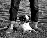
Looks very cool and I love how you did the coloring with lighting on your dog,the water, and your feet. ----Emma S. -- Emma
- on September 20, 2016
I like how there are only 3 colors, truly depicts shading. (The 3 colors I see, are blue gold and white. Is that correct?) -- Guy
- on September 20, 2016
i did this last year in my art class. i think your lines in this could have been a little more straighter. the triangles in the bottom left corner look like they are leaning. overall you did a good job. -- keiton
- on September 20, 2016
this is a very cool picture. i like how you made the colors look in the picture.also i think that you should have let the grass go all the way across the bottom part of the picture. also i like your dog it looks just like my dog that i used to have when i was 10. -- keiton
- on September 20, 2016
i really love how you put a puppy in this photo because it makes excitement. -- isabel
- on September 20, 2016
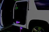
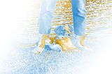
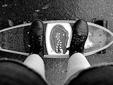
This photo is quite interesting due to the reflection in the window and the shoes floating in the air by the car. The color scheme adds nice contrast and mystery -- Aja
- on September 20, 2016
I really like how you made the details stand out. -- isabel
- on April 11, 2018
The photo is really interesting because the glow of the sneaker attracts your attention. The sneakers are on the rule of thirds so that makes it attract your attention as well. -- Courtney
- on April 11, 2018
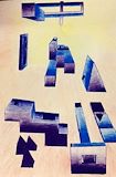
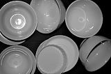
this is a a good photo because it has a good range of values.and the pieces are every where -- landon
- on April 11, 2018
WHAT IS THAT -- keiton
- on April 11, 2018
GATORS BUBUB -- keiton
- on April 11, 2018
WHAT WAS THE POINT OF THIS -- keiton
- on April 11, 2018
GREAT PICTURE -- keiton
- on April 11, 2018
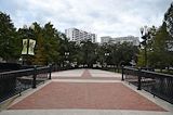
LAKE EOLA. -- keiton
- on April 11, 2018
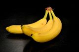
BANNANANNNNAAASSSSSS -- keiton
- on April 11, 2018
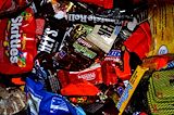
SO MUCH CANDY YUMMMM YUMMMM YUMMMMMYY -- keiton
- on April 11, 2018
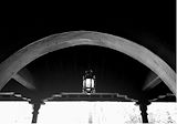
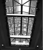
This photo is relaxing to look at because of the calming grays around the window. The photo also is telling a story like we're in New York with the buildings high in the middle . The photo also has a great variety of values from the gray borer and white lights to the black steel on the window. -- Aja
- on April 11, 2018
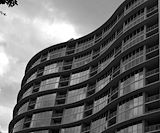
This photo is really fantastic because the building is very unique and is really emphasized because of the clear background. -- isabel
- on April 11, 2018
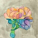
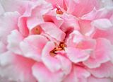
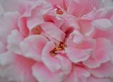
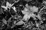
You have used the rule of thirds well with the flower off to the right. The leaves and twigs help lead me through your photo and it goes right to the flower which is very interesting for the viewer. -- Mya
- on April 11, 2018
i wonder where that is... -- Adam
- on April 11, 2018
This photo is so cool. It took me like 5 seconds to figure out what it was. -- Marlie
- on April 11, 2018
I like how you chose a black background. It shows great emphasis. -- Isabel barkley
- on April 11, 2018
Let the bright sweet parts of life help you get through the hard time. -- aja
- on April 11, 2018
The way my eye moves through this image is from the bottom to the top of the banana. I enjoy the emphasis of the banana. The value and the line make this photo very interesting. -- Noelani
- on April 11, 2018
i like how the edges are blended -- Haley
- on April 11, 2018
I see a flower and in the background some leaves. -- Xeleen
- on April 11, 2018
I see a still life of a banana with a blank background. -- Xeleen
- on April 11, 2018
Love the simplicity of this piece. Very nice! -- Luna :)
- on April 11, 2018
i really like the flower that you used and you implemented rule of thirds perfectly -- Alex :)