Wow! This looks perfect! From the shadows to the facial features, this is very clean and precise! Nice job! -- Emma
- on March 5, 2018
I absolutely love this and the message! I like how you had have the speech in the background! NICE! -- Emma
- on March 5, 2018
This is great!!!! -- GIa
- on March 5, 2018
This is so inspirational~ Great job! -- GIa
- on March 5, 2018
Great Job! You are so talented! Not many people can do stuff like this, I know I can't! :) :P -- Bella
- on November 8, 2017
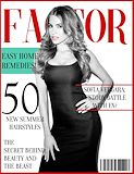
This looks like a magazine you would d buy at Public. It looks very realistic and professional. Overall, Genesis did a good job on her project. -- Emma
- on April 25, 2017
wow. this looks so real. I could totally see something like this in any store that sells magazines. I like how you added the shadow behind her so she looks like she is actually on the cover. The captions also sound very real and appealing. -- //morgan
- on April 25, 2017
Very talented. Great Job Genesis. I'm such a proud mom -- Mariela
- on February 28, 2017
THis design is very cool and well thought out clearly. -- Mya
- on December 5, 2016
I thought this was a very creative design! I think it's really cool that the M looks ike it has eyelashes. -- Mya
- on December 5, 2016
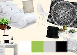
i really like the colors you used and all the furniture and plants are super cute -- izzy
- on November 14, 2016
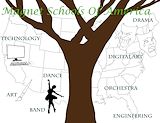
hey genesis :) i like the way you made the map with the tree in the middle. it makes the different types of magnets really stand out. i also like the way you put a picture for each of the magnets. -- //Morgan
- on November 7, 2016
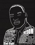
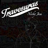
first off,nicky jam OMG.I love the faded graffiti in the background .It adds sum color and feel to the photo.and the white cursive letters. -- Amarilis
- on November 7, 2016
I like how you outlined the person it looks really cool:)) -- callie
- on October 27, 2016
There is a man outlined in white in front of a wall of graffiti. There are a lot of organic lines to make the outline of the person and really exaggerated lines for the graffiti. The colors are monotone for the foreground and very tinted bright colors in the background. The graffiti can maybe represent a rebellious nature to the person below the title. I think this a good piece of art and everything fits with each other. -- bryce
- on October 3, 2016
love the style of the album cover with the graffiti in the background. Great job! -- Marlie
- on October 3, 2016
I really like the color scheme... Its nice and calm -- Graham
- on October 3, 2016
In this artwork I think your grafitti background is very relevant to this artist. The outline is very unique and well drawn. Maybe if you made the background black and white then the colors would match and since the person is crying, then the black and white background would be very relevant. -- Noelani
- on October 3, 2016
I like how the lines and outlines look realistic, and how the colors really go well together. -- //Morgan
- on October 3, 2016
I really like the colors you used and how the green sticks out from all of the neutral colors. The objects are spaced out very nicely. Great Job! :) -- Emma
- on October 3, 2016
Yes fren, all the clique bows to you. |-/ |-/ |-/ |-/ |-/ |-/ -- Haley
- on May 23, 2016
Love this song. Amazing job Genesis. :) -- Luna :)
- on May 16, 2016
It looks so pretty and the color choices are very good. -- Marlie
- on May 10, 2016
I want gummy bears.... -- Henry
- on April 29, 2016
The left eye is in the middle of the photo... And the sun attracts attention to the eye. I think this turned out great! -- G R A M
- on April 7, 2016
A real masterpiece. That's all I have to say. -- Austin who's not a frog
- on March 14, 2016
Yes! Grey's Anatomy<3 I like -- Nayeli ;)
- on February 29, 2016
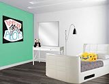
Really nice proportions. The 'Twenty One Pilots' poster and the emoji plush pillows give it a feel of a teenager's room. The bed is in a nice place, and matches with the dresser. Looks cool. -- RS
- on February 8, 2016
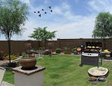
Looks really good!! I like the birds you added. -- Bao
- on February 8, 2016
I think this looks good,it looks like a teenagers room. I just feel the picture is bad quality and if you had a better quality picture it would completely make it great! -- Kaylee
- on February 1, 2016
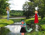
rapunzels hair is a little weird but i like it. -- josie:))
- on January 4, 2016
The artwork is very convincing that people are almost real and alive. The artwork shows a great deal of technique. Along with the color variations the color contrast is really amazing. For example,the way the colors contrast on the person with the turquoise shirt and her bright green hair makes her really stand out from the other two characters. Overall the artwork is very well thought out and planned. The artwork is very beautiful. -- Makyla123
- on January 4, 2016
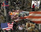
I like how you turned your whole arm the American flag. -- TS
- on November 2, 2015
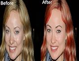
I liked how Genesis made everything look so natural and effortless. I think the only problem was that when Genesis changed the hair color there was a little bit of blonde hair still there. -- Gabrielle
- on October 19, 2015
I think the chin is certainly cleaner and the skin looks much more young. The hair is also very neat, and the hue is really good. -- Graham
- on October 12, 2015
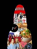
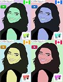
I like what you did here, I think all good pop arts you can tell who they are. And with yours I know exactly who this is. Plus PLL for life <3 -- Katie
- on October 5, 2015
Your artwork is very detailed and has a nice hue. -- Emily