I love the way all of your designs flow together. Great job! -- erin
- on March 4, 2016
I like the way you drew the facial features, especially the eyebrows and lips. -- erin
- on March 4, 2016
I like the piece, but the pinky could have been smoother. -- Michael
- on February 23, 2016
I like that you had fit everything in there. -- Michael
- on February 23, 2016
This looks great. :) -- Laylah
- on February 16, 2016
I like the tiger. -- John
- on February 16, 2016
Wow! You put a lot of work into this piece. Keep up the good work! -- Mike
- on February 10, 2016
Nice! -- Ava
- on February 10, 2016
It looks realistic. I like the plaid. And the anchor and chain(pearls?) is a cool touch. The border looks like a brick wall. -- Avery
- on January 8, 2016
The colors used in here are great~ -- Laylah
- on January 6, 2016
Beautiful picture and an amazing poem!! -- Mom
- on October 29, 2015
Love it!!
- on September 28, 2015
I love the detail and the way it really look like the same on each side! -- Arlan
- on May 13, 2015
I love the colors, and the pattern is really cool! I like how you used bright, happy colors in your piece. -- Lily
- on May 13, 2015
I love this it is adorable. -- emma
- on May 13, 2015
Really like the randomness of the splatters ---Mom
- on May 11, 2015
Very good. Love the colors -- Linda
- on May 11, 2015
Wow! Fantastic! -- Michael
- on May 11, 2015
The pattern is beautiful and fits well with the color scheme! -- Ashton
- on May 11, 2015
I like the way it's reflected. -- Ashton
- on May 11, 2015
I love the way it is balanced. -- Arlan
- on April 28, 2015
This quilt design is a absolutely beutiful. -- emma
- on April 28, 2015
Would make a beautiful quilt
- on April 27, 2015
Beautiful!! Love Mom
- on April 27, 2015
Love the colors you used!!
- on April 27, 2015
I really like the design used on the wings! -- Gabriella
- on April 24, 2015
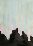
I love the pretty waterfall and the rocks have wonderful texture! -- Sophie
- on April 21, 2015
I like the balance of colors. -- Ashton
- on April 21, 2015
This one is the most creative out of all the ones in this category. Plus, I really like The Lord of the Rings. -- Kadyn
- on March 28, 2015
Ever since I was 5 I was watching "Lord of The Rings", so this was a pleasure seeing something of my past. Thanks -- Angelo
- on March 28, 2015
This is really cool! I love yellow and grey together, they are really pretty. I also love the design, I love the eyes and lips, they are beautiful. -- Lily
- on March 25, 2015
That is one beautiful whale. -- Ashton
- on March 24, 2015
This is really well done, the symmetry and the facial expression are great! -- Glenda
- on March 18, 2015
These are interesting. They remind me of microscopic organisms. -- Diana
- on March 18, 2015
This is a very special piece as it represents someone close to you. It is a nice tribute to them. -- Greg
- on March 18, 2015
The design is very interesting. Does it have special meaning to you? -- Ray
- on March 18, 2015
Well done! It is good to see art and science being combined! -- Grace
- on March 18, 2015
This is unique take on the blue dog. You are very creative. -- Chris
- on March 18, 2015
This is really cute. It looks like a whale to me. -- Rachel
- on March 18, 2015
This is an interesting concept. You were able to combine an understanding of Morse Code with beading to create a lovely piece of jewelry that has special meaning to you. Keep up the good work! -- Beatrice
- on March 18, 2015
Love the colors on this one... -- Aunt Shannon
- on March 14, 2015
Love your tatoo - hope it has special meaning to you... maybe one day you can make it real ;) -- Aunt Shannon
- on March 14, 2015
Came out very good! -- Charisse
- on March 12, 2015
Nice job on your art piece, and I really like how you made the swirls his eyes. -- Alyssa
- on March 12, 2015
I like your driftwood art piece. It looks really cool. -- Alyssa
- on March 6, 2015
This is such a cute piece. It looks like a whale to me, but you are the artist and if you say dolphin, it must be one. Keep up the good work! -- Bea
- on March 5, 2015
It looks like a cute dolphin. -- Ashton
- on March 3, 2015
The detail in the drawings is good! Good job! -- Morgan
- on February 24, 2015
It looks very realistic. -- Ashton
- on February 24, 2015
I love the waterfall it is awesome! -- Sophie
- on February 13, 2015
Your graphite drawing looks so much like the real butterfly leg!
- on February 10, 2015
The light ray gives this piece an interesting feel. Great job! -- Morgan
- on February 10, 2015
I absolutely LOVE the colors used in this piece! -- -Mary
- on February 3, 2015
Wow! You did GREAT on this one! I like the way you made it form. -- -Mary
- on February 3, 2015
I like the waterfall you made there! Nice touch! -- -Mary
- on February 3, 2015
I love this piece of artwork because it has an aged look to it. -- Leah
- on January 28, 2015
The color is very unique -- Ashton
- on January 27, 2015
I like how you show your understanding conscept in your piece. -- Brennon
- on January 13, 2015
You learned from a mistake. That is a good thing. Next time I am sure you will be more careful.
- Patricia (teacher at South Crowley Elementary) on January 6, 2015
Wow, I love the textures of the tear and the eye. -- Sophie
- on December 10, 2014
I like the heart border you made on this piece. The rest is really good too! -- Chris
- on December 5, 2014
This creepy my reasoning for this is its like all my fears wrapped into one. (ps the skull with the bulging eyes is from a childhood favorite , a song called crooked teeth) -- Angelo
- on December 5, 2014
You demonstrated an understanding of the techniques and achieved good depth by combining both techniques. Keep up the good work.
- Patricia (teacher at South Crowley Elementary) on December 4, 2014
Great picture! I like the different designs that you put on it. -- Alyssa
- on December 5, 2014
You did a great job creating a macabre collage. It has just the right amount of creepiness to it and is fun to view. -- Kamann
- on November 15, 2014
This is really interesting. I like it. Keep up the good work! -- Chris
- on November 15, 2014
This piece is very girly. I like the soft colors and the way it looks so light and dainty. -- Ellen
- on November 15, 2014
Wow that was a great collage! It was very weird, which makes it better and all of those things look so out of place. Especially, the huge head and the saw. -- Erin
- on November 14, 2014
It is so pretty! The colors blend perfectly with each other! -- Lily
- on November 12, 2014
Your use of complimentary colors makes this piece really pop!
- Patricia (teacher at South Crowley Elementary) on November 10, 2014
The use of pastel colors gives this piece a soft look. Keep up the good work.
- Patricia (teacher at South Crowley Elementary) on November 10, 2014
This piece shows you understand the concepts of macabre art as well as collage!
- Patricia (teacher at South Crowley Elementary) on November 5, 2014
Patience is hard to learn. Don't be discouraged when a project takes longer than expected.
- Patricia (teacher at South Crowley Elementary) on November 5, 2014
Your choice of three neutral tones for the paint job on this piece is good.
- Patricia (teacher at South Crowley Elementary) on November 4, 2014
The organic, flower-like shape of this piece makes it appear delicate. It is attractive. Keep up the good work.
- Patricia (teacher at South Crowley Elementary) on November 3, 2014