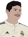
I like how well you did the hair and how you got the wrinkles in the shirt. The logo is really well done to. -- Xaden
- on January 4, 2017
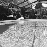
I like this picture because it has a little bit of something different to look at. The way the pool looks is really cool. I like the trees behind the house because it just looks like it's own private little pool in the wilderness. Good Job! -- Izzy
- on January 4, 2017
I like this soccer team a lot. I think the tracing was really good. I like the colors in it. -- Benjamin
- on October 5, 2016
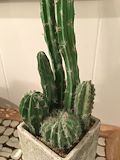
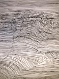
I like how you did the shading, it looks like it's popping out of the paper! -- Mackenzie
- on January 4, 2017
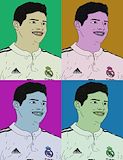
It looks like the picture is half under water, that's cool!! -- Mackenzie
- on January 4, 2017
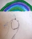
I like the color of the rainbow. -- Zachary
- on January 4, 2017
I like the value of this photo. -- Zachary
- on January 4, 2017
very nice details!
- on January 16, 2015
I like your art work,because it is colorful -- Benjamin
- on January 16, 2015
amazing,is that a pig? -- Brandon
- on January 16, 2015
i love how you outlined it with a darker color, it makes it stand out more -- olivia
- on November 26, 2014
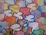
Awesome job using value and color to really compliment the shapes and make them look as if they emerging from the paper. -- Jude
- on January 16, 2015
your artwork is so pretty i like the way you colored all you things i dont know what they are sorry but its very nice -- sergina
- on November 15, 2014
Good job. because you curve the line at the hand it makes it really look 3D I really like this artwork because it looks like the hand is really sticking up from the page :) -- Hazel