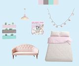
i like how you used different fonts :) great job -- genesis
- on November 23, 2016
I think that this art is very cool. The colors of the bedroom are super nice and appealing. -- MaryJane
- on November 8, 2016
I really like how you organized the information is and the art doesn't have an impact on the color of the font. Everything looks great. -- K3825 P325216
- on November 8, 2016
i love twenty one pilots. i also love the colors that you put on the album. keep up the good work! -- imani
- on October 25, 2016
This is amazing, everything looks so realistic! you are very creative! -- Marlie
- on October 4, 2016
I like the colors you chose for your room and how well everything goes together. My favorite part about your room is the Melanie Martinez poster -- Emma
- on October 3, 2016
I really like the shadow you used on your playbill. I also like how it contrasts with the bright background. Everything works really nice together. Good job :) -- Emma
- on October 3, 2016
I really liked all the colors you used . This scene from the movie was so nice, and its really cool that you incoorperated it into your work. The only thing i would change is the font you used. overall 10/10 -- genesis
- on September 27, 2016
I like the shadowy Pride Rock figure on the artwork. I also like the text spacing as well it makes the text easy to read. You could make the allstars logo small though. -- Xaden
- on September 27, 2016
This artwork is fantastic. I like the melting colors that relate to the original album "Twenty One Pilots". The melting words are clever and they relate to the image. Maybe you could have included the person or the piano from the original album. I fail to see how the pen relates to the album. A clever thing to do could have been to hint one of the songs in the album. -- Noelani
- on September 28, 2016
I love how you put the information on the bottle, very clever. Also I like the design of everything and the details are very good. -- Kaneo
- on September 27, 2016
I love you use of size and color and text font -- Delaney
- on September 27, 2016
This is very creative and pretty!! -- Marliehayes
- on September 13, 2016
I really like how you displayed the information, the background color is a fall color and relates well, like the color of wine. -- Xaden
- on September 13, 2016
I really like the idea you added with the wine bottle. You added the information into the wine bottle which was very creative. Good job -- Emma
- on September 13, 2016
You are one fashionable king kong...(thats his name right?!?) -- Julia
- on April 11, 2016
Don't fall down! -- Henry
- on April 7, 2016
I love this! This was defiantly a good album! (/0-0)/ -- Haley
- on March 29, 2016
melanieee ! omg i love this sm -- gennaa
- on March 29, 2016
oh my god this is amazing (?^?^)?*:·?? -- lizzy
- on March 29, 2016
This is so good i love how she is crying over everyone thats really cool amazing work!! -- Ellianna
- on March 28, 2016
this is so amazing omg! -- izzy
- on March 28, 2016
i love crybaby good job i should try that its cool -- yeah bru
- on March 28, 2016
I really love this!! This looks really good! I love This album!!! -- Victoria
- on March 28, 2016
This is great! Haha, everytime I look at it I smile. Love it! :))) -- Camryn
- on March 15, 2016
Don't you dare think I don't see Patrick, fren. -- Pete Wentz
- on March 9, 2016
i like this a lot the colors go great together :) -- matria
- on March 7, 2016
Love the llama and the greens -- Beth
- on February 2, 2016
I love miranda, I love the colors, I love every single thing about this ever. -- Julia
- on February 1, 2016
I love this a lot. The colors work really well together and it's just really pretty. It also looks realistic which means you got the skills to pay the bills. -- Julia
- on February 1, 2016
Llamas. Cool house too. -- Guy
- on February 1, 2016
I like the simplicity of this room with the edges of the furniture. The objects on the media center add nice small elements. And even though there aren't many objects, the room looks entertaining. -- Callie
- on January 27, 2016
thats cool -- mark
- on January 25, 2016
this is so adorable! -- Haley
- on January 5, 2016
I like how you set the background as Hot Topic. You did a really nice job on changing their hair colors and clothes. Keep up the Good Work! -- Christie
- on January 5, 2016
The artwork is very adorable and should be put in a daycare for children because it is very child friendly.The artwork shows lots of technique. The artwork is very colorful and cute. I would honestly put this in my room one because I love cats and it has great quality. -- Makyla123
- on January 5, 2016
I really like the colors and I like Llamas :3 -- Emma
- on January 4, 2016
awww i did aspca as well and i think u did great -- AT
- on January 4, 2016
i love how you put hot topic in the background, i love hot topic -- Haley
- on December 17, 2015
This looks really great! Good job! ¯\_(?)_/¯ -- Katie
- on December 17, 2015
You did a great job at making Ariel look natural in the surroundings. I love what you did to her coloring too. Awesome! -- Camryn
- on December 17, 2015
THIS IS SO CUTE -- Emma
- on December 14, 2015
I love Ariels hair and clothes. It really looks like the princesses are wearing those clothes. good job on this artwork -- Emma
- on December 14, 2015
it looks like those princesses are actually there in real life . you did a rlly good job for the clothes ! overall everything is pretty good . -- destiny :)
- on December 14, 2015
this is cute and colorful -- Reyce
- on November 17, 2015
Good job! I like T Swift. That's who I did for some of my projects. -- AT
- on November 17, 2015
Meow, that is so cute! -- AT
- on November 17, 2015
The colors you chose are bright, and catch my eye. I love your pop art! -- Emma
- on November 17, 2015
Love your new piece! The green makes it look like the animals are floating in your hands. C u soon! -- Aunt Tracy
- on November 5, 2015
super cute, and great editing!! love the background and the sun rays. probably my favorite artwork in this section! -- kayla
- on November 3, 2015
I really like how you made the grass in your hand so....natural. It seems almost as if you are actually holding the grass and the cute animals.:) -- Austin
- on November 3, 2015
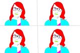
I like how you changed Taylor's appearance completely. This looks really good. -- Reana
- on October 21, 2015
I can see on the left a happy taylor swift, but on the right, still happy, goth taylor swift. The shirt and the lipstick color go from red to black. I believe that this was done to be humorous, not "omg taylor swift is secretly goth, goth confirmed!" -- Adam
- on October 21, 2015
I really like how you made her look goth, and make it look really realistic! I also like how you took it a step further and colored her clothes! -- Katie
- on October 21, 2015
I really like how it looks so real, and how you made her sort of gothy. Overall this is really good! -- izzy
- on October 19, 2015
Dat t-swivle hair doe -- Ellianna
- on October 19, 2015
YOU MADE HER GOTH!!!! -- Ellianna
- on October 19, 2015
This is amazing! I love how you only made subtle changes but still changed the piece entirely! Also, the choker looks like it wasn't even photoshopped on! -- Cynthia :3
- on October 21, 2015
i love how you just completely turned her into a gothy Taylor Swift . looks like she did her makeup herself & its just really good :) . -- destiny
- on October 19, 2015
I love how you used dark colors for her makeup it's very different -- Emma
- on October 16, 2015
I think it was interesting how this artist took taylor swift without makeup and gave her this more edgy look. I really enjoyed how this piece stands out compared to many others! -- Gabrielle
- on October 13, 2015
I like how you went for a different aspect of the Real Beauty project. Everything in this photo is very natural and real. Good Job! --- Genesis :) -- Genesis
- on October 13, 2015
I like how the narwhal doesn't look too realistic, very simplistic. I also love the colors. -- Chloe
- on October 13, 2015
The bright colors really work with the photo. You did a good job outlining her. I like how her skin and the glass lenses are the only things that don't change color, it looks very nice. Good job! -- Camryn
- on October 13, 2015
The simplicity of the artwork is incredible. I love it Tristyn. :) -Luna -- Luna
- on October 13, 2015
I think maybe we should send this to Taylor, because even if she tried to dress up like this, yours woulds still look better. The additions look so realistic. How did you add that choker? it looks amazeballs. -- Julia
- on October 13, 2015
This is Totally one of my Favorite ones! I love how you changed Taylor Swift into gothy Taylor! Great Job!!!! -- Victoria
- on October 16, 2015
I like how you added in the goth style with Taylor Swift, it matches her. -- Aiden
- on October 12, 2015
I can really tell the difference between the photos and I like that. -- Marlie
- on October 12, 2015
I like your creative interpretation of goth T-Swift. This is a really original idea and I haven't seen another like this! I'd put that design on a shirt. Swift-tastic work! [See what I did there?!] -- Josie?
- on October 12, 2015
Wow! This looks exactly like T-swift! Love the colors!! -- Josie
- on October 12, 2015
Its a Pandacorn! If you had some color I think the image would pop out a little bit more. -- Julia
- on October 5, 2015
The color scheme is beautiful and I like how you kept it nice and simple so there wouldn't be too many things at once happening -- Aiden
- on October 5, 2015
I love the colors and how much it looks like T Swizzle! -- Julia
- on October 5, 2015
I like how you used the contrast of colors in this picture. You did a very good job on this pop art project. You did the right size of lines for everthing. -- Sarah
- on September 29, 2015
I like your color scheme . The color scheme goes well together -- Kaylee
- on September 26, 2015
This narwhal is perfect....I will name it squishy. Great colors, fun vibe. The curves are great and the cartoon is awesome. I think it's cool that the narwhal's horn goes off the page. -- Justin
- on May 19, 2015
it's so cute!!! -- amalia
- on May 19, 2015
Hey, tristyn let me join your fan club -- SARAH
- on April 28, 2015
Tristyn: your art works keeps getting better. I'm so proud of you. -- Lorain
- on March 18, 2015
HAPPY BIRTHDAY -- SARAH
- on February 24, 2015
WOW love the water fall and how it looks so real -- Hayley
- on February 18, 2015
I like the colors and the fact that its a narwhal -- Ana Sophia
- on February 18, 2015
I like the variety of colors and shades you used. -- Faith
- on January 29, 2015
i really like pandas but I would have wanted a spot on his tummy -- Alex
- on January 6, 2015
I like the the design of the character very cartoon-like -- Ana Sophia
- on January 6, 2015
Keep it up Girl. You are doing great. Quite an artest! -- Gene
- on December 13, 2014
i like how the color does a fade in each shape and how u have one with a sold color that makes it stand out -- jennah