Very mysterious... The perspective was created artistically and the colors cooperate well. -- faith
- on June 6, 2016
This looks real and professional. Good job on the info and colors. -- faith
- on June 6, 2016
Good job with the silhouettes and the colors. -- faith
- on June 6, 2016
These pictures are so cool and fit really well with the camera. Good job! -- Emma
- on April 19, 2016
This is really good it looks like an actual cereal box. -- Emma
- on April 19, 2016
good job!! -- sam
- on April 6, 2016
this is rly good -- sam
- on April 6, 2016
WOW! THIS IS SO ORIGINAL! OMG! :3 I JUST LOVE <3 HOW YOU MADE THIS BOX 10/10! like omg! Keep up the swell work! you do so good!!! -- Kevin
- on April 6, 2016
This looks really realistic!! good job! -- kayla
- on April 6, 2016
I really like how you made the cereal box and the theme is great. -- Emma
- on April 6, 2016
I just <3 how you made this artwork! ^w^ how you made it is just fantastic! Even the gods would compliment your work!!!!!!!! -- Kevin
- on March 16, 2016
omg! this is soooooo goood! 10/10. Even the gods would compliment your work! I just love how you made it all colorful and stuff! truly amazing! -- Kevin
- on March 16, 2016
I love how the mountains are really detailed, and how the outfits look just like the movie. I also love the way you positioned the characters! -- CJ
- on March 14, 2016
This is absolutely AMAZING. I love the amount of detail you put into this!! I also love the color choices you used. This is very original and creative. The only thing I would suggest is changing the font to a little something less common. Overall great job!! -- Kayla
- on February 29, 2016
This is really good! The shadows are spot on! -- Cyndy :3
- on March 1, 2016
Cool I like how you did the COLORS. -- Faith
- on February 23, 2016
Cool! Good job on the clothes and textures. -- Faith
- on February 23, 2016
This is so creative and unique! I think this one should have won! -- Cynthia :3
- on February 5, 2016
This is a really nice artwork. I like it a lot. -- Keanu
- on November 16, 2015
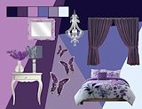
I'm in love with the purple color scheme here. A bedroom like this would be amazing. :) -- Luna :)
- on November 16, 2015
I love the color scheme you used for your mood board. The colors create a calm mood to your room -- Amalia
- on November 2, 2015
I love the way you presented this. You did a great job at showing the people even without faces, I can really tell who they are. Great job! -- Camryn
- on November 2, 2015
I enjoy the contrast of the two sides yet the similarity of the set up. The message comes across clear and I like the bold, filled in elements. -- Callie
- on November 2, 2015
The way you used positive and negative space to create a story in the image is amazing. -- Andrew
- on October 19, 2015
I love the black and white values on this, and I think the shapes are very organic and well-made. The words in the different characters look cool. Good job! -- Genesis
- on October 19, 2015
This looks really cool. Its vey complex and well defined and creative, but yet its very clean and the blocked shading is perfect for all the info. This is just awesome. -- James
- on October 12, 2015
This artwork has a black and white, or neutral, color scheme. The use of the characters is very creative and visually appealing. The text placement is smart and fits into the playbill. I love this, great job! -- Camryn
- on October 12, 2015
I like how you included so many unique ideas. -- Reyce
- on October 12, 2015
I think it would look better if it projected a more creepy feel. Into the Woods is a creepy name. Although, unlike the others, the picture does not reveal too much about the play. -- Dylan
- on October 12, 2015
I like the design. -- Alex
- on October 12, 2015
Nice work. It is really creative. -- Vanessa
- on October 12, 2015
This is really creative and good!!! -- Kayla :))
- on October 5, 2015
I love the wine glass constellations! -- Chubbs
- on October 5, 2015
I like how this logo shows more creativity because of the artistic background from the paint brush and paint. -- Sam V
- on September 23, 2015
The gradient effect is pretty cool -- James
- on September 23, 2015
Nice design, the black grass looks good. -- James
- on September 22, 2015
I like how you created your flyer by emphasizing the under stars and using wine glasses as constellation. -- Joelle
- on September 22, 2015
I like how the letter's texture makes them look like they were actually painted.;-) -- Piper
- on September 22, 2015
I love how you did a blur of the disney princesses. -- Kennia
- on June 15, 2015
Congrats! -- Kate
- on April 6, 2015
I love how there is not only great shading and coloring in the pear, but also in the backround. -- Piper
- on April 6, 2015
Really cool:) Great job! -- faith
- on April 6, 2015
That is so cool how modern it looks but it's still cartoony. -- Ariana
- on April 6, 2015
This is really cool. You did a greta job blending the animals and made it look realistic. -- Tori
- on April 6, 2015
It looks like the characters belong in the picture. Good job! -- caroline
- on April 6, 2015
This is great!! The shadows look amazing!! -- Kennia
- on March 30, 2015
I love how you made it look like the dog has hair! You did a great job! -- Catherine
- on March 16, 2015
This looks really cool! It looks like one person. Good job! -- Keira
- on March 16, 2015
This looks cool! Congratulations! -- Jennah
- on March 16, 2015
This is so good! I like the varirty of colors. -- Jennah
- on March 16, 2015
I like this 'cause the combination of animals go good together. -- Jennah
- on March 16, 2015
Whoa that's awesome! It looks so realistic! -- Cynthia ^.^
- on March 16, 2015
This is amazing! Great job! -- Yasmine
- on March 16, 2015
Really cool. I like the animal combination you chose. -- Faith
- on March 16, 2015
I really like this... I love how you made her hair into tree leaves and her skin into tree bark. -- Cat
- on March 9, 2015
This is cool and unique. I love it! -- Aryanna
- on March 9, 2015
I like the color of the splash, but I think you could've done better on mimicking a real splash. Overall, this is very different. Good job! -- Emily:)
- on March 9, 2015
Rocky, you have a lot of potential in your artwork. Everything you do is unrealistic and creative. Keep up the great work! -- Kennia
- on March 2, 2015
Wow! I love how you put tree bark on Taylor's skin. It looks very real. Great job! -- Kiara
- on March 2, 2015
I love the background! Also Congratulations! -- Kyla
- on March 2, 2015
This is so cool! I like how everything blends together. -- Aryanna
- on March 2, 2015
I like how you used the repetition of the tree pattern, it gives it an earthy feel. I like how you added the background and changed the colors to fit together. -- Faith
- on February 23, 2015
I love how you added the texture of the bark! -- Gage
- on February 23, 2015
This is really cool! I, especially, love the background -- Danielle
- on February 23, 2015
I like how you made her blend in with her surroundings. -- Kailey
- on February 23, 2015
This is so cool! -- Yarlin
- on February 23, 2015
I like how you used the tree to change Taylor's face. I also enjoy your good craftsmanship. -- Samantha
- on February 23, 2015
I like how clear this photo is. I also like how you made a background a place rather than just a color. -- Keira
- on February 2, 2015
The backround is awesome . -- Andrew
- on December 15, 2014
I love how you made one side of the picture sunny and the other side rainy. -- Amalia
- on December 12, 2014
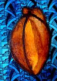
Very nice job. I love how you used complimentary colors, it really makes the star fruit pop! -- Hannah
- on December 12, 2014
I like the colors that you used and how you zen-tangled the background. -- Jaried
- on December 12, 2014
Love the dark contrast! -- Jazlyn
- on December 12, 2014
I like the clash of colors :) -- Polina
- on December 12, 2014
I love how all of your colors blend together very well .Good choice of fruit. -- Olivia
- on December 12, 2014
I like how your colors are very realistic. Also, I think you made an amazing choice on how you did your background. -- Kennia
- on December 9, 2014
I love the bright blue background. -- Cat
- on December 8, 2014
I love the color for the background. It shows contrast from the blue to the orange of the star-fruit. -- Amalia
- on December 8, 2014
There is so much detail and contrast in this artwork. It is really amazing. -- Gage
- on December 8, 2014
I like how the cool background color makes the warm foreground color pop out. -- Elijah
- on December 8, 2014
Yours actually looks like a starfruit! The values you used for the blues are some of my favorite colors. -- Veronica
- on December 8, 2014
I like how you used blue in the back ground to contrast with the very nicely shaded starfruit! Good job! -- Faith
- on December 8, 2014
I love the purple background. It makes the pear pop out. -- Greta
- on December 1, 2014
You are an amazing artist i love your work. :) -- Ariana
- on November 20, 2014
I love this! This is so cool! I love how real it looks! :) -- Ariana
- on November 20, 2014
This artwork reminds me of a puddle of spilled bubble solution -- Anna-Teresa
- on November 17, 2014
This is beautiful! I wish I had a vase of these in my room! -- Mazzy
- on November 17, 2014
This looks like a real iTunes giftcard! I love this! -- Kennedy
- on November 10, 2014
I really like this artwork, I like how there are all kinds of different shapes in the background. If this was an actual card i would buy it. -- Keira
- on November 10, 2014
The reason I clicked on your picture was because it popped out at me,I couldn't resist taking a closer look.I like all of the color choices and their locations.Great job;Keep it up! -- Elaina
- on November 7, 2014
The flower looks so pretty! I love how you did the colors. -- Greta
- on November 7, 2014
I love how you used so many colors, it makes the picture look really good -- Kionah
- on November 7, 2014
I see lots of color, which is good. Again LOTS of color. I like how you made the colors blend together. This piece of art commands attention because of all the color. -- Madeline
- on November 7, 2014
I love how you used many different colours and the choice of colour for her hair looks really good when its mixed a little with blue. Good job! -- Elena
- on November 7, 2014
I love the filter you used! It makes it seem as if you drew it. -- Rachel
- on November 7, 2014
I really like the way you chose the filter in photoshop and colors you chose and how the dark background is different from the bright colors in the picture. Overall it is a great photoshop work. -- Joelle
- on November 7, 2014
I really like the colors you used and how it made the image of the girl pop out making it not collide to the background. -- Emily
- on November 7, 2014
I really like the way that you used these vibrant and vivid colors to portray a such realistic looking rose. Good Job!!!!! -- Emily
- on November 7, 2014
This is beautiful (: -- Angelina
- on November 3, 2014
I like the filters you chose but i think you could have made the petals different colors yourself to customize it even more. -- Cooper
- on November 3, 2014
I love how the design has bright colors that really bring out the texture from the color. It really is a pretty flower. -- Emari
- on November 3, 2014
I really like this...a lot. It doesnt look fake or like you used the bucket tool. It blends in really well. -- Kate
- on November 3, 2014
I really like your choice of the colors for the petals. I also like how you turned the sharpness up. Great job! -- Emmanuel
- on November 3, 2014
This is so cool. I love the petals and I love how it takes up all the space. -- Yasmine
- on November 3, 2014
I really like this flower. I love all the colors that are in it. -- Kaitlyn
- on November 3, 2014
This is really good and cool. --Aryanna
- on November 3, 2014
I love the colors that you used. -- Nia
- on November 3, 2014
I really love the color work on this photo. -- April
- on November 2, 2014
I love how real this looks! -- Kyla
- on October 30, 2014
cool!i love the use of shadows,blending,and colors!!!!!! -- faith
- on October 30, 2014
really cool use of color and blending!!! -- faith
- on October 30, 2014
i really like how your colors are shaded and are bright. -- jerlian
- on October 30, 2014
Lots of good Color & Line. I Love how you did lots of different colors in the background. For some reason this picture jumped out at me. Maybe it was because it has lots of color? Anyways, you did a great job!! :) -- Madeline
- on October 30, 2014
It looks SO realistic! I love the color and pop. I can see you worked really hard on this! -- Samantha
- on October 30, 2014
This flower is unimaginably well done. The colors are perfect, and the whole thing looks so real. Keep it up. -- James
- on October 30, 2014
You did a really good job on the hair and the facial structure. It looks very well put together and the eyes look very nice. This looks very realistic, but also cartoony. You did a very good job on this. -- Petra
- on October 30, 2014
You did a great job on this project and I really like how the girl has very cool colors and the background is filled with bright colors to contrast.I also like the way you made her hair look braided. -- Joelle
- on October 30, 2014
I really love this! You can tell that its a little girl. It looks so realistic, and at the same time cartoony.The hair is my favorite part. the way you made it different shades of blue and purple, it looks like there is a light source somewhere. Very beautiful! --Quinn;)
- on October 30, 2014
I love the colors on her shirt and over all i really like it. -- Robert
- on October 30, 2014
I love the use of color! You did an amazing job! -- Francesca
- on October 30, 2014
I really enjoyed this because it wasn't a celebirty it was a simple little girl. I really liked the hair. -- Keira
- on October 30, 2014
This is an amazing artwork. -- angennie
- on October 30, 2014
I love the hair strokes. You did a very nice job making it look like her hair is really braided. -- Mari
- on October 27, 2014
This is amazing!! Her hair is really nice and the use of colors are perfect. Her face is also defined really well:) -- Jasmine
- on October 27, 2014
This is really good . I love how you had complimentary colors for everything. -- Hannah
- on October 27, 2014
I love how you used complimenting colors (the blue on top of the orange).