I like the flowery shapes that you put in the background aa well as the colors you used. It all blends together really well. -- Rachel
- on May 24, 2016
I like the colors you choose and the light/shading in the background. -- faith
- on May 23, 2016
this is so cool i love it ! -- - destiny
- on May 17, 2016
I like how you wrote the words vertically on the sides. -- Allie
- on May 23, 2016
Piper, I love your album cover. I have always been a fan of Prince and his music. You did a great job! -- Gammy
- on May 13, 2016
I really like your choices for the album cover. The color really pops and it is a good use of gradient color. -- Ashlee
- on May 13, 2016
Really nice! I like your red and black color scheme,carried it out,and sided the colors of objects on both sides. It really does look like an album cover because its simple,but yet well done. -- Faith
- on May 10, 2016
The eye shape looks so draconic -- Anna-Teresa
- on March 2, 2016
What an adorable dragon! I love the details in the wing and legs. Good work. -- Ashlee
- on February 23, 2016
This really looks like you put a lot of thought into the character design, especially the patterns. Good job :-) -- David
- on February 23, 2016
So cute i like the detail. -- faith
- on February 23, 2016
This is an awesome dragon! I <3 her scribbles! -- Rachel
- on February 23, 2016
I like the way you shaded to add depth and the variety of sizes and shapes of the luggage. -- faith
- on January 5, 2016
I like how you repeatedly used the same colors. I also like how you used different shapes to make it interesting. Good job. -- faith
- on January 5, 2016
I love your bird! Nice fabric choices. -- Ashlee
- on December 14, 2015
Piper I love your newest bird creation. The colors are pretty and it looks very organic and natural. Can't wait to see your next piece. Gammy -- Gammy
- on December 14, 2015
I really like how you made the bird gradient. It looks really pretty! -- Catherine :D
- on October 6, 2015
Really nice! i like the bird, lettering, and the colors. -- faith
- on September 23, 2015
I like the depth and colors. Good work.
- on June 18, 2015
I like this! Some good shading and interesting distortion. -- Mom
- on May 9, 2015
i like the colors choosen for this project! -- Chloe:)
- on April 7, 2015
Good perspective. Sorry you didn't get to add the dog leaving the room. -- Ashlee
- on March 13, 2015
that's the randomest thing i've seen all day. -- angelina
- on February 3, 2015
I wish I had a computer like this. But, nice job. -- Edward
- on February 3, 2015
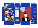
I like the twist you added to this memo. I like how you added the milk stain on the camera. Do cameras drink milk??? -- Veronica
- on January 10, 2015
I love how well you spaced everything out. This is a very simple design but very appealing to the eyes. Prior is such a cute last name by the way. -- Veronica
- on January 10, 2015
I really like this card front because of the color choices, they are very natural and look good together. I like the font you used because it goes with the swirly tree icon and I like the background color because it goes better with the natural reds and greens rather than plain white. -- Hazel
- on January 10, 2015
I love the swirly red and green tree and how the frame with your name on it fits right in with the shape of the tree! Great Job! -- Catherine
- on January 10, 2015
this is really pretty i mean its amazing -- jennah
- on January 10, 2015
great job! this is really sharp. i like it -- kate
- on January 10, 2015
this is really good. i like how you put your lastname in the middle -- kate
- on January 10, 2015
I like the design and the balance of red and green building up the christmas tree. -- Carlos
- on January 10, 2015
this is really good -- Aryanna
- on January 10, 2015
Wow I love this one! Your self portrait is right on, looks just like you if you were on a playing card. So proud of you talents. You keep amazing me with your creativity. -- Gammy
- on December 13, 2014
I love it! Your choice of emotions is creative. Keep up the good work. -- Ashlee
- on December 13, 2014
I like the use of different patterns. -- Ashlee
- on December 13, 2014
There is alot of detail in this it's so realish -- Suraj
- on December 13, 2014
I like the theme you used to present the facts. You did a good job of presenting your point. I also like the title. keep it up. -- James
- on December 9, 2014
This definitely caught my attention because of the big bold letters and the movie poster idea! -- kayyy
- on December 9, 2014
Good job with the horror movie poster idea. I like how you use red as the main color font and the the small font in yellow so even though it is small text you can still see it contrasting from the dark background. I really like how you used the font and the size of the monster from inside the car. I like the idea of a movie poster and think that you did a great job overall. and I agree with you that it may have looked better if you added a picture in the middle to grab the viewer's attention. -- Joelle
- on December 9, 2014
Very informative, Piper! Great job keep up the good work. -- Justin
- on December 9, 2014
i really like this bff piper -- kate
- on December 9, 2014
I love that you used these colors and I love how you made it looked like a movie poster. -- Nia
- on December 9, 2014
I would go see that if it were real. -- kenneth
- on December 9, 2014
This is super cool -- Aryanna
- on December 9, 2014
i like how you didn't make it to cluttered -- Aryanna
- on December 9, 2014
I love how this is very organized yet still filled with information. This is really cool. Great job. -- Candice
- on November 19, 2014
I love how you made it look like a bird! So cute!! -- Rachel
- on November 19, 2014
i like the use of blue and purple! -- faith
- on October 31, 2014
Did the camera drink the milk? -- Cooper
- on October 31, 2014
this is my favorite! -- kate
- on October 14, 2014
i love the color scheme in this -- kate
- on October 14, 2014
I thought it was so creative that you used a bird to create your intials!!!!!!!!!!!! -- Catherine
- on October 8, 2014
great job i like how u made the letters part of the bird -- destiny
- on October 8, 2014
I remember when you made this, you put a lot of effort into this and it shows! -- Veronica
- on October 8, 2014
This is really cool! I like how your name fits in perfectly with the shape of the bird! -- Veronica
- on October 8, 2014
Keep up the good work! -- Drekel
- on October 8, 2014
Wow! You are off to a great start. I love how you incorporated your initials with a sandpiper. Love it, love it, love it, keep up the good work. -- Gammy
- on September 18, 2014
Yummy! A Mona Lisa Smoothie! -- Catherine
- on June 5, 2014
I love that she is thinking about her missing tail. Nice work Piper. -- Steve
- on April 7, 2014
That must have taken a long time!!!! -- ariel
- on April 1, 2014
I love the love! -- Ariel
- on April 1, 2014
the people look great -- jacobe37
- on March 18, 2014
I love the spiky hair! -- ARIEL
- on March 18, 2014
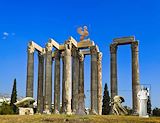
I really like the setting and how there are people taking pictures!! But I think you should try to erase a bit better. I can see some unnatural white fleaks in the sky! -- ARIEL
- on March 18, 2014
I like the background you used, and I like how you put people in front of the building too. -- Catherine
- on March 18, 2014
this artwork is very beautiful. -- Osmara
- on March 5, 2014
good -- vfbgh
- on February 13, 2014
Wow this is amazing! I love how it's in a black and white style, Cool work! -- Cynthia
- on February 13, 2014
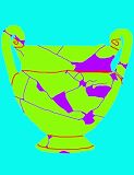
I love the colors. The missing pieces look so cool with having its own color, and it being darker. -- Candice
- on February 3, 2014
this is really cool -- jennah
- on February 3, 2014
i like the colors -- jennah
- on February 3, 2014
Its a very cool idea and if you did more things like it i think people would like it. -- Cooper
- on February 3, 2014
sweet -- sage
- on February 3, 2014
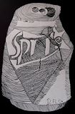
This is really cute, I like the fact that it's a hand-dragon too! -- Catherine
- on February 3, 2014
wow, piper! that looks great! --Ariel -- Ariel
- on January 11, 2014
looks so funny! I love it! -- Ariel
- on January 11, 2014
cool -- rgradtga
- on January 11, 2014
the colors are great. Depending on wheather you call black and white colors. But i think you did realy good on this its pleasent to look at. -- Sarah
- on December 18, 2013
i love this alot. Its very simple but very pretty at the same time. I love the flames there really great -- Sarah
- on December 18, 2013
I love this picture. The black and white looks good, and there is movement in this picture. Good work. -- Ashlee
- on December 15, 2013
I really like the fox guy in the background, it's what differentiates this piece from all the rest :D -- Avery
- on December 13, 2013
Cute, the black and white 'colors' make it look very artistic. -- cathrine
- on December 13, 2013
I like that it is black and white. -- Ian
- on December 15, 2013
i love the colors you used in this peace -- kaylee