This a good collage of many different drawings. Very unique. Congrats! -- Alexis
- on May 9, 2016
i like all the color and detail -- Reyce
- on January 4, 2016
I really like how simple it is. Great job! -- Cole
- on October 5, 2015
This should have won.. -- chloe
- on May 14, 2015
i really like this one. i like how the black background compliments the bright glittery shoes -- quinn
- on May 14, 2015
I really love this, i love how all the color and detail plays together to make one beautiful collage :3 -- Cat
- on March 2, 2015
This is very cool to look at. -- Katie
- on March 2, 2015
I love the shoe and the clock to show features from the movie! cool! -- Kyla
- on March 2, 2015
This is really cool and i love all the detail and how all the colors come together -- Aryanna
- on March 2, 2015
This is really Amazing!!Great Job i can really tell that you put a lot of effort into this -- Yasmine
- on March 2, 2015
I love the feeling and amount of detail this artwork has. Love it!!! -- Greta
- on February 23, 2015
Your play bill is soo cool i don't know how to explain it would be a really good choice. -- Ariana
- on February 23, 2015
I love the look of this playbill. I also really like how it is illuminating on the shoe to show the focus or the main part. -- Jayffnee
- on February 23, 2015
I think this one should win!!!!!!!! :D -- Elijah
- on February 23, 2015
This is really cute! -- Tori
- on February 12, 2015
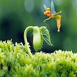
I love tinker bell. This looks so good and it is so creative. Good job! -- madison
- on February 9, 2015
i like the colors you used and the vibrant blue dress, it looks abstract but also realistic. -- anon
- on February 2, 2015
Such a cool idea. :) --Ariana -- ariana
- on January 21, 2015
I like how soft the "light side" looks and how mysterious the "dark side" looks. The contrast is subtle but there. You did a really good job on this. -- Kyla
- on January 20, 2015
i really like this design because of these colors used. i really like the shading in the picture and the background makes these hands pop!!!!! good job!!! -- TRAVIS
- on January 20, 2015
The colors you chose have a nice balance. I really like how you were able to capture the different shades within the hands. I think that the piece carries a positive vibe and personally I really like the simplicity. -- Brian
- on January 20, 2015
You did a good job with this work. I like how the colors contrast yet still go together.The dark background makes the skin tone of the hand pop. I like how the hands are in the middle of the card so it is the point of emphasis. overall I think you did a great job and believe your friend will love it. -- Joelle
- on January 20, 2015
I liked the simplicity of the card and the message its giving. Good job -- Clooper
- on January 20, 2015
This is really cool. I love the detail that is used on the hands and how the rest is simple. Great job. -- Candice
- on January 12, 2015
I like the contrast between the two sides of the card. -- Reana
- on January 5, 2015
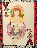
I like the way you used the desert for your background....well done. -- Antonio
- on December 12, 2014
very nice work! -- zakari
- on December 12, 2014
it looks like you put a lot of effort into this picture Goodjob !!!!! -- Chaquruis
- on December 9, 2014
I like how you know it's deadly, but it is odorless. Also you did not erase the 2, bringing the conspiracy of mixing CO with CO2. Other than that, it is still a good artwork. -- David
- on December 8, 2014
Keep up the good work! -- drekel
- on December 8, 2014
Wonderful choice of color. -- Kayla :)
- on December 1, 2014
I love the snow on the scrooge logo. -- Greta
- on December 1, 2014
I love how the pumpkin is orange with a black and white background. I also love how it looks like it is being sucked in. :-) -- Greta
- on December 1, 2014
I can see that you cut out the hat to but on the background. I like how you put emphasis on the logo by the background. -- David
- on November 10, 2014
This is cute. I like how you made the hat "sit" on the moon. -- Tori
- on November 10, 2014
i like the way you used commentary colors. -- faith
- on October 27, 2014
niiiice -- mr.skeleton
- on October 27, 2014
I really like the logo great job -- Emari
- on October 27, 2014
this is cool -- --Aryanna
- on October 27, 2014
this is really cool! -- Danielle
- on October 13, 2014
The pink and green go very well together...very good complementary choice. :) -- jazlyn
- on October 13, 2014
My favorite teeshirt design. -- sloan
- on October 13, 2014
i really like how the colors contrast,really cool! -- faith