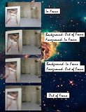
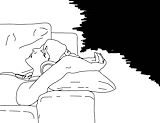
I love the quality of this. The lighting looks really good and I love how the background is blurred out. -- Camryn
- on June 7, 2016
This is stunning Kat. -- Luna :)
- on May 18, 2016
WOAH HEY I AM IN A CAMERA -- Luna :)
- on May 18, 2016
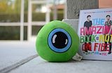
i love twenty one pilots and fairly local! -- Allie
- on May 18, 2016
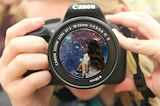
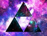
Nice picture. The galaxy theme fills the entire lens, with sort of a glassy touch on top. Good job with the focus as well, the main point of the camera is really obvious. :) -- RS
- on May 18, 2016
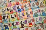
I really love the colors! the design is very pretty too. -- chloe
- on May 18, 2016
I bow to you (/o-o)/ <3 -- Haley
- on May 18, 2016
I like how your focus was something direct and obvious. You can tell what each one is supposed to be, and it looks like it turned out really well done. Good job. Also, cute dog :) -- :) Ruby :)
- on May 18, 2016
how adorable :') -- lizzy
- on May 18, 2016
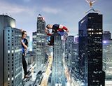
You did a great job at making this, I also like how you put your hands like they are grasping the building, this is really good -- Critic
- on April 11, 2016
this is so cool lol -- maddie
- on April 11, 2016
jacksepticeye! nice -- mark
- on April 11, 2016
So creative and cute I LOVE IT! -- Luna :)
- on April 11, 2016
Amazing oh my GOODNESS! -- Luna :)
- on April 11, 2016
Good job at making your hands look like they are really holding onto the building. Great job! -- Camryn
- on April 5, 2016
This is amazing you did such a good good job!!! -- Alicia
- on April 5, 2016
really cool piece. teach me how to do this. -- anthony
- on April 5, 2016
that guy in the middle looks awesome -- reyce
(this is katie, editing your comment. i have no words...)
- on April 5, 2016
i rlly like this -- josie:))
- on April 5, 2016
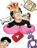
mark is king woof woof fnaf markiplier rules i like how it looks like he is coming from behind the mustache -- Allie
- on April 5, 2016
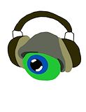
I see good 'ol septiceye Sam wearing Jack (or Sean)'s hat and headphones. I like how it's a popart with no black lines except for the parts that are black which makes it look crisp and clear. I also like this because Jack is my favorite youtuber but biasedness aside I really like this artwork. :D -- Ryan
- on April 5, 2016
It all fits together perfectly. -- Madeline
- on April 5, 2016
Good job! I love jacksepticeye! -- Henry
- on April 5, 2016
i luv this piece cuz its so #relatable. -- Alejandro
- on March 28, 2016
love the trace, reminds me of stuff i see on tumblr lol -- lizzy
- on March 28, 2016
This is beautiful. -- Luna :)
- on March 28, 2016
Adorable combination, and it looks very real -- Marlie
- on March 28, 2016
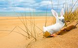
I love this! The head blends perfectly with the body. I like how you made it look like the bird is really on the beach using the rules of thirds and the leaf. This looks very natural and real, I love it! :) -- Camryn
- on March 14, 2016
The quality of this is amazing and I like how you used the space of the photo. The animal stands out but looks like it fits in the landscape. I also enjoy the addition of the leaf. -- Callieeee
- on March 14, 2016
the ears flow well into the head, good job :) -- lizzy
- on March 14, 2016
This is really good I love how you coordinated colors so everything looks real and that this could be a real animal! :D -- Victoria
- on March 14, 2016
This animal blends together really well and is super cute! I love it! -- Julia
- on March 14, 2016
Great job on blending the ears to the head! -- Catherine
- on March 14, 2016
I see a cool parrot-duck-bird creature that looks very realistic. The only problem is that the ears and head are a little wonky because the parrot head looks a little too big for the body, but otherwise this is amazing!!! -- Ryan
- on March 14, 2016
You blended very well -- Guy
- on March 14, 2016
Really good job. I like the shadow effect. Really nice piece of art. -- anthony
- on March 1, 2016
this is so cute, based on this i really want to be friends with you! -- josie :))
- on February 29, 2016
mark is love ,mark is life -- Chardnet
- on February 29, 2016
MARK IS KING!!!!! OF FNAF!!!i love this pic -- Chardnet
- on February 29, 2016
I see a silhouette of a person with many things in it including youtubers such as Jacksepticeye, Markiplier, and Danisnotonfire.This piece has balance because it doesn't feel as if the things aren't evenly spread out amongst the silhouette. -- Ryan
- on February 29, 2016
really cool use of color and perspective. -- faith
- on February 24, 2016
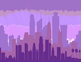
I love the buildings and how it all flows together. -- JN
- on February 23, 2016
Markiplier is really cool! I'm glad someone did a project based on him. -- Henry
- on February 23, 2016
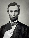
This is funny! I love his nose ;)) Good job! -- Camryn
- on February 1, 2016
Lincoln is fab. -- Lizzie
- on February 1, 2016
I remember seeing this in the works and the color scheme I was obsessed with. I love the crazy technique used for the background. I love it so much Katie !! -- Callie
- on February 23, 2016
This looks really cool! You did a really good job at making the background colors blend together. -- Camryn
- on February 1, 2016
Why would it be weird? I Make Pewdiepie Shrines. Markiplier Shrines are totally fine by me. -- Spencer
- on February 1, 2016
Omg I'm in love this is so cool and just perfect ;) -- Nayeli ;)
- on February 1, 2016
There might not be quite enough contrast between the phone and the picture. The phone is a little hard to see. You could have added a little more, but overall a great job. -- Dylan
- on February 1, 2016
I see Markiplier with many things symbolic of him around him. It didn't use too many of the elements of art overall. I feel maybe making the background blue like mark's hair in recent videos, I feel it play very well off the pink mustache, but nonetheless this looks very good and I'm sure Mark would love to see this. -- Ryan
- on February 1, 2016
Mark IS the best and he is the rightful king of FNAF. \(>-<)/ -- Haley
- on February 1, 2016
The color scheme you used is very nice and works well with the city -- Anna-Teresa
- on February 1, 2016
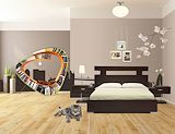
nice room. everything is perfect -- anthony
- on January 25, 2016
i like all the colors good job. -- anthony
- on January 25, 2016
nice job on the realism! -- Reyce
- on January 4, 2016
i did aspca too. u did a teriffic job -- AT
- on January 4, 2016
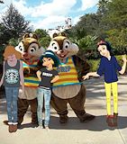
WOW! This artwork look fabulous, it looks like you put a lot of time and effort into the project. I like the clothing it looked really realistic, the cloths basically looked like there own. I also enjoyed how close up the girls were they weren't really in the background and unnoticeable. Nice job! -- Gabrielle
- on January 4, 2016
I love the fact that you pop art the clothing, it looks amazing! -- Beth
- on January 4, 2016
You did a great job pop arting the outfits. The characters blend very well with the picture. You did an awesome job! -- Camryn
- on January 4, 2016
Their clothing looks so realistic, and I like the princesses you chose. You did amazing!! -- yatzarith
- on December 14, 2015
Nice Work! -- Gabby
- on December 14, 2015
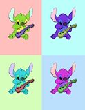
I love this art work so much I love how you made stitch poparted! -- Alicia
- on November 16, 2015
stitch is SO cute! -- reyce
- on November 16, 2015
I love cats! Great job! -- Kevin
- on November 16, 2015
I saw a lot of ASPCA charity projects, but this one is my favorite. ( I also did one, for another cat charity :) ). I really like that you thought about your own cats, and applied their favorite toy, the feathered stick, to the project. The reaching cat on the couch is a nice touch, and I think it's very creative. my only suggestion is maybe have a house background, or colored background- Besides that, it looks amazing already. -- RS
- on November 16, 2015
This looks great! It is very natural looking and I love the home-y feel. Great job! -- Camryn
- on November 16, 2015
Awesome! It looks great! -- Christie
- on November 2, 2015
Love the texture of hair and eyebrows. Expertly done!
- on October 30, 2015
Out of all of the other ones, you are DEFINITELY my favorite! -- Sam V
- on October 19, 2015
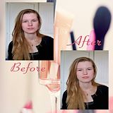
I really like the background and how you did her makeup! -- Makala
- on October 19, 2015
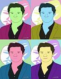
In the artwork the artist used mask to represent the celebrity. Also, the artist used a lot of detail and design. I really enjoyed how the artist made the colors compliment each other! -- Gabrielle
- on October 7, 2015
In this artwork the artist used mask to describe there celebrity. Also, there was a lot of detail and design. I really enjoyed how the colors compliment each other! -- Gabrielle
- on October 19, 2015
There are a lot of nice colors in this artwork, I could see all of his features after you filled the color into the outline. I like the cheerful and friendly mood of this art, and I could tell you worked hard on it. Great job! -- Camryn
- on October 19, 2015
This artwork is very abstract and creative. You can see the effort you put into it. I like it, IT's fresh -- Osmara
- on November 13, 2013
Nice details in each character. -- Alex
- on November 13, 2013
nice i like how you put all the different faces. -- nia