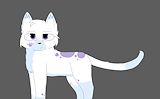
This is so cute and dangerous at the same time. Love it :D -- Marlie
- on May 23, 2016
I really like this, it looks like it was done by a professional -- Emma
- on May 23, 2016
I always like your cat drawings. -- Reana
- on May 23, 2016
congrasts on winning -- Piper
- on February 23, 2016
I really like how this character actually looks like a professional made it. Good job :-) -- David
- on February 23, 2016
I LOVE how she turned out!!!!!!!!!! ;) -- Piper
- on February 23, 2016
Really cool and well done. soooo cute. -- faith
- on February 23, 2016
I love this! The anatomy is great and I love the colors. -- Makala
- on February 23, 2016
Lovely. :D -- >:3 Cierra
- on February 23, 2016
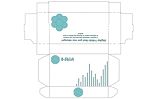
I like the simpleness of the box, how you didn't use too much color or take up too much room. I also like the designs you choose i think it suits your product. -- Faith
- on January 4, 2016
Good. The cartoonish design is actually rather flattering -- James
- on December 16, 2015
I love the soft and dull colors you used! -- AL
- on March 9, 2015
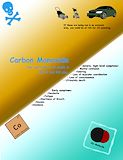
This artwork is superb. I simply adore the color contrast and the facts about carbon monoxide are a very nice touch. -- Rose Lalonde
- on February 2, 2015
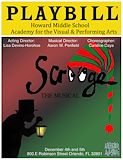
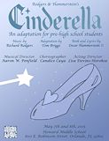
You did a great job on this playbill, congrats on winning -- Kailey
- on January 5, 2015
Great job and looks fantastic! -- Matria
- on January 5, 2015
I like how you added the gradient and used it as a line. How did you get that gradient... -- David
- on January 5, 2015
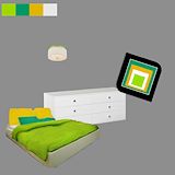
I like the green you used -- Zoe
- on December 1, 2014
I really like your choice in colors! They all seem to fit together very nicely, even the "All Stars" logo! Say, did you make the silouette all by yourself, or did you get it from online? -- Alayna
- on November 17, 2014
I like the way the logo and the background colors blend but I think the background would be a bit better if the colors were a little lighter because now its kind of overpowering the logo itself -- Aex
- on November 17, 2014
congrats on winning. Very good job -- izzy
- on November 17, 2014
I think that your picture is too small, extend it out a bit. But I like how you used the colors. -- David
- on November 17, 2014
I think the use of the gradient tool is simple, but effective. I like this artwork a lot. -- David
- on December 1, 2014
I really thought you could have added more to really show a type of a Scrooge/Christmas effect instead of the guy holding the light on a green and red background. But you did okay. Good job Rachel. -- Emily;)
- on December 1, 2014
I like the colors that you chose for your background. And I also like that you included the man with the lantern. -- Kiara
- on November 17, 2014
congrats on winning ! -- zoe
- on November 17, 2014
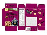
This is super cool! I like the batman twist it makes it fun and original! -- Sabrina
- on November 17, 2014
I really like this piece simply because everything is spread out well, i love the effect of the silhouette on the gradient background and the words and everything else just fit on their perfectly, great job. -- Kirsten
- on November 17, 2014
Congratulations on winning! Your design is very captivating. Simple, content, and colorful. -- Justin
- on November 17, 2014
Nice job but next time you should change your initials color because there kind of covered up by the other colors -- Alex
- on November 10, 2014
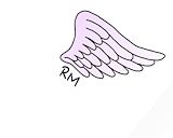
Rachel,I found myself liking your monogram.I like it because it has a design that could be accepted the real world. Good job -- Elaina
- on November 3, 2014
I love how the paint splatter in the middle guides the viewer's eye to the rest of the objects in the work. Nice job Rachel! -- Piper
- on October 27, 2014
I really like how you used the computer as a frame. All the colors go good together as well. Good job! -- Hannah