I love the backround you picked for this!! Very intresting! -- Sarah
- on March 31, 2014
He looks really good looking. I would date him -- Victoria
- on March 10, 2014
I crossed the pencil in the hair because my hair tends to cross and not comb straight, but the shirt was an accident. -- Austin
- on March 3, 2014
Nice art, good pose, and nice detailing. A word of advice, use a blending stone to soften the pencil marks and add soft texture. Also, unless you did it on purpose, don't cross the marks, move the pencil in one direction. Overall a wonderful artwork -- James
- on March 3, 2014
I think that looks really cool. I like how it actually looks like the statue is wearing the outfit. -- Ariel
- on February 7, 2014
Cool -- Jude
- on February 7, 2014
that was accident @David14954 -- Austin
- on February 7, 2014
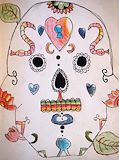
You didn't put an artist statement on this one.Anyways,I like how you used cross-hatching. -- David
- on January 27, 2014
I didn't add color because in photo shop adding colou makes it look like a cartoon -- Austn
- on January 27, 2014
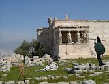
I really like how you put the people.It looks like that there is an ancient Greek memorial. -- David
- on January 27, 2014
I think you should have added color to it.Anyway,it is very good on detail. -- David
- on January 27, 2014
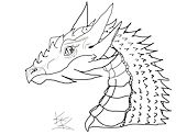
This is an amazing dragon, and it has detail trough everything on its body, this dragon is just awsome -- Joshua
- on January 15, 2014
Cool dragon, but why did you not put color on it -- Raymond
- on January 13, 2014
this is an amazing dragon -- lucas
- on January 13, 2014
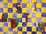
I'm sorry that I said that the I is wrong. -- David
- on December 9, 2013
Imade the I short because i wanted to add a different letter because all the leeters are long -- Austin
- on December 9, 2013
this is a really good piece of art -- Austin
- on December 9, 2013
I forgot to add something.I think that you messed up on the I. -- David
- on November 12, 2013
I like how you colored in the drawing!I also really like how your letters are so spread out.Keep it up! -- David
- on November 12, 2013
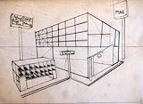
Great mall!I really like how you transformed your 3D perspective drawing into a mall!But I recommend you to add cars around it to make it look like a popular mall. -- David
- on November 11, 2013
Great mall!I really like how you transformed your 3D perspective drawing into a mall!But I recommend you to add cars around it to make it look like a popular mall. -- David
- on November 12, 2013
i think i could have coloured the squares in more so that theres no white showing. -- Austin