I like this quote, as you would rather have more valuable friends than having less valuable ones. Good job :) -- David
- on June 8, 2016
I like how you highlighted the most important part of the quote by making it a different color. Your background is also cool. -- faith
- on June 8, 2016
This animal is really well morphed. It looks super neat and i like how I cant tell where the head starts. Good job!:) -- Emma
- on May 2, 2016
I love the shading, it really makes the character look like it's 3D. -- JN
- on March 10, 2016
So cute i like how you used complementary colors. -- faith
- on March 10, 2016
I really like the shading that you used for the lion's fur. He is really cute! -- Rachel
- on March 10, 2016
I really like how you aded the aspects of the team to make this character. Good job :-) -- David
- on March 10, 2016
As great as this is, the first thing I saw was "JEL OLE". Do not get me wrong this is great, but if you see what I am trying to get at its kinda funny. -- Andrew
- on February 23, 2016
this is the absolute best photoshopping i have seen, ever. my standards have been raise! -- Reyce
- on February 23, 2016
This is a cool concept! I like the blue-purple color you put on the box. -- Beth
- on January 4, 2016
this is so cool and creative how you used different things that symbolize these countrys. -- Marlie
- on January 4, 2016
This really pretty! I love the colors you used and the technique of smearing it to make the general shape of the falcon. -- Chloe
- on November 30, 2015
This is really cool and creative -- Aryanna
- on March 30, 2015
This is very very creative! I can always look at this and smile. Wonderful job. -- Justin
- on March 9, 2015
I like how it looks like you put a lot of effort into it -- samantha
- on March 7, 2015
I love how you included art and music in the poster!! -- samantha
- on March 7, 2015
I really like the font that you used! -- samantha
- on March 7, 2015
i really love this! i love the swirl on the capital C and its just really cool! =D -- Danielle
- on March 3, 2015
I love this. The way you combined the art and music elements is really creative. -- tori
- on March 3, 2015
really pretty u did a great job on this -- Mari
- on March 2, 2015
my favorite out of all of these :) -- Angelina P.
- on March 2, 2015
I love how you have the music and paint coming from the paint brush! Cool -- kyla
- on March 2, 2015
WOW, so far its the most creative artwork I've seen. Keep up the good work. -- Nickelson
- on March 2, 2015
This is really good -- Aryanna
- on March 2, 2015
i love how the clock in the background is like kind of blurry behind the two people. good job -- Danielle
- on February 24, 2015
this is the coolest illumination ive seen yet -- lucas
- on February 24, 2015
I love how the music notes are running along the paint lines. Nice poster :) -- petra
- on February 24, 2015
Simple and elegant. This is sure to win! -- Justin
- on February 23, 2015
you did a really good job with the logo -- brooke
- on February 23, 2015
this is really cool! -- Danielle
- on February 23, 2015
When I look at the J , I do recognize how the the lines and the shape make it look like a calligraphy J (but with a wire) . There is a lot of unity going one with the wire ( will of course you had to connect everything). also how you interpreted your name with the wire. Yet i would like to say it really caught my eye of how well you made it <great job> -- Makayla
- on February 2, 2015
Your J is really cool! I love the originallity of it. -- Piper
- on January 5, 2015
This is so pretty i love the colors and the texture you put into it. -- Matria
- on January 5, 2015
This is really cool! -- Amalia
- on December 8, 2014
Looks great! I like how you made the designs in the J look so detailed even though it was abstract! :] -- Sabrina
- on November 17, 2014
Keep up the god work! -- drekel
- on November 11, 2014
Well use of multiple colors to create a beautiful work. The use of the lines also add to the beauty, and compliment the work with natural lines. -- James
- on November 10, 2014
This is amazing! I love how you blended the colors and used the different colors to kind of shade it instead of using sharp outlines. -- tori
- on November 10, 2014
I really like your choice of color in this artwork. I also enjoy how you didn't outline the shape, instead you used implied shape or an unclosed shape. These two factors really give this artwork meaning, unity, and emphasis. -- Raquel
- on November 3, 2014
Good job. I like the colors that you used. I like how the colors flow . -- Tyler
- on November 3, 2014
This is really beautiful, it almost looks like watercolor so great job. -- angelina
- on November 3, 2014
This is AMAZING! -- Emily
- on November 3, 2014
Oh My Gosh this is so cool! -- Amalia
- on November 3, 2014
This is really really good!!!! The way the lines move together and the color all combine to make one perfect pice of art is truly amazing. I am in awww of this!!!! -- Katie
- on November 3, 2014
I love how you blended the colors and had the wing warm colors and the body cool colors -- katherine
- on November 3, 2014
This is super pretty great job! -- Cat
- on November 3, 2014
THIS IS SO PRETTY! You did a great job on the colors and blending them in! -- cierra
- on November 3, 2014
this is really cool. the way the colors blend is really amazing. like some colors dont match the other colors but the way you blended it makes it look really cool -- kate
- on November 3, 2014
This picture looks like you painted a portrait of the real bird. the colors are really well blended. It looks great -- yasmine
- on November 3, 2014
WOW ! i see a beautiful bird full of color .Its a great size and out line . this is so good . how did you makes it look like paint stokes ? -- Aubrey
- on November 3, 2014
Looks wonderful -- Jimmy
- on November 3, 2014
This is absolutely amazing! I love it! -- Madison
- on November 3, 2014
This looks amazing! -- Greta
- on November 3, 2014
I really like the texture and the colors you used! -- Osmara
- on November 3, 2014
this looks absolutely stunning! good job! -- Elena
- on November 3, 2014
It looks like it was water painted. -- logan
- on November 3, 2014
Did you do this only using the paintbrush and smudge tools? It's really good! -- Anthony
- on November 3, 2014
THis art has amazing paintlike stroaks that take my breath away. *swoon* -- intellectual skeleton
- on November 11, 2014
I like how this artwork has a homemade feeling. Good work! -- David
- on October 27, 2014
wow, this is amazing! it catches your eye and its super nice to look at. its beautiful. --Hannah -- Hannah
- on October 27, 2014
Keep up the good work! -- Drekel
- on October 27, 2014
I really like the amount of detail you were able to capture. I Also like the vast amount of colors and believe that they were well blended. -- Brian
- on November 11, 2014
I love all the bright colors! -- Rachel
- on October 27, 2014
This is so pretty! I love the colors you used. -- Caroline
- on October 27, 2014
that is really cool and smart. I would have never thought of that. I LOVE the colors you used. -- angelica
- on October 27, 2014
I like the way you had done this. Keep up the good work. -- drekel
- on October 27, 2014
i like how everything is going into his mind! nice job! -- danielle
- on October 8, 2014
I love how the different colors look together and the way you arranged the text and pictures. -- Osmara
- on October 8, 2014
I really like this because you have to think about all of this when designing something. Also the over all design of it popping out of your head and the wheels turning to start thinking is cool. -- Hannah
- on October 8, 2014
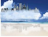
i like this one because it looks like the lost city of alantis great job joel! -- cool beans
- on April 9, 2014
its really pretty i love the background--lauren -- lauren
- on March 31, 2014
Nice...really like this. -- gemielee
- on April 9, 2014
This artwork is really creative. -- Osmara
- on April 9, 2014
I love how well you cut it out. -- Madison
- on April 9, 2014
It looks as if the building were actually underwater! -- Osmara
- on April 9, 2014
The background that you used is very pretty. -- Catherine
- on April 9, 2014
This has to be my favorite art work of this section. Very creative! -- Sarah
- on April 9, 2014
This is really pretty and nice! -- Taylor
- on April 9, 2014
This is so cool! I love the reflection of the buildings in the sand! Awesome! -- Osmara
- on April 9, 2014
I like the way the hair is. Very cool! -- Catherine
- on April 9, 2014
i like his hair -- Austin
- on April 9, 2014
I like the background you used. -- Catherine
- on March 3, 2014
OMG!!!!!!!! This is soooooo cool! You did a great job on the shadow, I absolutely love the setting! Keep up the great work! -- Petra
- on March 3, 2014
i want to live on this city!!!!!!!!! -- kate
- on March 3, 2014
i really like the bright colors -- jennah
- on March 3, 2014
That looks so awesome!!! The reflection is amazing:) -- Jasmine
- on March 3, 2014
Good Job!!! I like your lady she looks really good! -- Jasmine
- on March 3, 2014
i like this! keep up the good work! -- Danielle
- on March 3, 2014
This looks really cool! -- Osmara
- on March 3, 2014
I really like how cool it looks. -- William
- on March 3, 2014
This is a very Beautiful piece of artwork -- Breana
- on March 3, 2014
I really like how the pictures tell a story -- kaitlyn
- on March 3, 2014
awsome. -- Drekel
- on March 3, 2014
I like the beachy theme, very nice. -- Catherine
- on March 3, 2014
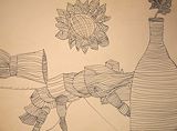
In really like your vase because you put a lot of bright colors.It looks really cool. -- travis
- on March 3, 2014
I like all the color and design on this vase. It is very well done. -- Hannah
- on March 3, 2014
I really like it and its such a beautiful scenery but the only thing i would of differently is make the flower and the humming bird smaller and place the humming bird in the different spot to where it more visible. -- kaitlyn
- on March 3, 2014
Great job I can tell you put a lot of time into this! -- Cierra
- on March 3, 2014
This picture is so beautiful, it just looks amazing. -- Osmara
- on March 3, 2014
Love the color! I also adore soccer, so this picture is great for me! -- Petra
- on March 3, 2014
cute -- Anais
- on March 3, 2014
THis is very pretty, I like it. -- Catherine
- on March 3, 2014
Love the colors on the soccer ball! -- jordyn
- on March 3, 2014
what i like about your artwork is the tree it looks so pretty. -- Nia
- on March 3, 2014
OMG I love this background you chose to do. And the animals fit perfect for this piece! GREAT JOB -- Cierra
- on March 3, 2014
This is really cool! I like the figures you chose to do :) -- Cierra
- on March 3, 2014
pretty -- Anais
- on January 14, 2014
This scene is so beautiful. It looks very realistic. -- Osmara
- on January 14, 2014
i like the colors and the cool -- Anais
- on January 14, 2014
This is a really really awesome piece. Its like christmas in Florida. -- Madison
- on January 14, 2014
i like this artwork because its like a hidden island and theres that pretty little flower with the whale in the light blue water really pretty and is so pretty that i wish i could acually go there -- gabriela
- on January 14, 2014
The background does justice to the creature and creates an overall feeling of its personality. Haha good job! -- Alex
- on January 14, 2014
I really like this artwork and they hair is great. It is very detailed and I like the American Flag! The only thing i would recommend is cleaning up the nose a bit more.:) Besides that it is really cool. -- Jasmine
- on January 9, 2014
This artwork is amazing!! The morph goes together perfectly and the colors too. The backgroung also matches well. What do you call this animal? -- Jasmine
- on December 17, 2013
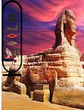
I like the back ground of the Sphinx. -- Catherine
- on December 17, 2013
I liked this piece if artwork a lot. -- Lucas
- on December 17, 2013
like this a lot -- beckett
- on December 17, 2013
I like the way you choose 2 different colors for each section in your drawing, it really makes your drawing jump off the page! -- Kaitlyn