Dang....these words speak on another level ;-; -- TITI
- on June 2, 2016
I like the shapes and colors you used in the background. The font is cool also. -- faith
- on May 23, 2016
....K den... -- Why he got eyeliner doe.... -TITI
- on May 23, 2016
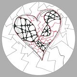
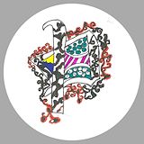
i really love this. it looks so awesome and the zentangling is great. -- travis
- on May 9, 2016
i really think this is a good looking album. i like the design on the sides but i think you should make the background color lighter. XD -- travis
- on May 9, 2016
I mean i guess.... ({}) -- Pookie -.-
- on May 3, 2016
I like the ombrè effect on the stick figure ;-; I also like how that huge Earth is going to drip all its water inside the bucket... As if it'll fit... -.- -- Jackson
- on May 3, 2016
It's ok...... <.< -- True Brown K
- on March 12, 2016
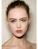
WHY DID YOU MAKE HER SO PALE -- Quinny
- on March 12, 2016
WOW -- keiton
- on March 12, 2016
that is awsome. -- keiton
- on March 12, 2016
nooooooo she wasnt ready . look at mmy smile face (._.) -- keiton
- on March 12, 2016
I just love the way you did everything! omg! sooooooo goood! 10/10. If I could like, I would. -- Kevin
- on February 24, 2016
Is she a ninja? Because if she is, it would be hard trying to sneak around with heals on. Or anything in that matter... ;-; -- Kevin
- on February 24, 2016
I really like how the colors mix in to make this character. Good job :-) -- David
- on February 24, 2016
That 2inch heel :P -- Jackson
- on February 23, 2016
Oh my -- Jackson
- on February 23, 2016
I mean its ok i guess...... Could've done better i guess....... -- Jackson
- on January 4, 2016
This gives me good vibes. Aesthetic -- Kiki
- on November 4, 2015
News flash!! This is pretty hype -- TiTi
- on November 4, 2015
derp :P -- Jackson
- on October 12, 2015
AWH! I remember this! I love how cutesie it is! the colorful choice of colors are adorable. -- Luna
- on October 12, 2015
I"M IN LOVE WITH THIS! The dull colors and bold font creates a perfect picture. Well done dude. -- Luna
- on October 12, 2015
This is super good, Petra. We seriously need to make t-shirts of all of your artwork! -- Luna
- on October 12, 2015
Awe Petra! This artwork is so cute!! -- Luna
- on October 12, 2015
i REALLY like this!!! super good lines and detail :) -- kayla :))
- on October 5, 2015
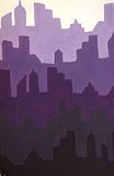
I really like the variation in the sizes and shapes of the buildings and the color scheme. When I look at this I think of a purple sun setting over a city. I really really love this artwork over all! -- Josie?
- on October 5, 2015
Nice Job i really like it. -- Giana :)
- on June 2, 2015
this is a city id love to go to. -- lucas
- on May 22, 2015
Good job on the rappers ,very realistic. -- Faith
- on May 22, 2015
Sweet -- Jude
- on May 18, 2015
I really like this art work because of the design in the background and how the eyes are sketchy and mysterious.I like how the movie poster draws your attention to the eyes and design and makes it feel complete and whole.great job -- Joelle
- on May 18, 2015
Very interesting concept! I would love to see this in the theaters. Meryl Streep is like my mom's favorite actress! You did a great job of executing the mystery behind the design and your information was correct at the bottom. -- Justin
- on May 18, 2015
Keep up the good work! -- Drekel
- on May 18, 2015
Love the detailss you put into this :) -- Sarah
- on May 18, 2015
I like how realistic this looks. Great job! :D -- Elena
- on May 4, 2015
This is soooo good omg!! Great color choice and form :)) -- kayla:)
- on May 4, 2015
I like the color combination used. -- Katie
- on May 4, 2015
The shading looks really cool, looks like you could reach into the picture and pull one of the candies out. Nice job -- Jude
- on May 4, 2015
he looks like he needs a banana -- BANANA
- on April 6, 2015
i love you -- Ba nee noi
- on April 6, 2015
wheres my name?? -- BANANA
- on April 6, 2015
she looks like she ate a lot of bananas -- Ba nee noi
- on April 6, 2015
do those cats like bananas -- BANANA
- on April 6, 2015
i bet she loves bananas -- ba nee nee
- on April 6, 2015
look at all those bananas -- ba nee nee
- on April 6, 2015
why isnt it called banana! -- BANANA
- on April 6, 2015
i like this banana -- banana
- on April 6, 2015
BANANA -- banana
- on April 6, 2015
BANANA -- BANANA
- on April 6, 2015
This is really cute and simple. I like how there isn't alot going on. -- Katie
- on March 19, 2015
I love the amount of balance you used in this. -- AL
- on March 12, 2015
very nice i hope they pick it -- weeter
- on February 23, 2015
i really love the use of specific colours and i also really like how the direction of the colour strokes are towards the dancer. -- Elena
- on February 3, 2015
love the name;) -- Queen
- on February 2, 2015
HOLY GOSH PETRA THIS IS AMAZING!!!!!!!!!! I LOVE IT!!!!! -- gabbie :)
- on January 29, 2015
I love the different colors and patterns you used and how each one is different. I also love how detailed each one is. Great job. -- Candice
- on January 29, 2015
I like your intricate choice of patterns. The colors here pop and excite! I want this on a T-Shirt! -- Justin
- on January 29, 2015
love how simple this is. at first it just looked like a regular sun flower. now i get it its a SUN flower. i just dont see your name. oh wait nevermind i see it. ---Quinn -- Quinn
- on January 5, 2015
I love how you made bold colors and made them look like cats. -- Nia
- on January 5, 2015
love how you used all of those colors. -- Victoria
- on January 5, 2015
I like the flames. -- Elijah
- on January 5, 2015
i always liked the way you designed this :) -- gabbie
- on January 5, 2015
honestly I might like this one more than the one they chose..hehe. -- gabbie
- on January 5, 2015
loving all the vibrant colors! B) -- gabbie
- on January 5, 2015
I like your art work,because thers a lot of color. -- Benjamin
- on January 5, 2015
I love how you used your color pencil techniques. -- Rachel
- on January 5, 2015
I Like this Bird/Cat because Its 2 in 1 And the faces really pop out It is very cool -- Jeffrey
- on January 5, 2015
Very cool on how you made a cat -- jeffery
- on January 5, 2015
nice work dude -- Andrew
- on January 5, 2015
I love your cats especially the happy and rainbow one!!! :) -- Julisha
- on January 5, 2015
Good job Petra....... -- Diamond
- on January 5, 2015
this is super cool. Great job -- Andrew
- on January 5, 2015
This art is really cool to have a poster and it's colorful -- Suraj
- on December 12, 2014
This is cool, the colors pop out and grabs attention! The shape is cute and I like the different designs you used, especially the spooky ghost one on the left. :> -- Angelina
- on December 12, 2014
I like the shadow on the girl. But I don't understand the white lines. -- Miles
- on December 12, 2014
I love all the different faces. They all look amazing. :-) -- -Greta
- on December 8, 2014
I love this playbill!! -- Kayla<3
- on December 8, 2014
I love the hand prints in the middle. I also love the color that Digital Arts was spelled in. :-) -- Greta
- on November 17, 2014
Wow this photo really impresses me. I love how you captured the motion of the water and how it actually magnifies the backround. -- Katiannah
- on November 17, 2014
This is my favorite. -- Hannah
- on November 17, 2014
I like all aspects of your playbill.Though my favorite part was the lithe man standing on "The Musical".Great job,your effort shows. -- Elaina
- on November 17, 2014
I love how you laid it out and how its simple but still really cool. Great job. -- Candice
- on November 17, 2014
Ooh I love it! ~pizza -- pizza (kayla)
- on November 17, 2014
The black and the white work with this because your attention goes to the tittle. -- Katie
- on November 10, 2014
I love the word play in this! The box overall is really really good :) -- Madison
- on November 10, 2014
this is I nice project, especially with the shades of brown, and the unity. -- james
- on November 10, 2014
I like how it goes along with the real brand and how it looks real. --Ariana -- Ariana
- on November 10, 2014
I love this!!!!!!!!! -- Kaylaaaaaa~~~
- on November 10, 2014
Great choice of word play. I appreciate your style and the whole design is just stellar. -- Justin
- on November 3, 2014
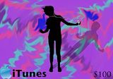
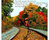
love this. i like the background. i think you couldve had more movement in this photo. nice legs ;) -- Quinn
- on November 3, 2014
i love it so much swagg -- Noel
- on November 3, 2014
This is genius! I love how much detail you put into the box. And the little games on the back are funny. Very well done :) SO MUCH SWAGOO -- Quinn
- on November 3, 2014
There was a great use of balance and space through out your box! I really like your creative and clear message! -- Laurie
- on November 3, 2014
I can total see your name! -- Greta
- on November 3, 2014
i love this! -- Greta
- on November 3, 2014
Super colorful. Fun to look at, and has a complete look to it. Great job, you're awesome! -- Justin
- on October 27, 2014
I like the colors you picked, they go good together -- angelica
- on October 27, 2014
I really like the colors you chose -- Kyla
- on October 27, 2014
Omg this is so cute!! ~Kaylaaaa -- Kaylaaaaaaaaaaa
- on October 27, 2014
cool -- angel
- on October 27, 2014
Great image. To me, Old school, new skills plays back to the history of HMS, back to when it was a high school, and its great background. I love this, and it has a deep meaning behind it. Keep on doing this. -- James
- on October 13, 2014
Good job -- Kennedy
- on October 13, 2014
I like the colors you used, it all looks so light. -- Rachel
- on October 7, 2014
I like how light and girly the tone is :) -- Laurie
- on September 29, 2014
i like the pastel colors -- katie
- on September 29, 2014
pretty<3 -- Jasmine
- on June 3, 2014
I love the colors you used great job. -- kyndall
- on June 3, 2014
you have fiber arts with luna -- selinaaaaaaaaaaa
- on March 17, 2014
That is cool!!!! -- greta
- on March 10, 2014
That looks so cool!!!!!!! -- greta
- on March 10, 2014
Thats cool and not as scary, good job. -- shayla
- on March 10, 2014
lol too cute -- erin
- on March 3, 2014
Omg!! Thats so adorable. The scene looks so realistic. Great job:) -- Jasmine
- on February 24, 2014
Mine craft is a great game. -- Miguel
- on February 24, 2014
I think Simone would love this. -Daniel Avila -- Daniel
- on February 10, 2014
chowder is a great tv show -- Miguel
- on February 3, 2014
I like how the cheese is bright when the background is dark it makes Jerry and the cheese stand out. It looks like you took a lot of time doing this artwork. -- Joelle
- on February 3, 2014
thats so creative! my favorite part is Arial -- kate
- on January 27, 2014
this is SOOOOOOOO coool!!!!!!!! -- kate
- on January 27, 2014
Very creative. I loved the colors you chose and going for a dark backround was a smart choice. -- Sarah
- on January 27, 2014
OMG I love this picture. My favorite part is the little mermaid! YOU DID AN AMAZING JOB ON THIS PICTURE!And the great part about this is that it looks like it was put with a lot of time! -- Cierra
- on January 27, 2014
This is a really cool picture.The way you angled the camera is really good.Keep it up!!!!!! -- Taylor
- on January 14, 2014
I love the beach and your picture makes me love it even more. You didnt put to much in the picture and you didn't leave out to much . you did this very well. -- Meliyah