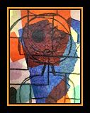
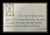
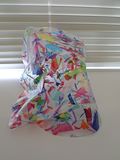
This is really cool! I'm impressed by your use of line, and the balance of color. -- Claire
- on March 24, 2016
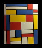
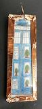
In like your piece Angelo because blue and purple are my favorite colors first of all. Also, the brown brings the colors out and makes it look royal. -- erin
- on March 24, 2016
Your a great artist Angelo, I enjoy all of your art keep them coming.. -- Guy
- on February 18, 2016
The knife/dagger looks pretty cool. -- Ashton
- on February 18, 2016
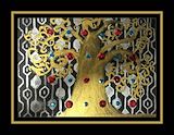
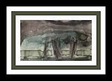
I love this piece! Your background is beautiful and this tree is certainly full of life! -- Madeline
- on February 18, 2016
I like the swirls on the tree. -- Cooper
- on February 18, 2016
This looks very rich and beautiful. I love it! -- Kay
- on February 18, 2016
I like how all the rectangles are straight lined. -- Isaiah
- on February 18, 2016
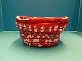
i like the colors you chose and the way it looks like a real pot -- Isaiah
- on February 18, 2016
I like the words you chose and how the lines look so straight. -- Isaiah
- on February 18, 2016
I like the colors you chose for your tree and its leaves. -- Isaiah
- on February 18, 2016
You did a really good job on this! The branches and the coloring and spacing of the sequins look very nice. -- Morgan
- on February 18, 2016
I like everything about your piece Angelo, from the background, the sequence, to the tree itself. Great job. -- Erin
- on February 18, 2016
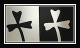
I like the piece, but one of the shamrocks is facing the wrong way. -- Michael
- on February 18, 2016
I like the piece, but the "I" is a little too fancy. -- Michael
- on February 18, 2016
This piece is very unique because of your color choice! Great Job! -- Madeline
- on February 18, 2016
LOVE This! The creativity put into this alongside the fun colors, it brings a bit of "pizazz" (xD) into it. KEEP it up! -- __-Mary
- on February 18, 2016
Very interesting piece you have here. The hourglass you put into the "I" shows the creativity. Very nice. -- __-Mary
- on February 18, 2016
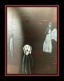
I love the darkness you incorporated into this piece. It gives it quite the bizarre but unique feeling. Good work!! -- __-Mary
- on February 18, 2016
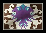
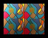
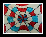
I'm drawn to this because of the repetition of the radial designs. Love it, son. So cool. <3 -- Claire
- on February 18, 2016
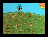
I love how you added a background, and I did, in fact notice that Saturn photo-bombed xD I love the little flowers, and the colors on the burrturflur. -- Lily
- on May 20, 2015
I like the swirls with the color pattern. -- Arlan
- on May 20, 2015
This is.. Oh my. I love this design, and how you were really original, as far as making something based off of someone else's art. It's really cool. I am (almost) speechless, because if I was totally speechless, I wouldn't be able to type. -- Lily
- on March 24, 2015
I love the phrase you used; "I'm the Doctor". Reminds me of 'I am Spartacus'. I love the colors you used, with the cool colors, then a bright red string. It looks great! -- Lily
- on March 24, 2015
The colors look very nice. -- Ashton
- on March 24, 2015
This is a very interesting concept of combining Rodrigue's work with an iconic symbol of Dr. Who. You appear to be very creative! Keep it up! -- Chris
- on March 24, 2015
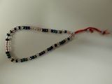
This is an interesting concept. You were able to combine an understanding of Morse Code with beading to create a lovely piece of jewelry that has special meaning to you. Keep up the good work! -- Beatrice
- on March 24, 2015
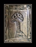
I like the mushroom and the chasing is good! -- Sophie
- on March 24, 2015
I like how you re-imagined the lane lines as keys. I think that this was really smart. I also like the trash and litter that is on the side of the road. Keep up the good work! -- Kadyn
- on March 24, 2015
Nice work, bro. I really like the colors on the sea. The best part about this was the decaying wood. -- Kadyn
- on March 24, 2015
This looks really cool! You took two pretty colors that people wouldn't usually put together and made something AWESOME out of them. This looks great /)^?^/) -- Lily
- on March 24, 2015
It looks like a magical mushroom tree. -- Ashton
- on March 24, 2015
I like the wacky colors and the cool shape! -- Arlan
- on March 24, 2015
I think that you did awesome. I like how you carved your whole name, which most people didn't do. I like how it turned out. -- Lily
- on March 24, 2015
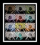
I really like your Op art cones! The colours look well together and the way they look bright in some places and dark in others make them look even better. Good job! -- Morgan
- on March 24, 2015
I really liked the shape for this piece of pottery. I wish I did mine like this. Nice job! -- Kadyn
- on March 24, 2015
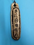
Good job on your cartouche, I like the carvings that you made. -- Alyssa
- on March 24, 2015
I love the shape! -- Ashton
- on March 24, 2015
Well done, Angelo!
- Patricia (teacher at South Crowley Elementary) on December 18, 2014
I really like the way you did your chasing, Angelo! It's really creative and with the lines carved in and the places that are raised and lowered make it look nice. -- Morgan
- on December 16, 2014
I really like he mushroom you carved into the metal. It is cool. -- William
- on December 16, 2014
You demonstrated an understanding of both techniques and although you had difficulty finding a subject for the piece, you were able to complete it in the time frame assigned. You have talent, now we need to work on time management.
- Patricia (teacher at South Crowley Elementary) on December 5, 2014
I like yours because it is very colorful compared to the other ones. -- Avery
- on December 16, 2014
I really like the colors, but I absolutely love the shape of the artwork! Keep up the good work! -- Kadyn
- on December 16, 2014
Hi Angelo. This is Avery. I am amazed at how sculpted and round. How were you able to keep it's shape? The designs are intriguing. Cool. -- Avery
- on December 16, 2014
This is really pretty. Keep doing good things! -- Grace
- on December 16, 2014
This is really cool. I would like to try it. -- Rachel
- on December 16, 2014
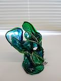
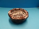
Good use of variety in color, size and shape. The piece also has a very interesting overall shape.
- Patricia (teacher at South Crowley Elementary) on November 13, 2014
The transition from a dense base to the airy transparent portions at the top is very dramatic!
- Patricia (teacher at South Crowley Elementary) on November 13, 2014
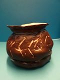
I really liked the way that you made the inside of the pot look like either a gear or a black hole, it looks really creative! :) -- Morgan
- on December 16, 2014
Although you had difficulty with this project you learned some important techniques. Keep up the good work.
- Patricia (teacher at South Crowley Elementary) on November 5, 2014
Well done! The contrast of the white inside of the lip is a good contrast to the dark outside. Keep up the good work.
- Patricia (teacher at South Crowley Elementary) on November 4, 2014
This is an excellent piece. It has a good level rim and the decor gives it the look of an ancient piece of pottery. Keep up the good work!
- Patricia (teacher at South Crowley Elementary) on November 3, 2014
Great! Isn't it amazing that we all followed the same directions, with the same materials and each had a unique piece of art in the end? Keep practicing during the summer! You will really be ready for projects in the fall!
- Patricia (teacher at South Crowley Elementary) on May 24, 2013