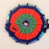
I like the illusion it makes to seem like a ripple from color to color and i like the way you did the wrapping. Great Job. -- Josie
- on May 21, 2014
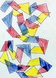
I like your shapes and the pattern that you used. I also like how you used the primary colurs onlly. I also like the geometric theme. Great job. -- Josie
- on May 21, 2014
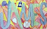
I like the way you made your letters blue and the choice of texture plates you used for the stained glass. Great Job -- Josie
- on May 21, 2014
The art has a great rythym, and the colours are really organized. Great Job! -- Josie
- on May 21, 2014
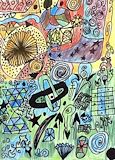
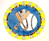
Your symbol is cool because the blue background makes the lighter-colored objects stand out. The yellow outside is cool, because it seems to make the middle part pop out, too. ~Olivia
- Jennifer (teacher at Seacoast Charter School) on March 3, 2014