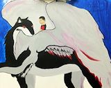
This is your best. Mixing the medias with such ease is a gift.
- Irene (teacher at Orange Preparatory Academy) on February 19, 2014
You can bend this line to suit your purpose and I think your best media is clay.
- Irene (teacher at Orange Preparatory Academy) on February 19, 2014
This design is fantastic, it's overwhelming and very good as a fine arts work. I would like to see the actual piece. -- Erline
- on January 11, 2014
I saw this in your Exhibit and loved everything about it. Well Done! -- Brianna
- on July 30, 2013
This is a very difficult project but yet you have accomplished it in a very mature way. Good job! -- Mrs. Garcia
- on July 30, 2013
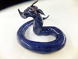
I am encouraged by the fact that your teachers say your talent has grown in this area. Looking at this sculpture in clay I would say you hit a home run. Good job! -- Robinson
- on July 23, 2013
I like your snake, the color and its form. I also think you should always work in clay. You are good so keep up the good work in the 10th grade. -- Karl
- on July 18, 2013
Clay is one of my favorite media. It can be difficult to work with because it has so many stages and the young artist must be very careful. In your case, I like the outcome especially as you described all of your difficulties. I love the fact that you, a 9th grader, was so successful. I think I would have glazed it but I like the bisque as well. Well done Jean and good luck on your next art project in the High School. -- Mrs. Bastista
- on July 17, 2013
Freehand drawing is your thing, stay with it...
- Irene (teacher at Orange Preparatory Academy) on June 30, 2013
You have captured this subject with line and the angles are perfect.
- Irene (teacher at Orange Preparatory Academy) on May 27, 2013
Well done Jean. I wish I had looked into Artsonia before I finished. -- Rachelle
- on May 29, 2013
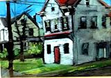
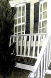
Your interpretation of this landscape subject is very different. I like that you decided to draw this unsual view and manages to get the idea over in pencil and drawing paper. Some of your shading is more than asked for but I can see the necessity because of this focal point. It is clearly a house front. You have windows, a porch and landscape. You had said you started with the porch and went up. The size of the railing dictates the rest. Great Job! -- Rachelle
- on June 8, 2013
You have reached your peek. Your creative ability has matured and you can't get much better right now. This is a perfect design and the colors match the design itself. Red and green are always favorites. -- Ana
- on May 18, 2013
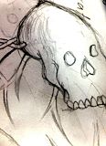
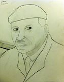
This is a very good likeness of this man as seen from my research. You have a good eye and are very accurate in your interpretation. -- Daniel
- on March 4, 2013
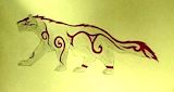
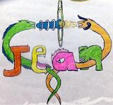
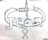
This artwork work is so cool. I would draw it myself. Although, instead of placing a tongue with a E, you could finish the tail to see it continue. Anyway, I like the colors because they go with the design. i liked the creatures with their powers. They look realistic. I can actually imagine them fighting. Good Job, Keep up the Good Work! -- Fabienne
- on February 12, 2013
This name design is so much better in color but some of my friends like the ink drawing best. -- Fabianne
- on January 16, 2013
You have drawn an different view of this subject. Most of us drew the front view but I like yours best and I think it is very creative. Be different is now the word in your art work. -- Cindy
- on January 13, 2013
This name design is interesting. I would like you to explain what it means because it is well drawn, the composition is good and so is the subject. -- Lucas
- on January 13, 2013
I like how you have designed this little figurine. It has movement and a lot of presence. -- Jessie
- on December 28, 2012
I like how you painted such a large painting and only used three colors. It clearly has an abstract appearance but I can identify figures. -- Xavier
- on December 28, 2012
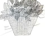
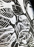
I always like leaf compositions and the way you have created this print is especially pleasing. WOW! -- CindyMarie
- on December 27, 2012
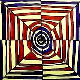
I like the movement in this work. The colors fit with the lines and I can see a deliberate movement in a circular and square form. The white spaces are almost yellow. Did you intend it to be that way. Good work! -- Lucas
- on December 27, 2012
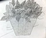
I like how you drew the leaves. The detailed are perfect for a first-draw class. The vains are detailed just right. -- Carly
- on December 25, 2012
This is your best and first art work. You can now go into business. Compliments to You! -- Bethsania
- on June 3, 2012
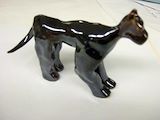
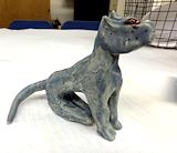
This dog says it all about your abilities in ART CLUB. It is the right size, color a more important it survived all of those processes in successful clay figure making. GOOD WORK! -- Henri
- on May 30, 2012
Your little dog is the best! GOOD JOB! -- Ariel
- on May 30, 2012
This is a great piece of ceramics. Your dog is just the right color and your art work is great! -- Bethsania
- on May 30, 2012
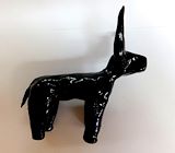
This is a beautifully designed bull. The horns are perfect, large and well balanced. It is the right size and color for for this little sculpture. Well made. -- Carl
- on May 30, 2012
This is the best one yet. I do like it best. The shape is fantastic. It is a bull and the profile of that animal. Just wait until the next one. -- Stephanie