I just love the design, the combinations are amazing. What a joy to see your work becoming more sophisticated and develop over the past 2 years. Many thanks go to the stellar art program at BCWM and a teacher that I could of only dream of when I was in school. So much of what your doing wasn't available in my day. I think the title should be "Happy Patch". -- GG
- on June 1, 2016
It's nice your learning about dimension and texture. -- Virginia
- on May 14, 2016
Another view with many colorful details. -- Virginia
- on May 14, 2016
Is this the back side of your earlier building? I recognize the pool. -- Virginia
- on May 14, 2016
The use of different materials is good. I like the person looking out into the world. -- Virginia
- on May 14, 2016
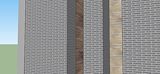
A contemporary building with with many modern elements, it's,a hoot. -- Virginia
- on May 14, 2016
This is a sad picture showing the harm that is overhead. I wish the lower part was more visible. Can't wait to see it in person. -- Virginia
- on May 14, 2016
This different shapes are interesting and the use of the many red tones really stand out. -- Virginia
- on May 14, 2016
This is an interesting mix of colors. The placement of the repeated pieces make it look like an amish flower design. -- Virginia
- on May 14, 2016
The question I always ask myself! -- Judy
- on May 14, 2016
Interesting perspective and shadowing. Love it! -- Judy
- on May 14, 2016
Great depiction, E. It is as gloomy and sad as the reality of pollution. Very good conveyance. I wonder how many people will not see it here either. "Art inspires." -- Judy
- on May 15, 2016
E, This is so cool. I love the color choices. They all seem to work together so very well. Now do one in Spring colors. Great work, mister! -- Judy
- on May 15, 2016
Good job on this sketch up piece -- Robert
- on May 4, 2016
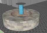
I like the way you made this water fountain, it looks really cool -- Owen
- on May 4, 2016
awsome you must be very good at sketchup -- luke
- on May 4, 2016
This is really cool this looks like the outer space. -- luke
- on May 4, 2016
very awsome -- luke
- on May 4, 2016
Like the colors you selected. the texture of the stars on the red and burgundy base make them feel lit, the Sun is blinding. -- Virginia
- on March 30, 2016
Love the colors! This piece takes me to a dimension far, far away. Thanks for the trip! -- Nancy
- on March 30, 2016
Interesting the way you link your thinking process to your work. -- Virginia
- on March 15, 2016
I like your point of focus, Eli. I dare say it is different from what most individuals would choose. Keep doing photos. -- Judy
- on March 15, 2016
Wow! What a perspective. This could be a cover for Architectural Digest. Great photo work. -- Judy
- on March 30, 2016
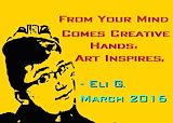
This is one of my favorite things you have done this year! I just love it. Your slogan makes one stop and think which is art in and of itself! The graphic of you is superb. You are quite the artist. -- Judy
- on March 30, 2016
Amazing the way the light hits the object. Leave it to you to focus on something like this. -- Virginia
- on March 10, 2016
Good old NYC, I can see the cucumber got your attention. -- Virginia
- on March 10, 2016
At the bottom I see what looks like part of a cat eye and ear. The colors are very happy and the water below seems to be lifting up the fish. -- Virginia
- on March 10, 2016
Love the likeness as well as the placement and color. You were able to capture some details. -- Virginia
- on March 10, 2016
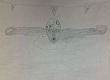
This is one serious swimmer. Good detail, lane 6 could be lane G. -- Virginia
- on March 10, 2016
I like the placement and the large person in the middle has your likeness. -- GG
- on March 10, 2016
This looks like outer space to me. I see a face in the blue right hand section. -- GG
- on March 10, 2016
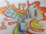
Love the light bulb at the end as well as the detail of the plug and wiring. Each letter is so very different in design which adds interest. -- GG
- on March 10, 2016
Interesting arrangement of color as well as patterns. -- GG
- on March 10, 2016
Love the morning shadows at the station. The feeling I get is one of movement and action frozen in time. -- GG
- on March 10, 2016
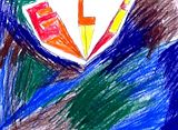
I find this both eerie and pleasing at the same time. The dark head against the flesh tones is very dramatic. The title should be "Dramatic Irony" -- GG
- on March 10, 2016
Very colorful! My first impression is that of an owl. -- GG
- on March 10, 2016
Since I know your love for pillows this seems very personal. Use of colors is interesting. The pattern has lots of movement. -- GG
- on March 10, 2016
Love the distribution of the pattern both the background and 4-design blocks work well. This would make an interesting rug. -- GG
- on March 10, 2016
This evokes happiness in me. The colors crescendo to the favorite end, yellow! Awesome. -- Nancy
- on March 3, 2016
This totally creeps me out but sort of in a good way. It is eerie. Different components, like the eye glasses or the nose, pop out of the piece at different times which adds to the eerieness of it. Interesting effect. Keep developing your creativity, E. -- Nancy
- on March 3, 2016
This is very cool! I very much like the red you chose to use paired with the green. Keep up the great work. -- Nancy
- on March 3, 2016
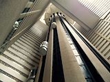
I understand this is a picture of a hotel floor in New York. It looks like granite to me with the reflection of overhead lighting. You captured this in a uniform way. The difference in color from one side to the other is interesting. I almost get the feeling of outer space exploding when looking at this piece. GG
- on August 10, 2015
Your really hit this one on the nail. It is an interesting piece of work. I like all the New York pictures and this is among my favorite. It was shot from a great angle and it must have really spoken to you as I understand your returned to admire the elevator structure before you left the city. Leave it up to you to find something so complex to draw you back. Virginia
- on August 5, 2015
Love the arrangement of shapes and colors G
- on August 5, 2015
Eli, This is an awesome perspective! Take more photos. -- Judy
- on August 5, 2015
Eli, You make some relly cool art! I love this especially the colors that you used. I cannot imagine how you did this on a computer. I know you explain it but I am not very good at computers. Maybe someday you can help me make one. Great Job! -- Judy
- on March 17, 2015
I love this piece the choice of colors is good and I like the balance of the work. -- Gg
- on March 16, 2015
E, This really catches the eye. The colors are wonderful and I love the design. The yellow background is awesome! Keep up the good work. Looking forward to more art from you. -- Nancy
- on March 13, 2015
Another self portrait. The use of green in the background is nice as well as the way you placed the gold and red around the sides. -- GG
- on January 14, 2015
I like the background color as well as the shading and the use of dark color for the hair. The shirt looks very nice. -- GG
- on January 14, 2015
Eli, You are my talented great nephew. I love the bright colors during this wintery period. A lot of sunshine I see in your art. Happy! -- Judy
- on January 14, 2015
E, I see why you named this "Pillow Mandala. " I want to put my head on it and rest. The colors would take me to a beautiful dream land full of sunshine and comfort. Great work. -- Nancy
- on January 14, 2015
Like your background, Eli...it's really interesting with the colors you chose and the stripe action on the sides. I like that you are off center in the portrait too. The pose is interesting as well. You should try a portrait every month and then have a series of 12 at the end of the year! That could be a cool project. -- AG
- on January 14, 2015
this reminds me of Keith Harings work a little bit...like your Mandala Pillow...that is an interesting take on a mandala and actually might be fun to make from this drawing. We should try to do that one day! -- AG
- on January 14, 2015
I picked you out without a problem. I really like your faces collage.
- on January 13, 2015
Interesting what you cn do on the computer. This looks like it could be a Christmas card. Love the choice of colors. G
- on December 23, 2014
E, I like this very much. I do not think you intended this but it looks like white smoke is coming from the top of Snowie's hat! I wonder if Snowie is just letting off steam! Too much shopping! Great job. N -- Nancy
- on December 23, 2014
Happy snow! Love the sky colors and you use of aqua. Looks like the snow person wants a hug! -- Judy
- on December 23, 2014
Like the use of color from frame to frame. It's nice to see you using the computer to present your art work. G
- on December 15, 2014
Eli, you are really mastering this methodology. I am so impressed with this piece. Keep up your strong use of color because I just love it! -- Judy
- on December 16, 2014
I love the bright colors on this dreary day. You brightened my world today, Eli. Thank you. -- Nancy
- on December 16, 2014
This is an interesting art form. I like the black and white contrast that allows for the details to show. Keep up the good work. -- GG
- on December 16, 2014
I like the black and white. I see so many different things in this art ...a face, a couple of legs with feet attached, a crescent moon, a fish, etc. I first saw a dinosaur looking at the whole piece. This is fun for me. I looked up what a notan is and how to create one. Someday soon I too am going to make one. Maybe you can help me. I really love this creation! Good job, Eli. -- Judy
- on December 16, 2014
I hear the music! -- Judy
- on December 7, 2014
Great print with good enegy. I can feel the music. -- Virginia
- on December 7, 2014
I love your print "Trombone Player". Guessing this must be a self portrait. Looks like the player is belting out an exciting song. The lines and background add to the energy of the work. -- GG
- on December 7, 2014
This work almost looks like a coat of arms. The white acts like a stark background against the dark colors. Would love to see you attempt this again. -- GG
- on December 1, 2014
I like the way you used both vivid and dark colors. The bit of turquoise at the end of the hall is interesting. -- GG
- on December 1, 2014
I do like the warm colors set apart from the cool colors. G
- on November 28, 2014
E, Interesting choice of colors. -- Judy
- on November 28, 2014
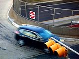
Great job, Eli. I know this was a challenge for you but you sure conquered it with a few simple rules... This hallway has an ominous feeling kind of like in Dr. Who sometimes. I kind of feel like something will pop out of the lockers on the wall at any moment. -- Amy
- on November 22, 2014
This piece has so much going for it. I love the detail in the branches as well as the paint on the some of the leaves. The leaves kind of sparkle, just like they did that morning. The dimensional aspect of this work really makes it come alive. -- GG
- on November 20, 2014
You sure got the hang of perspective. I enjoy looking at all the details in the hallway. I know you'll be using what you learned from this assignment in your upcomming art work. -- GG
- on November 20, 2014
This is pretty neat. I like the use of different media. It gives a lot of dimension to the work. Kudos to the teacher for inspiring her artists! -- Nancy
- on November 20, 2014
Nice work, Eli. I like you use of tissue paper for dimension. -- Judy
- on November 20, 2014
Eli, WOW! I love everything about this piece. This will hang somewhere in my home as soon as I find a spot worthy of it. The colors are so beautiful. The concept of "2 Universes, 1 Sun" is dramatically depicted here; an awesome name for an awesome piece! Did you ever read The Little Prince? This very much reminds me of the Prince's stars, universes, and travels. Keep on developing your art brain. -- Nancy
- on November 4, 2014
Eli, This piece speaks to me. It makes me feel all "mystical" inside. I am very drawn to your color selection and the effects you created. I very much appreciate that in your artist's statement you shared how you created this beautiful piece of art! -- Judy
- on November 4, 2014
This is an interesting piece, I like the dimensional aspect and they way it pulls you beyond the surface. The selection of colors is very interesting and I especially like the highlight in the top left hand corner. Keep up the good work with Photoshop. -- GG
- on October 31, 2014
Eli! This is great...and so professional looking. We'll have to work on Photoshop together when I get back. You can teach me a few things and I can teach you a few things. I have some great books too at home with more tips and tools... -- amy
- on November 1, 2014
This is a sparkling happy piece. The mixture of clear bright color along with muted tones create a nice balance. It looks like your able to place the color where you want it and not overwork the paint.
- on October 30, 2014
Eli this is an interesting piece. I like the energy it gives off. The use of red and yellow as well as the black line areas give in a nice dimensions.
- on October 30, 2014
Like the use of salt and the color washes/blending. The pop of yellow is really effective. I really love the lower left and upper left border washes too. Leaving some white space relieves the eye as well... Great JOB! -- Amy
- on October 30, 2014
The piece makes me feel happy I like the way you wove the colors and especially love the green outer curled edge. the center is interesting especially since you selected yellow to surround the area. G
- on October 13, 2014
Eli, This reminds of crocheted yarn. You know how I love crocheting. All the colors together are awesome. -- Judy
- on October 13, 2014
I absolutely love this. The colors are so bright and happy. It looks quite intricate. Nice work. -- Nancy
- on October 13, 2014
Really cool, Eli. It reminds me of a groovy postage stamp in a way...you did a great job with the colors and design elements. I really love the arrows and the placement of the text. Hands are super hard to draw and you did a great job. Did you make up that quote or did someone else say it? -- Amy
- on October 9, 2014
Eli, You are the first thing I notice. The colors are nice. I like your words. -- Judy
- on October 9, 2014
E, Great thought. I feel a flow through the piece which i find really neat. Your designs are interesting. I think I see bowties! -- Nancy
- on October 9, 2014
This piece is interesting. I like all the colors, especially the placement. The various designs and how you choose to lay them in the work grab attention. Keep up with the planning as it has paid off in this artwork. -- GG
- on October 9, 2014
Dude, way too cool! -- Judy
- on September 25, 2014
Yale, here I come! Intense yet happy looking dude. Nice job! -- Nancy
- on September 25, 2014
Love the intense use of color and contrast. The white collar on the shirt is interesting against the dark shirt. This Dud looks hip, confident and ready to take on the world. The work has positive happy attitude. -- GG
- on September 24, 2014
I see an animal theme going on in this piece. I like the background color that was selected. The hamburger and kitten anchor the work nicely. -- GG
- on September 20, 2014
E, You really knocked my socks off with this self portrait. Love all the colors as well as the way you treated the background. The use of black in the left top gave the work a special touch. -- GG
- on September 20, 2014
Really LOVE this one Eli...I want to frame it when I get home! -- AG
- on September 18, 2014
Eli, This is a very different image of you! I think your color choice is interesting. Is this going to be the picture of you in the yearbook? -- Judy
- on September 18, 2014
Very interesting. It seems to become more complex with the use of color. Cannot wait to see the school project! -- Nancy
- on September 18, 2014
Eli; This is a wondful use of color. I like the font you selected and the black background makes the colors interesting. GG -- GG
- on September 18, 2014
Cool graffiti name. Reminds me of New York City. I see this a lot in different neighborhoods! -- ag
- on September 15, 2014
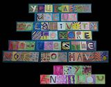
E, Your artist's statement adds so much more dimension to your art piece. I like the elements of you that you chose to be reflected here ( Minecraft, fishing, and bowling). I think it is significant that the first and largest letter is depicted by your favorite game! Fun. -- Nancy
- on September 15, 2014
Pretty neat Eli. Your artist's statement tells me this is really you since the themes chosen for each letter are all very much some of your favorite things. Good job! -- Judy
- on September 15, 2014
Eli, I like this very much. It reminds me of stained glass art which I love! Your choice of colors draws me into the piece. Keep up the good work! -- Nancy
- on September 15, 2014
Eli, I very much like the colors you chose for your graffitti. This piece is very eye-catching. I think it would make a great poster for framing. -- Judy
- on September 15, 2014
Groovy bowl, Eli! Glad you are doing such great work in art class... -- ag
- on September 10, 2014
Love the shape and texture of your bowl. It almost looks like a pearl. G -- GG
- on September 10, 2014
A bowl for all the "free rice!" Neat. -- Nancy
- on September 7, 2014
Eli, Nice job! -- Judy
- on September 7, 2014
Reminds me a little of "The Little Shop of Horrors." Nice work, Eli! -- Nancy
- on October 30, 2013
Love the City Scape, especially the road. Keep up the good work. G -- GG
- on October 30, 2013
Looking at this piece of your art makes me feel happy. I really like your use of color. Keep up the great work! -- Judy
- on October 16, 2013
Wonderful use of color. The texture made the colors "pop" for me. The piece is a true reflection of the artist's persona. Great work, Eli. -- Nancy
- on October 16, 2013
E, I have been one of the lucky people in this world who has seen you use your creativity in so very many ways. Your quote truly fits you. Your creativity has grown from one little seed when you were 2 years old to a vast field of wild flowers. I love your use of color and design in this piece. I had to really focus on the piece to read the quote. That totally drew me into this work of art. Excellent work. Keep it up. Some day I may see your creativity shown at Art Prize! -- Nancy
- on September 26, 2013
E, I have been one of the lucky people in this world who has seen you use your creativity in so very many ways. Your quote truly fits you. Your creativity has grown from one little seed when you were 2 years old to a vast field of wild flowers. I love your use of color and design in this piece. I had to really focus on the piece to read the quote. That totally drew me into this work of art. Excellent work. Keep it up. Some day I may see your creativity shown at Art Prize! -- Nancy
- on October 2, 2013
E, I have been one of the lucky people in this world who has seen you use your creativity in so very many ways. Your quote truly fits you. Your creativity has grown from one little seed when you were 2 years old to a vast field of wild flowers. I love your use of color and design in this piece. I had to really focus on the piece to read the quote. That totally drew me into this work of art. Excellent work. Keep it up. Some day I may see your creativity shown at Art Prize! -- Nancy
- on September 26, 2013
Really groovy work Eli! Super colors... -- Amy
- on June 5, 2013
This is a fun piece. Keep up the art work. -- Judy
- on June 5, 2013
Eli, I like this very much. The curved lines make it flow so nicely. Of course I love the use of orange and yellow! Very interesting. -- Nancy
- on June 5, 2013
Loved the detail in his expression! Did he find the subway? -- Kathie
- on May 22, 2013
Background colors are interesting. I like the bow tie. I would add "favorite nephew" to your descriptives! -- Judy
- on May 6, 2013
Polka dots and bow tie ..... I think you captured a couple essential Eli faves! -- Nancy
- on May 6, 2013
Cool drawing Eli! Nice perspective... -- Amy
- on April 17, 2013
Very nice color choices! I love your creativity. Keep up your good work! -- Kathie
- on February 27, 2013
E, What a "fin" job!!! Great dorsal... I am so happy you have another piece of art to show. Want more. -- Nancy
- on February 27, 2013
Eli, I love the color choices. The geometry is neat. I would like to see more of your work! -- nancy